
When the KPI Visualization preview feature is enabled, you can visualize KPI data points with the KPI (Single Value) chart option in Looker. The KPI (Single Value) chart option replaces the Single Value chart option in Explores.
The KPI Visualization preview feature provides users with the following capabilities:
- Add secondary visualizations: Users can add a sparkline or bar chart within a visualization to show trends or distributions that are related to the primary KPI.
- Show enhanced comparisons: Users can specify and compare a primary value against any other measure in an Explore query, using data from the first row, second row, last row, or totals row.
- Access improved styling options: Users have more control over the appearance of the visualization, including background color of the tile, and the alignment of the values.
This page provides guidance for enabling and using the KPI Visualization preview feature for your Looker (original) or Looker (Google Cloud core) instance. This page includes the following sections:
- User and instance requirements
- Enabling the KPI Visualization
- Things to know
- KPI (Single Value) chart options
- Related resources
User and instance requirements
To enable and use the KPI Visualization preview feature, the following requirements must be met:
- Your Looker (original) or Looker (Google Cloud core) instance must be running Looker 26.10 or later, and your Looker (original) instance must be Looker-hosted.
- You must have the Admin Looker role to enable the KPI Visualization preview feature.
- To view and interact with Explores, including creating visualizations, you must have the following access:
- The User Looker role or another role that contains the
explorepermission - Access to the underlying LookML model that the Explore is based on to see and use its fields in a visualization
- The User Looker role or another role that contains the
Enabling the KPI Visualization
The KPI Visualization preview feature is disabled by default.
Admins can enable the KPI Visualization preview feature by following these steps:
- In Looker, click the Admin option in the main navigation menu.
- Click the Preview option under the General section to open the Preview Features page.
- Click the KPI Visualization switch to enable the preview feature.
Things to know
When several single value visualizations appear on a dashboard, each visualization defaults to using the same font size for a consistent appearance. However, single value visualizations automatically resize fonts when a tile size is reduced. If the font for a visualization cannot show the entire value in the space available, then the value is truncated by an ellipsis (...).
If the Smart Single Value Text Size feature is enabled, the displayed fonts on single value visualizations in dashboard tiles automatically resize to display at least 8-10 value characters within the tile at any given size.
KPI (Single Value) chart options
To edit the KPI (Single Value) chart, click Edit in the Explore Visualization pane.
Once in edit mode, users can make selections in the Style, Comparison, and Formatting menus to customize the appearance of the KPI (Single Value) visualization.
Style menu options
The Style menu includes the following options.
Colors Collection
Choose a color collection from the Colors Collection menu. A collection lets you create themed visualizations and dashboards that look good together. You can see all the palettes in each of Looker's built-in color collections on the Color collections documentation page. Your Looker admin may also create a custom color collection for your organization.
Value Color
To set the color of the chart value, click the color swatch in the Value Color section to open the color picker menu.
- To pick a color from a palette, click the Palettes tab of the color picker menu, and then use the left and right arrows to scroll through the available palettes. Select a color by clicking on a color in one of the palettes.
- To select a custom color, click the Custom tab of the palette picker, and then either use the color gradient and value slider to choose a custom color, or enter an RGB hex string, such as
#2ca6cd, or CSS color name, such asmediumblue, into the input field.
Looker will use the selected color for single value visualizations both with and without hyperlinks.
Depending on your needs, consider using the following alternate techniques:
- Change the font color to differentiate between good or bad results: Turn on the Show Comparison setting in the Comparison menu, and choose the Show as Change option.
- Change the font color for a particular field's value everywhere, including in the Explore Data pane: A LookML developer can add an
htmlparameter to the field definition.
Auto Resize Value
Enabling the Auto Resize Value option automatically resizes the font on the single value visualization that's displayed within dashboard tiles. Fonts are resized to display at least 8-10 value characters within a tile; if the characters in the visualization overflow horizontally or vertically at a given size, the font size will decrease incrementally. The minimum font size allowed is 14 pixels. Once the minimum font size is reached, any overflowing characters will be truncated with an ellipsis (...). The maximum font size allowed is 104 pixels.
When you're using this feature, single value tiles on dashboards may look less consistent, but more characters will fit on smaller tiles.
This setting has no effect if the Smart Single Value Text Size setting is enabled on the Admin > General Settings page. To use this per-visualization control, the admin-level setting must be disabled.
Show Title
You can determine whether a title appears under the number. For a saved Look, the default title is the name of the Look. You also can specify a different title by using the Title field.
Title Override
You can specify a title to display with the value. This field is available when Show Title is on. For a saved Look, if this field is left empty, the title defaults to the name of the saved Look.
Show Spark chart
Turn on the Show Spark Chart setting to display a secondary visualization that shows the change of the data value. When this setting is turned on, you can customize the secondary visualization with the following settings:
- Chart Type: Choose either Area chart or Column chart as the secondary visualization.
- Chart Color: Choose a color for the secondary visualization, similarly to the Value Color setting.
- Visible X Axis: Turn this setting on to display X Axis values for the secondary chart.
Primary Value
The settings in this section let you choose the primary value for the KPI (Single Value) visualization, including the following:
- Primary Series: Choose a measure from the Explore to set as a primary series. The value of the measure will be the value that is compared against when the Show Comparison setting in the Comparison menu is turned on.
- Primary Row: Specify a row's value from the Primary Series to display. Options include 1st, 2nd, Last, and Total (when Totals are enabled). 1st is selected by default.
- Alignment: Choose an alignment option for the values in the visualization. Options include Left, Center, and Right. This setting applies to all of the values in the visualization.
Comparison menu options
The Comparison menu includes the following options.
Show Comparison
You can turn on the Show Comparison setting to add comparison information from a second field to your KPI (Single Value) visualization. When the Show Comparison setting is enabled, you can use the style options that appear on the Comparison menu.
Comparison Series
The comparison series appears underneath the primary series in the visualization. The settings in this section let you choose the secondary value for comparison, including the following:
- Comparison Series: Choose a measure from the Explore to set as a comparison series. The value of the selected measure will be the value that is compared against the primary value.
- Comparison Row: Specify a row's value from the Comparison Series to display. Options include 1st, 2nd, Last, and Total (when Totals are enabled). 1st is selected by default.
- Value Labels: You can specify how the comparison series is used in the visualization. The options include the following:
- Show as Value: The value of the comparison series is displayed.
- Show as Change: The value of the comparison is displayed, with conditional formatting to indicate the type of change compared to the primary series. If the change in value is negative, a triangle points downwards. If the change in value is positive, the triangle points upward. By default, a negative number appears in red with a red triangle, and a positive number appears in green with a green triangle. These colors can be switched by turning on the Positive Values are Bad setting.
- Show as Percentage Change: The value of the comparison series is displayed with the percentage change compared to the primary series, with conditional formatting that indicates the type of change. If the percentage change in value is negative, a triangle points downwards. If the percentage change in value is positive, the triangle points upward. By default, a negative percentage appears in red with a red triangle, and a positive percentage appears in green with a green triangle. These colors can be switched by turning on the Positive Values are Bad setting.
- Calculate Progress: The value of the primary field is divided by the comparison field's value, and the percentage appears as a progress bar.
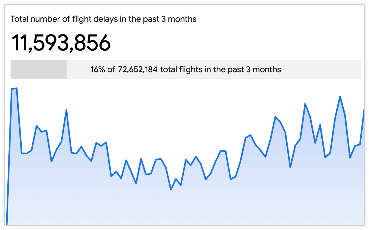
- Calculate Progress (with Percentage): The value of the primary field is divided by the value of the comparison field. The percentage appears as a progress bar that is labeled with the percentage and the value of the comparison field, such as "83% of $347.8 K". If the Show Label setting is on, then the progress bar also shows the label for the comparison field, such as "83% of $347.8 K Monthly target".
- Show Label: Turn on this setting to show a label for the comparison field. By default, the label is the name of the comparison field. If you want to display a different label, enter a new label in the Label field.
Formatting menu options
Turn on Enable Conditional Formatting to define rules that color code your visualization by specifying values that are of interest.
Colors Collection
A collection lets you create themed visualizations and dashboards that look good together. All of Looker's built-in color collections appear on the Color collections documentation page. Your Looker admin may also create a custom color collection for your organization.
You can choose a color collection from the Colors Collection menu. The palettes that appear for the color swatches in each rule come from that collection.
Include Null Values as Zero
Turn on the Include Null Values as Zero setting to have Looker treat null values as zero. Including null values as zero helps to eliminate mathematical errors in calculations, avoids gaps in your visualizations, and ensures accurate metric aggregation.
Multiple rules
You can have multiple rules for conditional formatting. To add a rule, follow these steps:
- To add a rule, click Add Rule.
- If you have more than one rule, the rules that are higher on the list have precedence over the rules that are lower on the list. To change the precedence of a rule, click the rule's drag handle and drag the rule higher or lower in the list.
- To delete a rule, click Delete Rule.
Format
For each rule, use the Format menu options to select one of the following rule options:
- between
- equal to
- greater than
- less than
- not between
- not equal to
- not null
- null
Then, enter comparison values into the text fields that appear, based on your selection. When you enter values into the rule, don't use thousands separators.
Styles
Click the color swatches next to Background color or Font color to open the color picker menu, which lets you pick or customize a color:
- To pick a color from a palette, click the Palettes tab of the color picker menu, and then use the left and right arrows to scroll through the available palettes. Select a color by clicking on a color in one of the palettes.
- To select a custom color, click the Custom tab of the palette picker, and then either use the color gradient and value slider to choose a custom color, or enter an RGB hex string, such as
#2ca6cd, or CSS color name, such asmediumblue, into the input field.
Related resources
Now that you know how to create a KPI (Single Value) visualization in Looker, you may want to learn how to do the following:
- Save Explore queries as Looks.
- Add Explore queries to dashboards.
- Share data with other users.