
You can customize the tooltips that appear when users hover over elements in Looker visualizations. Customized tooltips let you provide more context, display additional metrics, and tailor the information that's presented to your users. With the Custom Tooltip visualization setting, you can configure tooltips within the Explore visualization editor by using a combination of UI settings and an HTML editor that supports Liquid templating.
This page provides guidance for enabling and using the Custom Tooltips visualization setting on your Looker (original) instance. This page includes the following sections:
User and instance requirements
To access the Custom Tooltips visualization setting, you must meet the following requirements:
- Your Looker (original) instance must be running Looker 26.4 or later.
- To make custom tooltips in Explores, you must have the
explorepermission, and access to the underlying LookML model.
Limitations
The Custom Tooltips preview feature has the following limitations:
- Custom tooltips are supported for most visualization types except the following:
- Donut multiples charts
- Word cloud charts
- Static map (regions) charts
- Static maps (points) charts
- Charts made using the Chart Config Editor (with the exception of Sankey charts)
- Custom visualizations
- Custom tooltips can only reference fields that are included in an Explore query.
- Tooltips can only display the same data granularity as a given field. If users want to see a more granular level of data than is available in the tooltip, they must use the drill down functionality.
- Custom tooltips are saved at the visualization level. They cannot be saved at the Explore level.
- If you remove a field from an Explore query that has a custom tooltip, a user can still see that tooltip if the Explore query is shared with them and they add the field back to the Explore query.
- Rendered HTML in custom tooltips is subject to Looker's HTML sanitization rules.
- Not all Liquid variables may be supported for custom tooltips.
- Tooltip customizations will override any theme that is applied to either an internal (non-embedded) dashboard or an embedded dashboard.
How to use Custom Tooltips
If you have the appropriate permissions, you can customize the tooltip for a series in your Explore visualization. To customize the tooltip, follow these steps:
- Open or create an Explore query and select a supported visualization type.
- Click Edit in the Explore Visualization tab to open the visualization editor.
- Click the Series tab.
- For Google Maps charts and boxplot charts, click the Plot tab, and proceed to step 5.
- For waterfall charts, click the Series tab, and proceed to step 5.
- For single value charts and single record charts, click the Style tab, and proceed to step 5.
- For funnel charts, click the Labels tab, and proceed to step 5.
- For timeline charts, click the Options tab, and proceed to step 5.
- Under the Customizations section, find the series that you would like to add the tooltip to. If there are multiple series, expand the one that you want to add a tooltip to.
- Click the Custom Tooltip switch to enable the custom tooltip functionality for that specific series or chart.
- In the Custom Tooltip section, you can adjust the basic appearance of the tooltip using the provided options:
- Font Size: Sets the font size of the tooltip font.
- Font Family: Sets the font family of the tooltip font.
- Border Radius: Sets the roundedness of the tooltip edges. The higher the number, the rounder the tooltip edges.
- Box Shadow: Sets the shadow of the tooltip box.
- Font Color: Sets the font color of the tooltip.
- Background Color: Sets the background color of the tooltip.
- Border Color: Sets the border color of the tooltip.
- Text Alignment: Sets the alignment of the tooltip font. Choose Align Left, Align Center, or Align Right. Align Left is the default setting.
- In addition or alternatively to the previous options, you can apply more advanced styling options by clicking Edit Tooltip Content to open the Edit tooltip content HTML editor.
In the Edit Tooltip Content editor, you can use HTML and Liquid variables to structure and populate your tooltip.
- Use standard HTML tags to format your tooltip content (for example,
<div>,<span>,<strong>,<table>,<ul>,<ol>). Note that the rendered HTML is subject to Looker's HTML sanitization rules. - Not all Liquid variables may be supported for custom tooltips.
- Use standard HTML tags to format your tooltip content (for example,
As you edit the custom tooltip content, you can preview the tooltip by clicking Preview (or keyboard shortcuts Command-Return for Mac, or Ctrl+Enter for PC) and hovering over the data points in the visualization preview pane.
Click Save in the HTML editor, and then save your Explore as a Look or as a dashboard tile to persist the changes.
Examples
The following examples demonstrate use cases for different levels of tooltip customization:
- Custom tooltip with multiple measure values
- Custom tooltip with hidden values structured as a table
- Custom tooltip with common Liquid functions
Custom tooltip with multiple measure values
Custom tooltips can be helpful in cases where you want to provide more context to users about a datapoint that is displayed in a visualization. For example, a single value chart displays the value of only one measure. With a custom tooltip, you can display more data, and provide your users with more context about the data in the chart.
In this example, a single value chart titled "Count of orders in 2025" displays the value for Orders Count for the Users Country "USA", and is based on an Explore query that also includes Order Items Count. However, the value for Order Items Count isn't displayed in the chart.
The following HTML is input in the Edit Tooltip Content editor for the Orders Count series, and sets the content to include the Order Items Count value in the tooltip:
<div style="padding: 5px; font-family: Arial, sans-serif; font-size: 13px;">
  <div>
    <strong>Order Items Count:</strong> {{ order_items.count }}
  </div>
  <div>
    <strong>Orders Count:</strong> {{ orders.count }}
  </div>
</div>
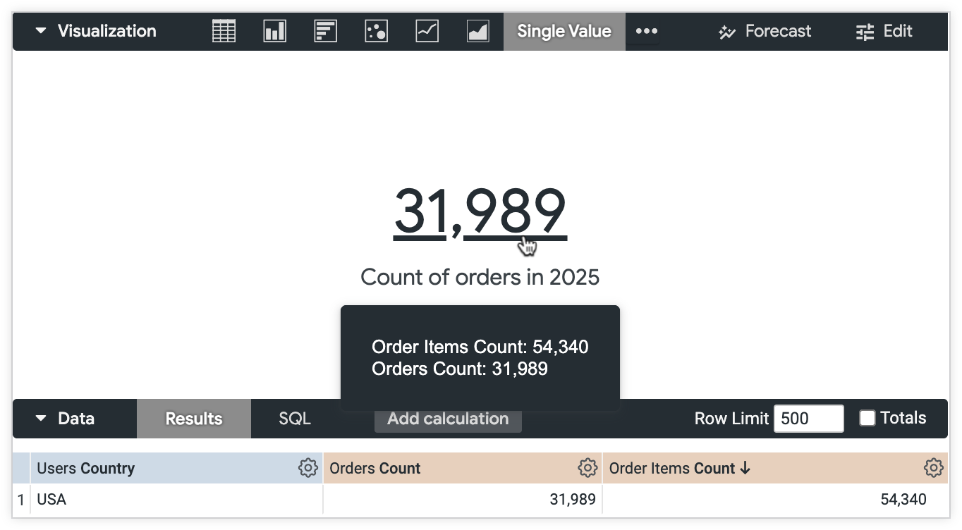
Users are able to see the values for both fields, Orders Count and Order Items Count, and have more context for the data that is displayed in the chart.
Custom tooltip with hidden values structured as a table
As noted in the limitations information on this page, custom tooltips can only reference fields that are included in an Explore query. However, you may not want to display all of the Explore fields in a chart. With a custom tooltip, you can display data from fields that are hidden from visualizations to your users, without adding them to a chart.
In this example, an Explore data table includes the measures Orders Count and Order Items Count, grouped by the dimensions Users State and Orders Status. The developer wants to display a small table to users, and hides the fields Orders Status and Order Items Count from the table chart. However, the developer still wants users to see the Orders Status and Order Items Count values that are associated with a given Orders Count.
The following HTML is entered in the Edit Tooltip Content editor for the Orders Count series, and sets the content to include the values for Orders Status and Order Items Count in the tooltip, structured as a table:
<div>
    <div>
        <table border="1">
          <!-- Table Body -->
          <tbody>
            <!-- Row 1 -->
            <tr>
              <td>
                <strong>Order status</strong>
              </td>
              <td>
                {{ orders.status }}
              </td>
            </tr>
            <!-- Row 2 -->
            <tr>
              <td>
                <strong>State</strong>
              </td>
              <td>
                {{ users.state }}
              </td>
            </tr>
            <!-- Row 3 -->
            <tr>
              <td>
                <strong>Count of orders</strong>
              </td>
              <td>
                {{ orders.count }}
              </td>
            </tr>
            <!-- Row 4 -->
            <tr>
              <td>
                <strong>Count of order items</strong>
              </td>
              <td>
                {{ order_items.count }}
              </td>
            </tr>
          </tbody>
        </table>
      </div>
  </div>
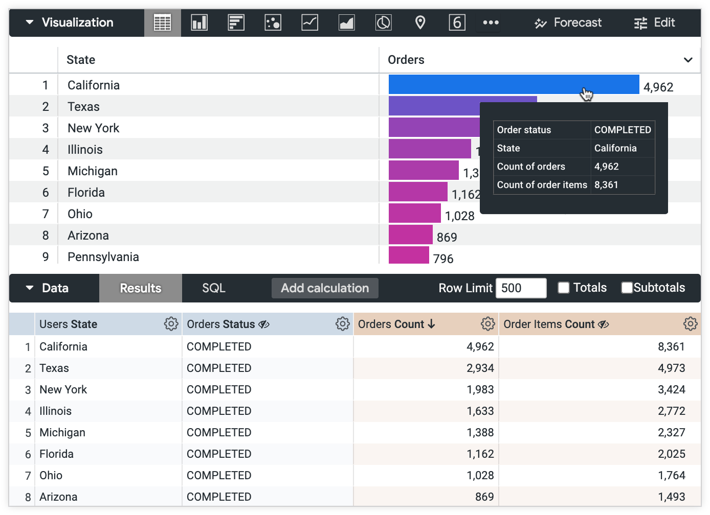
Users can see all of the Explore query data, without the additional fields displayed in the table chart.
Custom tooltip with common Liquid functions
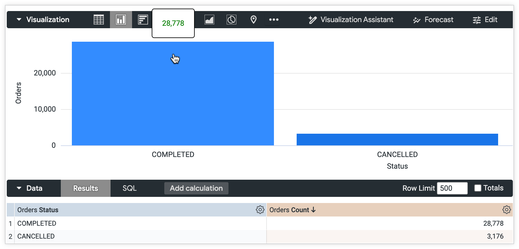
Custom tooltips support common Liquid functions such as piping and using downcast statements. In this example, a column chart displays Orders Count grouped by Orders Status. The developer wants to format the tooltip so that users can quickly identify the difference between the Orders Count for a "CANCELLED" Orders Status and a "COMPLETED" Orders Status.
The following HTML and Liquid is entered in the Edit Tooltip Content editor for the Orders Count series, and sets the tooltip value to appear red for order counts with a "CANCELLED" status and green for orders with a "COMPLETED" status. The code uses a variable assignment and piping to ensure the accuracy of the string, and to apply the specified conditional formatting:
{% assign my_variable = orders.status | downcase | strip %}
{% if my_variable == "completed" %}
  <span style="color:green">{{orders.count}}</span>
{% else %}
  <span style="color:red">{{orders.count}}</span>
{% endif %}
The Orders Count value for the "COMPLETED" Orders Status column displays green text in the tooltip.
The Orders Count value for the "CANCELLED" Orders Status column displays red text in the tooltip.
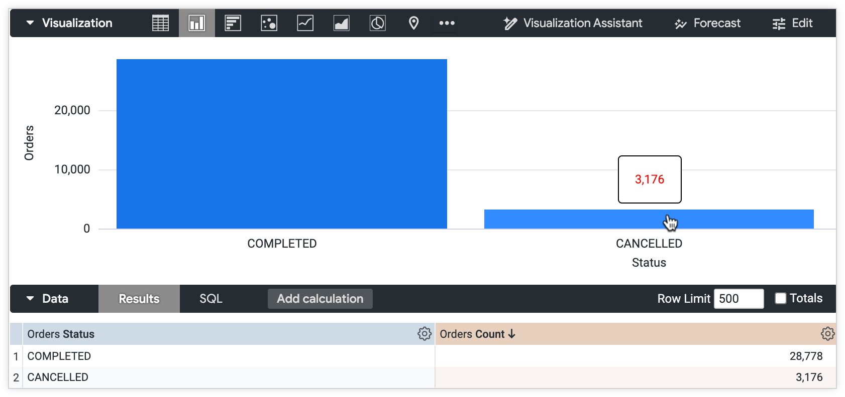
Users are quickly able to distinguish between cancelled and completed orders displayed in the column chart.
Related resources
- Learn more about creating visualizations.
- Review the Liquid variable reference documentation page for more ways to use Liquid in Looker.
- Review the HTML sanitation documentation page for more information about Looker-supported HTML tags.