
This page guides you through the visualization components of the new Explore experience and describes how to edit and configure visualizations in the new Explore experience. Read the following sections to learn about these concepts:
- Required roles
- Accessing the new Explore experience
- Visualization limitations in the new Explore experience
- Changing the visualization type
- Navigating visualization settings in the Style tab
- Related resources
Required roles
To view and interact with Explores and visualizations, you must have the User Looker role or another role that contains the explore permission.
Accessing the new Explore experience
To access the new Explore experience, the New Looker Explore Experience preview feature must be enabled for your instance. If you are not a Looker admin, ask an admin to enable the feature.
From an Explore page, click Try the new Explore to turn on the new Explore experience for all Explores that you interact with. To switch back to the classic experience, click Switch to classic Explore.
Visualization limitations in the new Explore experience
Although there are many charts listed in the All chart types menu, the new Explore experience supports only the following visualization types:
- Area charts
- Bar charts
- Boxplot charts
- Column charts
- Donut multiples charts
- Funnel charts
- Google maps charts
- Line charts
- Pie charts
- Scatterplot charts
- Single record charts
- Single value charts
- Table charts
- Timeline charts
- Waterfall charts
- Word cloud charts
If you select an unsupported chart type, the visualization will render the Explore data, but there will be no configuration options available in the Style tab.
Changing the visualization type
Visualizations are displayed in the Visualization pane in the new Explore experience. When you open an Explore, you can make changes to the query and make changes to the visualization that appears.
To change the visualization type in the new Explore experience, follow these steps:
- Click the Change chart button to open the All chart types menu.
- Choose a chart type from the menu. Alternatively, you can click Auto visualize to let Looker choose the best chart option for displaying the results.
The new chart type will display in the Visualization pane.
Navigating visualization settings in the Style tab
Once you have chosen a visualization type, you can use the Style tab in the Configure panel to edit or configure the chart settings.
In the Style tab, the configuration options are organized into expandable sections that have the same names as the tabs in the classic Explore experience. Each section in the new Explore experience also includes the same configuration options as the classic Explore experience.
To view the options in each section, click the section name. To collapse the section, click the section name again.
Style options for area charts, bar charts, boxplot charts, column charts, line charts, and scatterplot charts
For area charts, bar charts, boxplot charts, column charts, line charts, and scatterplot charts, the sections include the following:
- Plot: Options to control the overall layout, spacing, and organization of a chart.
- Series: Options to manage color schemes, field naming conventions, and granular per-series customizations.
- Values: Options to customize the appearance, formatting, and behavior of data labels within a chart.
- X: Options to configure the horizontal axis, including its scale, labels, and interactive features.
Y: Options to configure the vertical axes for precise control over scaling, labeling, and analytical overlay.
To earn more about configuration options for charts, see the following topics:
- area chart configuration options
- bar chart configuration options
- boxplot chart configuration options
- column chart configuration options
- line chart configuration options
- scatterplot chart configuration options.
Style options for donut multiples charts and pie charts
For donut multiples charts and pie charts, the sections include the following:
- Plot: Options to control the overall layout and size of the chart.
- Series: Options to manage color schemes.
Learn more about donut multiples chart configuration options and pie chart configuration options.
Style options for funnel charts
For funnel charts, the sections include the following:
- Bars: Options to control the colors, orientation, and label scale of the chart.
- Labels: Options to manage the position and appearance of bar labels.
- Axes: Options to display axis labels.
Learn more about funnel chart configuration options.
Style options for Google maps charts
For Google maps charts, the sections include the following:
- Plot: Options to control the type and appearance of the chart.
- Map: Options to map style, position, and interactive features.
Learn more about Google maps charts configuration options.
Style options for single record charts
For single record charts, the sections include the following:
- Style: Option to customize the appearance of the field name.
Learn more about single record chart configuration options.
Style options for single value charts
For single value charts, the sections include the following:
- Style: Options to customize the appearance of the primary value and its title.
- Comparison: Options to incorporate a second data field for providing context or performance metrics relative to the primary value.
- Formatting: Options to apply conditional formatting to color-code a visualization based on specific data values.
Learn more about single value chart configuration options.
Style options for table charts
For table charts, the sections include the following:
- Plot: Options to customize the layout and theme of a chart.
- Series: Options to customize the layout and formatting of individual columns.
- Formatting: Options to customize the visual style and apply data-driven coloring to the chart.
Learn more about table chart configuration options.
Style options for timeline charts and word cloud charts
For timeline charts and word cloud charts, the sections include the following:
- Style: Option to customize the colors and appearance of the chart.
Learn more about timeline chart configuration options and word cloud chart configuration options.
Style options for waterfall charts
For waterfall charts, the sections include the following:
- Series: Options to customize the colors and appearance of the chart.
- Values: Option to customize the chart labels.
- X: Options to configure the horizontal axis, including its scale, labels, and interactive features.
- Y: Options to configure the vertical axes for precise control over scaling, labeling, and analytical overlay.
Learn more about waterfall chart configuration options.
Using the Visualization Assistant in the new Explore experience
The Visualization Assistant, which lets you customize a Looker visualization by using Gemini in Looker, is available in the new Explore experience. The Visualization Assistant in the new Explore experience includes an updated conversational panel that supports multi-turn chats, displaying compact visualization renderings at each turn, letting you iterate your visualization customizations.
To customize a visualization with the Visualization Assistant, follow these steps:
When viewing a visualization in an Explore, click the Style tab.
Click pen_spark Visualization Assistant to open the prompt window.
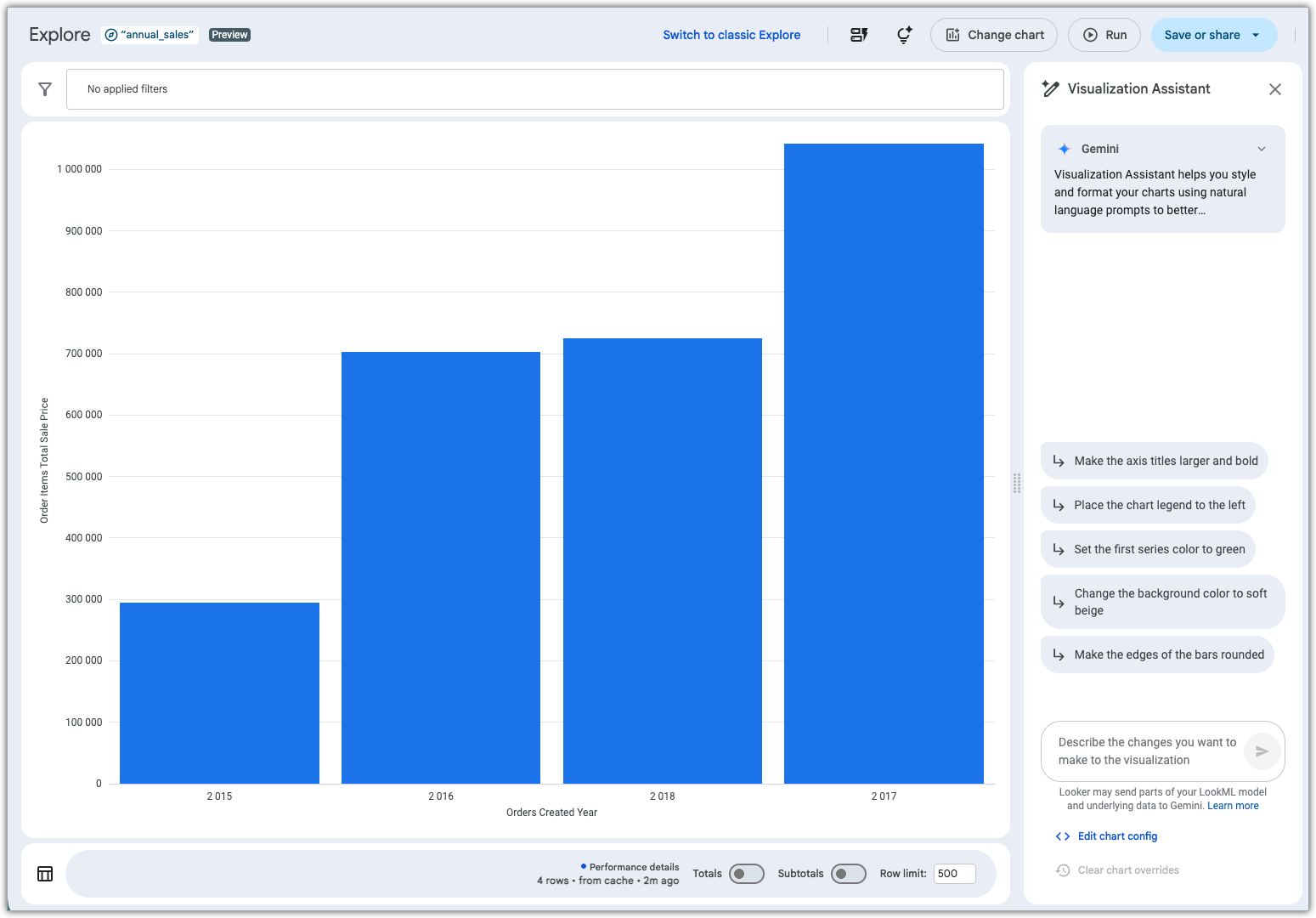
In the Visualization Assistant prompt field, describe any changes that you want to make to the visualization.
For more information about using the Visualization Assistant, see the Create visualizations with Gemini assistance documentation page.
Related resources
Now that you know how to edit and configure visualizations in the new Explore experience, you might want to learn how to do the following:
- Learn how to view and interact with Explores in the new Explore experience.
- Learn how to create or edit Explores in the new Explore experience.
- Learn about creating visualizations and graphs.
- Learn about selecting an effective data visualization.
- Learn about using color collections.
- Learn how to create custom tooltips.
- Learn how to save Explore queries as Looks.
- Learn how to add Explore queries to dashboards.
- Learn how to share data with other users.