
public static final class Card.Builder extends GeneratedMessage.Builder<Card.Builder> implements CardOrBuilderA card interface displayed in a Google Chat message or Google Workspace add-on.
Cards support a defined layout, interactive UI elements like buttons, and rich media like images. Use cards to present detailed information, gather information from users, and guide users to take a next step.
To learn how to build cards, see the following documentation:
- For Google Chat apps, see Design the components of a card or dialog.
For Google Workspace add-ons, see Card-based interfaces.
Note: You can add up to 100 widgets per card. Any widgets beyond this limit are ignored. This limit applies to both card messages and dialogs in Google Chat apps, and to cards in Google Workspace add-ons.
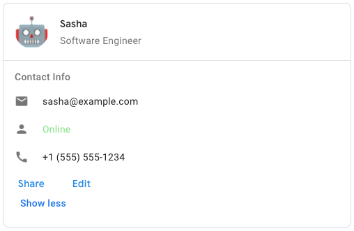
Example: Card message for a Google Chat app
To create the sample card message in Google Chat, use the following JSON:
<code><code> { "cardsV2": [ { "cardId": "unique-card-id", "card": { "header": { "title": "Sasha", "subtitle": "Software Engineer", "imageUrl": "https://developers.google.com/workspace/chat/images/quickstart-app-avatar.png", "imageType": "CIRCLE", "imageAltText": "Avatar for Sasha" }, "sections": [ { "header": "Contact Info", "collapsible": true, "uncollapsibleWidgetsCount": 1, "widgets": [ { "decoratedText": { "startIcon": { "knownIcon": "EMAIL" }, "text": "sasha@example.com" } }, { "decoratedText": { "startIcon": { "knownIcon": "PERSON" }, "text": "<font color=\"#80e27e\">Online</font>" } }, { "decoratedText": { "startIcon": { "knownIcon": "PHONE" }, "text": "+1 (555) 555-1234" } }, { "buttonList": { "buttons": [ { "text": "Share", "onClick": { "openLink": { "url": "https://example.com/share" } } }, { "text": "Edit", "onClick": { "action": { "function": "goToView", "parameters": [ { "key": "viewType", "value": "EDIT" } ] } } } ] } } ] } ] } } ] } </code></code>
Protobuf type google.apps.card.v1.Card
Inheritance
java.lang.Object > AbstractMessageLite.Builder<MessageType,BuilderType> > AbstractMessage.Builder<BuilderType> > GeneratedMessage.Builder > Card.BuilderImplements
CardOrBuilderStatic Methods
getDescriptor()
public static final Descriptors.Descriptor getDescriptor()| Returns | |
|---|---|
| Type | Description |
Descriptor |
|
Methods
addAllCardActions(Iterable<? extends Card.CardAction> values)
public Card.Builder addAllCardActions(Iterable<? extends Card.CardAction> values)The card's actions. Actions are added to the card's toolbar menu.
For example, the following JSON constructs a card action menu with
Settings and Send Feedback options:
<code><code>
 "card_actions": [
 {
 "actionLabel": "Settings",
 "onClick": {
 "action": {
 "functionName": "goToView",
 "parameters": [
 {
 "key": "viewType",
 "value": "SETTING"
 }
 ],
 "loadIndicator": "LoadIndicator.SPINNER"
 }
 }
 },
 {
 "actionLabel": "Send Feedback",
 "onClick": {
 "openLink": {
 "url": "https://example.com/feedback"
 }
 }
 }
 ]
 </code></code>
repeated .google.apps.card.v1.Card.CardAction card_actions = 3;
| Parameter | |
|---|---|
| Name | Description |
values |
Iterable<? extends com.google.apps.card.v1.Card.CardAction> |
| Returns | |
|---|---|
| Type | Description |
Card.Builder |
|
addAllSections(Iterable<? extends Card.Section> values)
public Card.Builder addAllSections(Iterable<? extends Card.Section> values)Contains a collection of widgets. Each section has its own, optional header. Sections are visually separated by a line divider. For an example in Google Chat apps, see Define a section of a card.
repeated .google.apps.card.v1.Card.Section sections = 2;
| Parameter | |
|---|---|
| Name | Description |
values |
Iterable<? extends com.google.apps.card.v1.Card.Section> |
| Returns | |
|---|---|
| Type | Description |
Card.Builder |
|
addCardActions(Card.CardAction value)
public Card.Builder addCardActions(Card.CardAction value)The card's actions. Actions are added to the card's toolbar menu.
For example, the following JSON constructs a card action menu with
Settings and Send Feedback options:
<code><code>
 "card_actions": [
 {
 "actionLabel": "Settings",
 "onClick": {
 "action": {
 "functionName": "goToView",
 "parameters": [
 {
 "key": "viewType",
 "value": "SETTING"
 }
 ],
 "loadIndicator": "LoadIndicator.SPINNER"
 }
 }
 },
 {
 "actionLabel": "Send Feedback",
 "onClick": {
 "openLink": {
 "url": "https://example.com/feedback"
 }
 }
 }
 ]
 </code></code>
repeated .google.apps.card.v1.Card.CardAction card_actions = 3;
| Parameter | |
|---|---|
| Name | Description |
value |
Card.CardAction |
| Returns | |
|---|---|
| Type | Description |
Card.Builder |
|
addCardActions(Card.CardAction.Builder builderForValue)
public Card.Builder addCardActions(Card.CardAction.Builder builderForValue)The card's actions. Actions are added to the card's toolbar menu.
For example, the following JSON constructs a card action menu with
Settings and Send Feedback options:
<code><code>
 "card_actions": [
 {
 "actionLabel": "Settings",
 "onClick": {
 "action": {
 "functionName": "goToView",
 "parameters": [
 {
 "key": "viewType",
 "value": "SETTING"
 }
 ],
 "loadIndicator": "LoadIndicator.SPINNER"
 }
 }
 },
 {
 "actionLabel": "Send Feedback",
 "onClick": {
 "openLink": {
 "url": "https://example.com/feedback"
 }
 }
 }
 ]
 </code></code>
repeated .google.apps.card.v1.Card.CardAction card_actions = 3;
| Parameter | |
|---|---|
| Name | Description |
builderForValue |
Card.CardAction.Builder |
| Returns | |
|---|---|
| Type | Description |
Card.Builder |
|
addCardActions(int index, Card.CardAction value)
public Card.Builder addCardActions(int index, Card.CardAction value)The card's actions. Actions are added to the card's toolbar menu.
For example, the following JSON constructs a card action menu with
Settings and Send Feedback options:
<code><code>
 "card_actions": [
 {
 "actionLabel": "Settings",
 "onClick": {
 "action": {
 "functionName": "goToView",
 "parameters": [
 {
 "key": "viewType",
 "value": "SETTING"
 }
 ],
 "loadIndicator": "LoadIndicator.SPINNER"
 }
 }
 },
 {
 "actionLabel": "Send Feedback",
 "onClick": {
 "openLink": {
 "url": "https://example.com/feedback"
 }
 }
 }
 ]
 </code></code>
repeated .google.apps.card.v1.Card.CardAction card_actions = 3;
| Parameters | |
|---|---|
| Name | Description |
index |
int |
value |
Card.CardAction |
| Returns | |
|---|---|
| Type | Description |
Card.Builder |
|
addCardActions(int index, Card.CardAction.Builder builderForValue)
public Card.Builder addCardActions(int index, Card.CardAction.Builder builderForValue)The card's actions. Actions are added to the card's toolbar menu.
For example, the following JSON constructs a card action menu with
Settings and Send Feedback options:
<code><code>
 "card_actions": [
 {
 "actionLabel": "Settings",
 "onClick": {
 "action": {
 "functionName": "goToView",
 "parameters": [
 {
 "key": "viewType",
 "value": "SETTING"
 }
 ],
 "loadIndicator": "LoadIndicator.SPINNER"
 }
 }
 },
 {
 "actionLabel": "Send Feedback",
 "onClick": {
 "openLink": {
 "url": "https://example.com/feedback"
 }
 }
 }
 ]
 </code></code>
repeated .google.apps.card.v1.Card.CardAction card_actions = 3;
| Parameters | |
|---|---|
| Name | Description |
index |
int |
builderForValue |
Card.CardAction.Builder |
| Returns | |
|---|---|
| Type | Description |
Card.Builder |
|
addCardActionsBuilder()
public Card.CardAction.Builder addCardActionsBuilder()The card's actions. Actions are added to the card's toolbar menu.
For example, the following JSON constructs a card action menu with
Settings and Send Feedback options:
<code><code>
 "card_actions": [
 {
 "actionLabel": "Settings",
 "onClick": {
 "action": {
 "functionName": "goToView",
 "parameters": [
 {
 "key": "viewType",
 "value": "SETTING"
 }
 ],
 "loadIndicator": "LoadIndicator.SPINNER"
 }
 }
 },
 {
 "actionLabel": "Send Feedback",
 "onClick": {
 "openLink": {
 "url": "https://example.com/feedback"
 }
 }
 }
 ]
 </code></code>
repeated .google.apps.card.v1.Card.CardAction card_actions = 3;
| Returns | |
|---|---|
| Type | Description |
Card.CardAction.Builder |
|
addCardActionsBuilder(int index)
public Card.CardAction.Builder addCardActionsBuilder(int index)The card's actions. Actions are added to the card's toolbar menu.
For example, the following JSON constructs a card action menu with
Settings and Send Feedback options:
<code><code>
 "card_actions": [
 {
 "actionLabel": "Settings",
 "onClick": {
 "action": {
 "functionName": "goToView",
 "parameters": [
 {
 "key": "viewType",
 "value": "SETTING"
 }
 ],
 "loadIndicator": "LoadIndicator.SPINNER"
 }
 }
 },
 {
 "actionLabel": "Send Feedback",
 "onClick": {
 "openLink": {
 "url": "https://example.com/feedback"
 }
 }
 }
 ]
 </code></code>
repeated .google.apps.card.v1.Card.CardAction card_actions = 3;
| Parameter | |
|---|---|
| Name | Description |
index |
int |
| Returns | |
|---|---|
| Type | Description |
Card.CardAction.Builder |
|
addSections(Card.Section value)
public Card.Builder addSections(Card.Section value)Contains a collection of widgets. Each section has its own, optional header. Sections are visually separated by a line divider. For an example in Google Chat apps, see Define a section of a card.
repeated .google.apps.card.v1.Card.Section sections = 2;
| Parameter | |
|---|---|
| Name | Description |
value |
Card.Section |
| Returns | |
|---|---|
| Type | Description |
Card.Builder |
|
addSections(Card.Section.Builder builderForValue)
public Card.Builder addSections(Card.Section.Builder builderForValue)Contains a collection of widgets. Each section has its own, optional header. Sections are visually separated by a line divider. For an example in Google Chat apps, see Define a section of a card.
repeated .google.apps.card.v1.Card.Section sections = 2;
| Parameter | |
|---|---|
| Name | Description |
builderForValue |
Card.Section.Builder |
| Returns | |
|---|---|
| Type | Description |
Card.Builder |
|
addSections(int index, Card.Section value)
public Card.Builder addSections(int index, Card.Section value)Contains a collection of widgets. Each section has its own, optional header. Sections are visually separated by a line divider. For an example in Google Chat apps, see Define a section of a card.
repeated .google.apps.card.v1.Card.Section sections = 2;
| Parameters | |
|---|---|
| Name | Description |
index |
int |
value |
Card.Section |
| Returns | |
|---|---|
| Type | Description |
Card.Builder |
|
addSections(int index, Card.Section.Builder builderForValue)
public Card.Builder addSections(int index, Card.Section.Builder builderForValue)Contains a collection of widgets. Each section has its own, optional header. Sections are visually separated by a line divider. For an example in Google Chat apps, see Define a section of a card.
repeated .google.apps.card.v1.Card.Section sections = 2;
| Parameters | |
|---|---|
| Name | Description |
index |
int |
builderForValue |
Card.Section.Builder |
| Returns | |
|---|---|
| Type | Description |
Card.Builder |
|
addSectionsBuilder()
public Card.Section.Builder addSectionsBuilder()Contains a collection of widgets. Each section has its own, optional header. Sections are visually separated by a line divider. For an example in Google Chat apps, see Define a section of a card.
repeated .google.apps.card.v1.Card.Section sections = 2;
| Returns | |
|---|---|
| Type | Description |
Card.Section.Builder |
|
addSectionsBuilder(int index)
public Card.Section.Builder addSectionsBuilder(int index)Contains a collection of widgets. Each section has its own, optional header. Sections are visually separated by a line divider. For an example in Google Chat apps, see Define a section of a card.
repeated .google.apps.card.v1.Card.Section sections = 2;
| Parameter | |
|---|---|
| Name | Description |
index |
int |
| Returns | |
|---|---|
| Type | Description |
Card.Section.Builder |
|
build()
public Card build()| Returns | |
|---|---|
| Type | Description |
Card |
|
buildPartial()
public Card buildPartial()| Returns | |
|---|---|
| Type | Description |
Card |
|
clear()
public Card.Builder clear()| Returns | |
|---|---|
| Type | Description |
Card.Builder |
|
clearCardActions()
public Card.Builder clearCardActions()The card's actions. Actions are added to the card's toolbar menu.
For example, the following JSON constructs a card action menu with
Settings and Send Feedback options:
<code><code>
 "card_actions": [
 {
 "actionLabel": "Settings",
 "onClick": {
 "action": {
 "functionName": "goToView",
 "parameters": [
 {
 "key": "viewType",
 "value": "SETTING"
 }
 ],
 "loadIndicator": "LoadIndicator.SPINNER"
 }
 }
 },
 {
 "actionLabel": "Send Feedback",
 "onClick": {
 "openLink": {
 "url": "https://example.com/feedback"
 }
 }
 }
 ]
 </code></code>
repeated .google.apps.card.v1.Card.CardAction card_actions = 3;
| Returns | |
|---|---|
| Type | Description |
Card.Builder |
|
clearDisplayStyle()
public Card.Builder clearDisplayStyle() In Google Workspace add-ons, sets the display properties of the
peekCardHeader.
.google.apps.card.v1.Card.DisplayStyle display_style = 6;
| Returns | |
|---|---|
| Type | Description |
Card.Builder |
This builder for chaining. |
clearFixedFooter()
public Card.Builder clearFixedFooter()The fixed footer shown at the bottom of this card.
Setting fixedFooter without specifying a primaryButton or a
secondaryButton causes an error. For Chat apps, you can use fixed footers
in
dialogs, but not
card
messages.
Google Workspace add-ons and Chat apps:
.google.apps.card.v1.Card.CardFixedFooter fixed_footer = 5;
| Returns | |
|---|---|
| Type | Description |
Card.Builder |
|
clearHeader()
public Card.Builder clearHeader()The header of the card. A header usually contains a leading image and a title. Headers always appear at the top of a card.
.google.apps.card.v1.Card.CardHeader header = 1;
| Returns | |
|---|---|
| Type | Description |
Card.Builder |
|
clearName()
public Card.Builder clearName()Name of the card. Used as a card identifier in card navigation.
string name = 4;
| Returns | |
|---|---|
| Type | Description |
Card.Builder |
This builder for chaining. |
clearPeekCardHeader()
public Card.Builder clearPeekCardHeader()When displaying contextual content, the peek card header acts as a placeholder so that the user can navigate forward between the homepage cards and the contextual cards.
.google.apps.card.v1.Card.CardHeader peek_card_header = 7;
| Returns | |
|---|---|
| Type | Description |
Card.Builder |
|
clearSectionDividerStyle()
public Card.Builder clearSectionDividerStyle()The divider style between the header, sections and footer.
.google.apps.card.v1.Card.DividerStyle section_divider_style = 9;
| Returns | |
|---|---|
| Type | Description |
Card.Builder |
This builder for chaining. |
clearSections()
public Card.Builder clearSections()Contains a collection of widgets. Each section has its own, optional header. Sections are visually separated by a line divider. For an example in Google Chat apps, see Define a section of a card.
repeated .google.apps.card.v1.Card.Section sections = 2;
| Returns | |
|---|---|
| Type | Description |
Card.Builder |
|
getCardActions(int index)
public Card.CardAction getCardActions(int index)The card's actions. Actions are added to the card's toolbar menu.
For example, the following JSON constructs a card action menu with
Settings and Send Feedback options:
<code><code>
 "card_actions": [
 {
 "actionLabel": "Settings",
 "onClick": {
 "action": {
 "functionName": "goToView",
 "parameters": [
 {
 "key": "viewType",
 "value": "SETTING"
 }
 ],
 "loadIndicator": "LoadIndicator.SPINNER"
 }
 }
 },
 {
 "actionLabel": "Send Feedback",
 "onClick": {
 "openLink": {
 "url": "https://example.com/feedback"
 }
 }
 }
 ]
 </code></code>
repeated .google.apps.card.v1.Card.CardAction card_actions = 3;
| Parameter | |
|---|---|
| Name | Description |
index |
int |
| Returns | |
|---|---|
| Type | Description |
Card.CardAction |
|
getCardActionsBuilder(int index)
public Card.CardAction.Builder getCardActionsBuilder(int index)The card's actions. Actions are added to the card's toolbar menu.
For example, the following JSON constructs a card action menu with
Settings and Send Feedback options:
<code><code>
 "card_actions": [
 {
 "actionLabel": "Settings",
 "onClick": {
 "action": {
 "functionName": "goToView",
 "parameters": [
 {
 "key": "viewType",
 "value": "SETTING"
 }
 ],
 "loadIndicator": "LoadIndicator.SPINNER"
 }
 }
 },
 {
 "actionLabel": "Send Feedback",
 "onClick": {
 "openLink": {
 "url": "https://example.com/feedback"
 }
 }
 }
 ]
 </code></code>
repeated .google.apps.card.v1.Card.CardAction card_actions = 3;
| Parameter | |
|---|---|
| Name | Description |
index |
int |
| Returns | |
|---|---|
| Type | Description |
Card.CardAction.Builder |
|
getCardActionsBuilderList()
public List<Card.CardAction.Builder> getCardActionsBuilderList()The card's actions. Actions are added to the card's toolbar menu.
For example, the following JSON constructs a card action menu with
Settings and Send Feedback options:
<code><code>
 "card_actions": [
 {
 "actionLabel": "Settings",
 "onClick": {
 "action": {
 "functionName": "goToView",
 "parameters": [
 {
 "key": "viewType",
 "value": "SETTING"
 }
 ],
 "loadIndicator": "LoadIndicator.SPINNER"
 }
 }
 },
 {
 "actionLabel": "Send Feedback",
 "onClick": {
 "openLink": {
 "url": "https://example.com/feedback"
 }
 }
 }
 ]
 </code></code>
repeated .google.apps.card.v1.Card.CardAction card_actions = 3;
| Returns | |
|---|---|
| Type | Description |
List<Builder> |
|
getCardActionsCount()
public int getCardActionsCount()The card's actions. Actions are added to the card's toolbar menu.
For example, the following JSON constructs a card action menu with
Settings and Send Feedback options:
<code><code>
 "card_actions": [
 {
 "actionLabel": "Settings",
 "onClick": {
 "action": {
 "functionName": "goToView",
 "parameters": [
 {
 "key": "viewType",
 "value": "SETTING"
 }
 ],
 "loadIndicator": "LoadIndicator.SPINNER"
 }
 }
 },
 {
 "actionLabel": "Send Feedback",
 "onClick": {
 "openLink": {
 "url": "https://example.com/feedback"
 }
 }
 }
 ]
 </code></code>
repeated .google.apps.card.v1.Card.CardAction card_actions = 3;
| Returns | |
|---|---|
| Type | Description |
int |
|
getCardActionsList()
public List<Card.CardAction> getCardActionsList()The card's actions. Actions are added to the card's toolbar menu.
For example, the following JSON constructs a card action menu with
Settings and Send Feedback options:
<code><code>
 "card_actions": [
 {
 "actionLabel": "Settings",
 "onClick": {
 "action": {
 "functionName": "goToView",
 "parameters": [
 {
 "key": "viewType",
 "value": "SETTING"
 }
 ],
 "loadIndicator": "LoadIndicator.SPINNER"
 }
 }
 },
 {
 "actionLabel": "Send Feedback",
 "onClick": {
 "openLink": {
 "url": "https://example.com/feedback"
 }
 }
 }
 ]
 </code></code>
repeated .google.apps.card.v1.Card.CardAction card_actions = 3;
| Returns | |
|---|---|
| Type | Description |
List<CardAction> |
|
getCardActionsOrBuilder(int index)
public Card.CardActionOrBuilder getCardActionsOrBuilder(int index)The card's actions. Actions are added to the card's toolbar menu.
For example, the following JSON constructs a card action menu with
Settings and Send Feedback options:
<code><code>
 "card_actions": [
 {
 "actionLabel": "Settings",
 "onClick": {
 "action": {
 "functionName": "goToView",
 "parameters": [
 {
 "key": "viewType",
 "value": "SETTING"
 }
 ],
 "loadIndicator": "LoadIndicator.SPINNER"
 }
 }
 },
 {
 "actionLabel": "Send Feedback",
 "onClick": {
 "openLink": {
 "url": "https://example.com/feedback"
 }
 }
 }
 ]
 </code></code>
repeated .google.apps.card.v1.Card.CardAction card_actions = 3;
| Parameter | |
|---|---|
| Name | Description |
index |
int |
| Returns | |
|---|---|
| Type | Description |
Card.CardActionOrBuilder |
|
getCardActionsOrBuilderList()
public List<? extends Card.CardActionOrBuilder> getCardActionsOrBuilderList()The card's actions. Actions are added to the card's toolbar menu.
For example, the following JSON constructs a card action menu with
Settings and Send Feedback options:
<code><code>
 "card_actions": [
 {
 "actionLabel": "Settings",
 "onClick": {
 "action": {
 "functionName": "goToView",
 "parameters": [
 {
 "key": "viewType",
 "value": "SETTING"
 }
 ],
 "loadIndicator": "LoadIndicator.SPINNER"
 }
 }
 },
 {
 "actionLabel": "Send Feedback",
 "onClick": {
 "openLink": {
 "url": "https://example.com/feedback"
 }
 }
 }
 ]
 </code></code>
repeated .google.apps.card.v1.Card.CardAction card_actions = 3;
| Returns | |
|---|---|
| Type | Description |
List<? extends com.google.apps.card.v1.Card.CardActionOrBuilder> |
|
getDefaultInstanceForType()
public Card getDefaultInstanceForType()| Returns | |
|---|---|
| Type | Description |
Card |
|
getDescriptorForType()
public Descriptors.Descriptor getDescriptorForType()| Returns | |
|---|---|
| Type | Description |
Descriptor |
|
getDisplayStyle()
public Card.DisplayStyle getDisplayStyle() In Google Workspace add-ons, sets the display properties of the
peekCardHeader.
.google.apps.card.v1.Card.DisplayStyle display_style = 6;
| Returns | |
|---|---|
| Type | Description |
Card.DisplayStyle |
The displayStyle. |
getDisplayStyleValue()
public int getDisplayStyleValue() In Google Workspace add-ons, sets the display properties of the
peekCardHeader.
.google.apps.card.v1.Card.DisplayStyle display_style = 6;
| Returns | |
|---|---|
| Type | Description |
int |
The enum numeric value on the wire for displayStyle. |
getFixedFooter()
public Card.CardFixedFooter getFixedFooter()The fixed footer shown at the bottom of this card.
Setting fixedFooter without specifying a primaryButton or a
secondaryButton causes an error. For Chat apps, you can use fixed footers
in
dialogs, but not
card
messages.
Google Workspace add-ons and Chat apps:
.google.apps.card.v1.Card.CardFixedFooter fixed_footer = 5;
| Returns | |
|---|---|
| Type | Description |
Card.CardFixedFooter |
The fixedFooter. |
getFixedFooterBuilder()
public Card.CardFixedFooter.Builder getFixedFooterBuilder()The fixed footer shown at the bottom of this card.
Setting fixedFooter without specifying a primaryButton or a
secondaryButton causes an error. For Chat apps, you can use fixed footers
in
dialogs, but not
card
messages.
Google Workspace add-ons and Chat apps:
.google.apps.card.v1.Card.CardFixedFooter fixed_footer = 5;
| Returns | |
|---|---|
| Type | Description |
Card.CardFixedFooter.Builder |
|
getFixedFooterOrBuilder()
public Card.CardFixedFooterOrBuilder getFixedFooterOrBuilder()The fixed footer shown at the bottom of this card.
Setting fixedFooter without specifying a primaryButton or a
secondaryButton causes an error. For Chat apps, you can use fixed footers
in
dialogs, but not
card
messages.
Google Workspace add-ons and Chat apps:
.google.apps.card.v1.Card.CardFixedFooter fixed_footer = 5;
| Returns | |
|---|---|
| Type | Description |
Card.CardFixedFooterOrBuilder |
|
getHeader()
public Card.CardHeader getHeader()The header of the card. A header usually contains a leading image and a title. Headers always appear at the top of a card.
.google.apps.card.v1.Card.CardHeader header = 1;
| Returns | |
|---|---|
| Type | Description |
Card.CardHeader |
The header. |
getHeaderBuilder()
public Card.CardHeader.Builder getHeaderBuilder()The header of the card. A header usually contains a leading image and a title. Headers always appear at the top of a card.
.google.apps.card.v1.Card.CardHeader header = 1;
| Returns | |
|---|---|
| Type | Description |
Card.CardHeader.Builder |
|
getHeaderOrBuilder()
public Card.CardHeaderOrBuilder getHeaderOrBuilder()The header of the card. A header usually contains a leading image and a title. Headers always appear at the top of a card.
.google.apps.card.v1.Card.CardHeader header = 1;
| Returns | |
|---|---|
| Type | Description |
Card.CardHeaderOrBuilder |
|
getName()
public String getName()Name of the card. Used as a card identifier in card navigation.
string name = 4;
| Returns | |
|---|---|
| Type | Description |
String |
The name. |
getNameBytes()
public ByteString getNameBytes()Name of the card. Used as a card identifier in card navigation.
string name = 4;
| Returns | |
|---|---|
| Type | Description |
ByteString |
The bytes for name. |
getPeekCardHeader()
public Card.CardHeader getPeekCardHeader()When displaying contextual content, the peek card header acts as a placeholder so that the user can navigate forward between the homepage cards and the contextual cards.
.google.apps.card.v1.Card.CardHeader peek_card_header = 7;
| Returns | |
|---|---|
| Type | Description |
Card.CardHeader |
The peekCardHeader. |
getPeekCardHeaderBuilder()
public Card.CardHeader.Builder getPeekCardHeaderBuilder()When displaying contextual content, the peek card header acts as a placeholder so that the user can navigate forward between the homepage cards and the contextual cards.
.google.apps.card.v1.Card.CardHeader peek_card_header = 7;
| Returns | |
|---|---|
| Type | Description |
Card.CardHeader.Builder |
|
getPeekCardHeaderOrBuilder()
public Card.CardHeaderOrBuilder getPeekCardHeaderOrBuilder()When displaying contextual content, the peek card header acts as a placeholder so that the user can navigate forward between the homepage cards and the contextual cards.
.google.apps.card.v1.Card.CardHeader peek_card_header = 7;
| Returns | |
|---|---|
| Type | Description |
Card.CardHeaderOrBuilder |
|
getSectionDividerStyle()
public Card.DividerStyle getSectionDividerStyle()The divider style between the header, sections and footer.
.google.apps.card.v1.Card.DividerStyle section_divider_style = 9;
| Returns | |
|---|---|
| Type | Description |
Card.DividerStyle |
The sectionDividerStyle. |
getSectionDividerStyleValue()
public int getSectionDividerStyleValue()The divider style between the header, sections and footer.
.google.apps.card.v1.Card.DividerStyle section_divider_style = 9;
| Returns | |
|---|---|
| Type | Description |
int |
The enum numeric value on the wire for sectionDividerStyle. |
getSections(int index)
public Card.Section getSections(int index)Contains a collection of widgets. Each section has its own, optional header. Sections are visually separated by a line divider. For an example in Google Chat apps, see Define a section of a card.
repeated .google.apps.card.v1.Card.Section sections = 2;
| Parameter | |
|---|---|
| Name | Description |
index |
int |
| Returns | |
|---|---|
| Type | Description |
Card.Section |
|
getSectionsBuilder(int index)
public Card.Section.Builder getSectionsBuilder(int index)Contains a collection of widgets. Each section has its own, optional header. Sections are visually separated by a line divider. For an example in Google Chat apps, see Define a section of a card.
repeated .google.apps.card.v1.Card.Section sections = 2;
| Parameter | |
|---|---|
| Name | Description |
index |
int |
| Returns | |
|---|---|
| Type | Description |
Card.Section.Builder |
|
getSectionsBuilderList()
public List<Card.Section.Builder> getSectionsBuilderList()Contains a collection of widgets. Each section has its own, optional header. Sections are visually separated by a line divider. For an example in Google Chat apps, see Define a section of a card.
repeated .google.apps.card.v1.Card.Section sections = 2;
| Returns | |
|---|---|
| Type | Description |
List<Builder> |
|
getSectionsCount()
public int getSectionsCount()Contains a collection of widgets. Each section has its own, optional header. Sections are visually separated by a line divider. For an example in Google Chat apps, see Define a section of a card.
repeated .google.apps.card.v1.Card.Section sections = 2;
| Returns | |
|---|---|
| Type | Description |
int |
|
getSectionsList()
public List<Card.Section> getSectionsList()Contains a collection of widgets. Each section has its own, optional header. Sections are visually separated by a line divider. For an example in Google Chat apps, see Define a section of a card.
repeated .google.apps.card.v1.Card.Section sections = 2;
| Returns | |
|---|---|
| Type | Description |
List<Section> |
|
getSectionsOrBuilder(int index)
public Card.SectionOrBuilder getSectionsOrBuilder(int index)Contains a collection of widgets. Each section has its own, optional header. Sections are visually separated by a line divider. For an example in Google Chat apps, see Define a section of a card.
repeated .google.apps.card.v1.Card.Section sections = 2;
| Parameter | |
|---|---|
| Name | Description |
index |
int |
| Returns | |
|---|---|
| Type | Description |
Card.SectionOrBuilder |
|
getSectionsOrBuilderList()
public List<? extends Card.SectionOrBuilder> getSectionsOrBuilderList()Contains a collection of widgets. Each section has its own, optional header. Sections are visually separated by a line divider. For an example in Google Chat apps, see Define a section of a card.
repeated .google.apps.card.v1.Card.Section sections = 2;
| Returns | |
|---|---|
| Type | Description |
List<? extends com.google.apps.card.v1.Card.SectionOrBuilder> |
|
hasFixedFooter()
public boolean hasFixedFooter()The fixed footer shown at the bottom of this card.
Setting fixedFooter without specifying a primaryButton or a
secondaryButton causes an error. For Chat apps, you can use fixed footers
in
dialogs, but not
card
messages.
Google Workspace add-ons and Chat apps:
.google.apps.card.v1.Card.CardFixedFooter fixed_footer = 5;
| Returns | |
|---|---|
| Type | Description |
boolean |
Whether the fixedFooter field is set. |
hasHeader()
public boolean hasHeader()The header of the card. A header usually contains a leading image and a title. Headers always appear at the top of a card.
.google.apps.card.v1.Card.CardHeader header = 1;
| Returns | |
|---|---|
| Type | Description |
boolean |
Whether the header field is set. |
hasPeekCardHeader()
public boolean hasPeekCardHeader()When displaying contextual content, the peek card header acts as a placeholder so that the user can navigate forward between the homepage cards and the contextual cards.
.google.apps.card.v1.Card.CardHeader peek_card_header = 7;
| Returns | |
|---|---|
| Type | Description |
boolean |
Whether the peekCardHeader field is set. |
internalGetFieldAccessorTable()
protected GeneratedMessage.FieldAccessorTable internalGetFieldAccessorTable()| Returns | |
|---|---|
| Type | Description |
FieldAccessorTable |
|
isInitialized()
public final boolean isInitialized()| Returns | |
|---|---|
| Type | Description |
boolean |
|
mergeFixedFooter(Card.CardFixedFooter value)
public Card.Builder mergeFixedFooter(Card.CardFixedFooter value)The fixed footer shown at the bottom of this card.
Setting fixedFooter without specifying a primaryButton or a
secondaryButton causes an error. For Chat apps, you can use fixed footers
in
dialogs, but not
card
messages.
Google Workspace add-ons and Chat apps:
.google.apps.card.v1.Card.CardFixedFooter fixed_footer = 5;
| Parameter | |
|---|---|
| Name | Description |
value |
Card.CardFixedFooter |
| Returns | |
|---|---|
| Type | Description |
Card.Builder |
|
mergeFrom(Card other)
public Card.Builder mergeFrom(Card other)| Parameter | |
|---|---|
| Name | Description |
other |
Card |
| Returns | |
|---|---|
| Type | Description |
Card.Builder |
|
mergeFrom(CodedInputStream input, ExtensionRegistryLite extensionRegistry)
public Card.Builder mergeFrom(CodedInputStream input, ExtensionRegistryLite extensionRegistry)| Parameters | |
|---|---|
| Name | Description |
input |
CodedInputStream |
extensionRegistry |
ExtensionRegistryLite |
| Returns | |
|---|---|
| Type | Description |
Card.Builder |
|
| Exceptions | |
|---|---|
| Type | Description |
IOException |
|
mergeFrom(Message other)
public Card.Builder mergeFrom(Message other)| Parameter | |
|---|---|
| Name | Description |
other |
Message |
| Returns | |
|---|---|
| Type | Description |
Card.Builder |
|
mergeHeader(Card.CardHeader value)
public Card.Builder mergeHeader(Card.CardHeader value)The header of the card. A header usually contains a leading image and a title. Headers always appear at the top of a card.
.google.apps.card.v1.Card.CardHeader header = 1;
| Parameter | |
|---|---|
| Name | Description |
value |
Card.CardHeader |
| Returns | |
|---|---|
| Type | Description |
Card.Builder |
|
mergePeekCardHeader(Card.CardHeader value)
public Card.Builder mergePeekCardHeader(Card.CardHeader value)When displaying contextual content, the peek card header acts as a placeholder so that the user can navigate forward between the homepage cards and the contextual cards.
.google.apps.card.v1.Card.CardHeader peek_card_header = 7;
| Parameter | |
|---|---|
| Name | Description |
value |
Card.CardHeader |
| Returns | |
|---|---|
| Type | Description |
Card.Builder |
|
removeCardActions(int index)
public Card.Builder removeCardActions(int index)The card's actions. Actions are added to the card's toolbar menu.
For example, the following JSON constructs a card action menu with
Settings and Send Feedback options:
<code><code>
 "card_actions": [
 {
 "actionLabel": "Settings",
 "onClick": {
 "action": {
 "functionName": "goToView",
 "parameters": [
 {
 "key": "viewType",
 "value": "SETTING"
 }
 ],
 "loadIndicator": "LoadIndicator.SPINNER"
 }
 }
 },
 {
 "actionLabel": "Send Feedback",
 "onClick": {
 "openLink": {
 "url": "https://example.com/feedback"
 }
 }
 }
 ]
 </code></code>
repeated .google.apps.card.v1.Card.CardAction card_actions = 3;
| Parameter | |
|---|---|
| Name | Description |
index |
int |
| Returns | |
|---|---|
| Type | Description |
Card.Builder |
|
removeSections(int index)
public Card.Builder removeSections(int index)Contains a collection of widgets. Each section has its own, optional header. Sections are visually separated by a line divider. For an example in Google Chat apps, see Define a section of a card.
repeated .google.apps.card.v1.Card.Section sections = 2;
| Parameter | |
|---|---|
| Name | Description |
index |
int |
| Returns | |
|---|---|
| Type | Description |
Card.Builder |
|
setCardActions(int index, Card.CardAction value)
public Card.Builder setCardActions(int index, Card.CardAction value)The card's actions. Actions are added to the card's toolbar menu.
For example, the following JSON constructs a card action menu with
Settings and Send Feedback options:
<code><code>
 "card_actions": [
 {
 "actionLabel": "Settings",
 "onClick": {
 "action": {
 "functionName": "goToView",
 "parameters": [
 {
 "key": "viewType",
 "value": "SETTING"
 }
 ],
 "loadIndicator": "LoadIndicator.SPINNER"
 }
 }
 },
 {
 "actionLabel": "Send Feedback",
 "onClick": {
 "openLink": {
 "url": "https://example.com/feedback"
 }
 }
 }
 ]
 </code></code>
repeated .google.apps.card.v1.Card.CardAction card_actions = 3;
| Parameters | |
|---|---|
| Name | Description |
index |
int |
value |
Card.CardAction |
| Returns | |
|---|---|
| Type | Description |
Card.Builder |
|
setCardActions(int index, Card.CardAction.Builder builderForValue)
public Card.Builder setCardActions(int index, Card.CardAction.Builder builderForValue)The card's actions. Actions are added to the card's toolbar menu.
For example, the following JSON constructs a card action menu with
Settings and Send Feedback options:
<code><code>
 "card_actions": [
 {
 "actionLabel": "Settings",
 "onClick": {
 "action": {
 "functionName": "goToView",
 "parameters": [
 {
 "key": "viewType",
 "value": "SETTING"
 }
 ],
 "loadIndicator": "LoadIndicator.SPINNER"
 }
 }
 },
 {
 "actionLabel": "Send Feedback",
 "onClick": {
 "openLink": {
 "url": "https://example.com/feedback"
 }
 }
 }
 ]
 </code></code>
repeated .google.apps.card.v1.Card.CardAction card_actions = 3;
| Parameters | |
|---|---|
| Name | Description |
index |
int |
builderForValue |
Card.CardAction.Builder |
| Returns | |
|---|---|
| Type | Description |
Card.Builder |
|
setDisplayStyle(Card.DisplayStyle value)
public Card.Builder setDisplayStyle(Card.DisplayStyle value) In Google Workspace add-ons, sets the display properties of the
peekCardHeader.
.google.apps.card.v1.Card.DisplayStyle display_style = 6;
| Parameter | |
|---|---|
| Name | Description |
value |
Card.DisplayStyleThe displayStyle to set. |
| Returns | |
|---|---|
| Type | Description |
Card.Builder |
This builder for chaining. |
setDisplayStyleValue(int value)
public Card.Builder setDisplayStyleValue(int value) In Google Workspace add-ons, sets the display properties of the
peekCardHeader.
.google.apps.card.v1.Card.DisplayStyle display_style = 6;
| Parameter | |
|---|---|
| Name | Description |
value |
intThe enum numeric value on the wire for displayStyle to set. |
| Returns | |
|---|---|
| Type | Description |
Card.Builder |
This builder for chaining. |
setFixedFooter(Card.CardFixedFooter value)
public Card.Builder setFixedFooter(Card.CardFixedFooter value)The fixed footer shown at the bottom of this card.
Setting fixedFooter without specifying a primaryButton or a
secondaryButton causes an error. For Chat apps, you can use fixed footers
in
dialogs, but not
card
messages.
Google Workspace add-ons and Chat apps:
.google.apps.card.v1.Card.CardFixedFooter fixed_footer = 5;
| Parameter | |
|---|---|
| Name | Description |
value |
Card.CardFixedFooter |
| Returns | |
|---|---|
| Type | Description |
Card.Builder |
|
setFixedFooter(Card.CardFixedFooter.Builder builderForValue)
public Card.Builder setFixedFooter(Card.CardFixedFooter.Builder builderForValue)The fixed footer shown at the bottom of this card.
Setting fixedFooter without specifying a primaryButton or a
secondaryButton causes an error. For Chat apps, you can use fixed footers
in
dialogs, but not
card
messages.
Google Workspace add-ons and Chat apps:
.google.apps.card.v1.Card.CardFixedFooter fixed_footer = 5;
| Parameter | |
|---|---|
| Name | Description |
builderForValue |
Card.CardFixedFooter.Builder |
| Returns | |
|---|---|
| Type | Description |
Card.Builder |
|
setHeader(Card.CardHeader value)
public Card.Builder setHeader(Card.CardHeader value)The header of the card. A header usually contains a leading image and a title. Headers always appear at the top of a card.
.google.apps.card.v1.Card.CardHeader header = 1;
| Parameter | |
|---|---|
| Name | Description |
value |
Card.CardHeader |
| Returns | |
|---|---|
| Type | Description |
Card.Builder |
|
setHeader(Card.CardHeader.Builder builderForValue)
public Card.Builder setHeader(Card.CardHeader.Builder builderForValue)The header of the card. A header usually contains a leading image and a title. Headers always appear at the top of a card.
.google.apps.card.v1.Card.CardHeader header = 1;
| Parameter | |
|---|---|
| Name | Description |
builderForValue |
Card.CardHeader.Builder |
| Returns | |
|---|---|
| Type | Description |
Card.Builder |
|
setName(String value)
public Card.Builder setName(String value)Name of the card. Used as a card identifier in card navigation.
string name = 4;
| Parameter | |
|---|---|
| Name | Description |
value |
StringThe name to set. |
| Returns | |
|---|---|
| Type | Description |
Card.Builder |
This builder for chaining. |
setNameBytes(ByteString value)
public Card.Builder setNameBytes(ByteString value)Name of the card. Used as a card identifier in card navigation.
string name = 4;
| Parameter | |
|---|---|
| Name | Description |
value |
ByteStringThe bytes for name to set. |
| Returns | |
|---|---|
| Type | Description |
Card.Builder |
This builder for chaining. |
setPeekCardHeader(Card.CardHeader value)
public Card.Builder setPeekCardHeader(Card.CardHeader value)When displaying contextual content, the peek card header acts as a placeholder so that the user can navigate forward between the homepage cards and the contextual cards.
.google.apps.card.v1.Card.CardHeader peek_card_header = 7;
| Parameter | |
|---|---|
| Name | Description |
value |
Card.CardHeader |
| Returns | |
|---|---|
| Type | Description |
Card.Builder |
|
setPeekCardHeader(Card.CardHeader.Builder builderForValue)
public Card.Builder setPeekCardHeader(Card.CardHeader.Builder builderForValue)When displaying contextual content, the peek card header acts as a placeholder so that the user can navigate forward between the homepage cards and the contextual cards.
.google.apps.card.v1.Card.CardHeader peek_card_header = 7;
| Parameter | |
|---|---|
| Name | Description |
builderForValue |
Card.CardHeader.Builder |
| Returns | |
|---|---|
| Type | Description |
Card.Builder |
|
setSectionDividerStyle(Card.DividerStyle value)
public Card.Builder setSectionDividerStyle(Card.DividerStyle value)The divider style between the header, sections and footer.
.google.apps.card.v1.Card.DividerStyle section_divider_style = 9;
| Parameter | |
|---|---|
| Name | Description |
value |
Card.DividerStyleThe sectionDividerStyle to set. |
| Returns | |
|---|---|
| Type | Description |
Card.Builder |
This builder for chaining. |
setSectionDividerStyleValue(int value)
public Card.Builder setSectionDividerStyleValue(int value)The divider style between the header, sections and footer.
.google.apps.card.v1.Card.DividerStyle section_divider_style = 9;
| Parameter | |
|---|---|
| Name | Description |
value |
intThe enum numeric value on the wire for sectionDividerStyle to set. |
| Returns | |
|---|---|
| Type | Description |
Card.Builder |
This builder for chaining. |
setSections(int index, Card.Section value)
public Card.Builder setSections(int index, Card.Section value)Contains a collection of widgets. Each section has its own, optional header. Sections are visually separated by a line divider. For an example in Google Chat apps, see Define a section of a card.
repeated .google.apps.card.v1.Card.Section sections = 2;
| Parameters | |
|---|---|
| Name | Description |
index |
int |
value |
Card.Section |
| Returns | |
|---|---|
| Type | Description |
Card.Builder |
|
setSections(int index, Card.Section.Builder builderForValue)
public Card.Builder setSections(int index, Card.Section.Builder builderForValue)Contains a collection of widgets. Each section has its own, optional header. Sections are visually separated by a line divider. For an example in Google Chat apps, see Define a section of a card.
repeated .google.apps.card.v1.Card.Section sections = 2;
| Parameters | |
|---|---|
| Name | Description |
index |
int |
builderForValue |
Card.Section.Builder |
| Returns | |
|---|---|
| Type | Description |
Card.Builder |
|