
The web widget is a web based client that you can use in your web and mobile applications for your users to interact with your agent application using chat or voice. This guide provides an overview and setup instructions.
When opened, the widget can be displayed as a floating dialog window in the lower right side corner, as a panel alongside your main content, or opened in an expanded dialog mode for a focused conversation.
Limitations
Presently, rich content responses only support English.
Set up the web widget
To embed the widget on your website:
- Click Deploy at the top of the agent builder.
- Click Create Channel or New channel.
- Select the Web widget channel type.
- Enter a name for your channel.
- Select or create an agent application version.
- Configure other preferences, such as the color theme and the experience type (chat, call, or mixed).
- Click Create channel to generate your deployment code.
- Add the deployment code to your website's HTML.
- Set up authentication for your end-users. The widget displays a warning if you use the unmodified embed code without configuring authentication. For details on options and setup, see the Configure authentication section.
Embed the widget on your website
To add the widget to your website, you need to add the following HTML snippets.
The snippet below includes a script that is required for reCAPTCHA. If reCAPTCHA is used in the widget, a notice will be displayed at the bottom of the widget indicating that the site is protected by Google and that the Google Privacy Policy and Terms of Service apply. You can also hide the reCAPTCHA badge.
To support responsive layouts, you may optionally load
chat-messenger-layout.css as well.
The chat-messenger-layout.css file is used for responsiveness styling
and to slide the messenger in and out of view
when using render-mode="slide-in" or render-mode="slide-over".
Since it styles body,
it may affect your website.
Hence, you may choose not to load chat-messenger-layout.css,
or you may copy its contents and integrate it into your own CSS.
For the best performance and to ensure responsive layouts, follow these placements:
In the <header> section:
<header>
  <meta name="viewport" content="width=device-width, initial-scale=1.0">

  <script defer src="https://www.gstatic.com/ces-console/fast/chat-messenger/prod/v1/chat-messenger.js"></script>

  <!-- Chat Messenger CSS -->
  <link rel="stylesheet" href="https://www.gstatic.com/ces-console/fast/chat-messenger/prod/v1/themes/chat-messenger-default.css">

  <!-- Optional responsive styling  -->
  <!-- <link rel="stylesheet" href="https://www.gstatic.com/ces-console/fast/chat-messenger/prod/v1/themes/chat-messenger-layout.css"> -->

  <!-- CSS customization -->
  <style>
    chat-messenger {
      z-index: 999;
      position: fixed;
      <!-- Your CSS customization goes here if needed -->
    }
  </style>
</header>
In the <body> section:
<body>
  <!-- Your website's main content goes here -->

  <script>
    window.addEventListener("chat-messenger-loaded", () => {
      chatSdk.registerContext(
        chatSdk.prebuilts.ces.createContext({
          deploymentName: "projects/YOUR_PROJECT_ID/locations/YOUR_REGION/apps/YOUR_APP_ID/deployments/YOUR_DEPLOYMENT_ID",
          tokenBroker: {
            enableTokenBroker: true,
            // If you enabled reCAPTCHA for the token broker, set enableRecaptcha to true.
            // enableRecaptcha: true,
          },
          // Automatically prompt the agent to start the conversation with a greeting.
          enableWelcomeEvent: true,
        }),
      );
    });
  </script>

  <!-- Messenger component -->
  <chat-messenger
    language-code="en"
    max-query-length="-1">
    <chat-messenger-chat-bubble
      chat-title="${your-chat-title}">
    </chat-messenger-chat-bubble>
  </chat-messenger>

  <!-- Page content continues -->
</body>
Automatically start the conversation
By default, the chat widget waits for the user to send the first message. To prompt the agent to start the conversation automatically with a greeting, set enableWelcomeEvent: true in the chatSdk.prebuilts.ces.createContext function.
When this option is enabled, the widget automatically sends a welcome event to the agent when the chat session initializes. The agent responds to this event with its configured greeting.
Security considerations
When embedding the widget as a custom element
(<chat-messenger>)
directly into your website,
the widget runs in a
shadow DOM
on your host page.
It does not enforce strict sandboxing (such as an iframe) by default.
Because the widget shares the window origin with your application:
- Shared Storage Access:
Any scripts running within the widget custom component
have access to
window.sessionStorageandwindow.localStorageof the host page. This includes authentication tokens or sensitive session data stored by the widget itself. - Cross-Site Scripting (XSS): If your custom component code or Rich Content payloads contain unsanitized input, they can be exploited to execute arbitrary JavaScript in the context of your main application.
To maintain the security of your application and your users' data, you must:
- Sanitize Custom Code: Ensure all custom JavaScript and HTML used in custom components or payloads are rigorously sanitized.
- Validate Inputs: Treat all data passed to the widget from external sources (including Agent responses) as untrusted.
- Handle Isolation: If your security requirements mandate strict isolation between the chat widget and your application's data, you must implement your own sandboxing (for example, wrapping the widget component in a container that you control and isolate).
Configure human agent handoff
Before configuring the widget, ensure the necessary resources are created and WebChat Proxy deployment is completed.
- Setup escalation number.
- Create a
PhoneNumber
resource for your project.
- Use a valid Conversation Profile configured for the agent application.
- Associate the Conversation Profile with the PhoneNumber to enable the system to handle the human escalation.
- Follow the instructions to set up WebChat Proxy.
- Create a
PhoneNumber
resource for your project.
Webchat Client Configuration:
Set the attribute from WebChat Proxy to enable the live handoff feature. Example code snippet:
<chat-messenger service='{"name":"ces","deployment-id":"projects/YOUR_PROJECT_ID/locations/YOUR_REGION/apps/YOUR_APP_ID/deployments/YOUR_DEPLOYMENT_ID"}'
  liveHandoff="true"
escalationNumber="projects/YOUR_PROJECT_ID/locations/global/phoneNumbers/YOUR_PHONE_NUMBER_ID"
  url-allowlist="*"
>
  </chat-messenger>
HTML customization
You can customize various aspects for how the chat dialog appears and behaves.
The chat-messenger and chat-messenger-container
HTML element has the following attributes:
| Attribute | Component attribution | Value (optional) | Effect |
|---|---|---|---|
| service | chat-messenger | The required service name for connected backend service. | |
| url-allowlist | chat-messenger | * | (comma-separated list of image domains |
| logging-level | chat-messenger | DEBUG | <OMIT> |
| enable-audio-input-only | chat-messenger-container | Voice only mode | |
| start-with-recording | chat-messenger-container | Requires Voice only mode. Voice only mode starts the second the chat-messenger-container is rendered | |
| enable-audio-input | chat-messenger-container | Adds a button to allow multimodal chat | |
| enable-file-upload | chat-messenger-container | Enables image uploads | |
| bot-writing-image | chat-messenger-container | string | Url of the image rendered during bot "thinking" |
| chat-title-icon | chat-messenger-container | string | Url of the image rendered at the top of the chat (Brand image) |
| chat-title | chat-messenger-container | string | Text for the chat title |
| render-mode | chat-messenger | string ("slide-in" or "slide-over") | The mode of rendering the chat dialog relative to the rest of the page. Options are "slide-over" or "slide-in". If not specified, positioning may be specified by the client. Styles are required in order to support render-mode. chat-messenger-layout.css can be used as a baseline. |
CSS customization
Customizing the widget appearance is handled through a system of CSS tokens. By modifying these tokens, you can ensure the chat interface feels consistent with your brand while maintaining layout integrity and accessibility.
Color Tokens
These tokens define the color palette for the widget surfaces, interactive elements, text, and states.
| Property | Description | Default Light Theme | Default Dark Theme |
|---|---|---|---|
| Containers / Surfaces | |||
| --chat-messenger-color--surface | The main background color for the chat body and footer area. | #F8FAFD | #1B1B1B |
| --chat-messenger-color--surface-container | The background color for widget containers (for example, product cards and carousels) nested within the chat. | #FFFFFF | #131314 |
| --chat-messenger-color--surface-container-high | A high-emphasis background for elements within widgets (for example, input fields) | #F0F4F9 | #1E1F20 |
| Brand / Accent | |||
| --chat-messenger-color--primary | Primary brand color used for high-emphasis fills and primary buttons. | #303030 | #E3E3E3 |
| --chat-messenger-color--primary-container | Standout background color for key components like user message bubbles. | #E9EEF6 | #282A2C |
| --chat-messenger-color--secondary | Color for secondary interactive elements, such as the "Send" button or tonal buttons. | #DDE3EA | #333537 |
| Text & Icons | |||
| --chat-messenger-color--on-surface | Primary color for text and icons displayed against standard surface backgrounds. | #1F1F1F | #E3E3E3 |
| --chat-messenger-color--on-surface-variant | Lower-emphasis color for secondary text and decorative icons. | #444746 | #C4C7C5 |
| --chat-messenger-color--on-primary | Color for text and icons placed on top of primary brand backgrounds. | #F2F2F2 | #303030 |
| --chat-messenger-color--on-primary-container | Color for text and icons placed on top of primary-container backgrounds. | #1F1F1F | #E3E3E3 |
| --chat-messenger-color--on-secondary | Color for text and icons placed on top of secondary brand backgrounds. | #444746 | #C4C7C5 |
| States | |||
| --chat-messenger-color--state-layer-on-surface | The translucent overlay used to indicate hover or selection states on standard surfaces. The fill for disabled components. | #1F1F1F 8% | #E3E3E3 8% |
| --chat-messenger-color--state-layer-on-primary | The translucent overlay used for interaction states on top of primary-colored elements. | #FFFFFF 8% | #062E6F 8% |
| --chat-messenger-color--state-layer-on-secondary | The translucent overlay used for interaction states on top of secondary-colored elements. | #1F1F1F 8% | #E3E3E3 8% |
| --chat-messenger-color--state-on-surface-mute | Color for disabled text and icons. | #444746 (38%) | #C4C7C5 (38%) |
| Utility | |||
| --chat-messenger-color--outline | Color for general borders, dividers, and decorative outlines. | #C4C7C5 | #444746 |
| --chat-messenger-color--outline-variant | Color for subtle borders (for example, the outer frame of widgets) | #747775 at 16% | #8E918F at 16% |
| --chat-messenger-color--outline-active | Border color for input fields and dropdowns when focused or active. | #747775 | #8E918F |
| --chat-messenger-color--error | Attention-grabbing color against surface for fills, icons, and text, indicating urgency. | #B3261E | #F2B8B5 |
| --chat-messenger-color--error-container | Background fill color for error banners or interactive alert containers. | #F9DEDC | #8C1D18 |
| --chat-messenger-color--on-error-container | Text and icons placed against the error-container background. | #8C1D18 | #F9DEDC |
| --chat-messenger-color--link | Color used for clickable hyperlinks within messages or descriptions. | #0B57D0 | #A8C7FA |
Shape & Elevation Tokens
These tokens control the corner radius and visual depth (shadows) of the chat components.
| Property | Description | Default |
|---|---|---|
| --chat-messenger-shape--corner-value-small | Corner radius for small nested elements within widgets (for example, product image thumbnails) | 8px |
| --chat-messenger-shape--corner-value-medium | Corner radius for nested elements within widgets (for example, input fields, images) | 16px |
| --chat-messenger-shape--corner-value-large | Corner radius for nested containers within widgets (for example, carousel cards, quick actions cards) | 20px |
| --chat-messenger-shape--corner-value-extra-large | Corner radius for the main chat window and widget containers. | 28px |
| --chat-messenger-shape--corner-fully-rounded | Used for buttons and pill-shaped interactive elements to ensure a fully circular end. | 100px |
| --chat-messenger-elevation | The box-shadow applied to floating elements and the main chat component. | 0 1px 2px 0 rgba(0,0,0,0.3), 0 2px 6px 2px rgba(0,0,0,0.15) |
Typography Tokens
These tokens define the typeface and the specific scale (size, weight, spacing) used throughout the interface.
| Property | Intended Use | Default |
|---|---|---|
| --chat-messenger-font-family | Main font family | Google Sans |
| Title large | Prominent headers | |
| --chat-messenger-typescale--title-large-font-size | 18px | |
| --chat-messenger-typescale--title-large-font-weight | 400 | |
| --chat-messenger-typescale--title-large-line-height | 24px | |
| --chat-messenger-typescale--title-large-letter-spacing | 0 | |
| Title medium | Section headers within widgets. | |
| --chat-messenger-typescale--title-medium-font-size | 16px | |
| --chat-messenger-typescale--title-medium-font-weight | 500 | |
| --chat-messenger-typescale--title-medium-line-height | 24px | |
| --chat-messenger-typescale--title-medium-letter-spacing | 0 | |
| Title small | ||
| --chat-messenger-typescale--title-small-font-size | Sub-headers or titles within smaller cards. | 14px |
| --chat-messenger-typescale--title-small-font-weight | 500 | |
| --chat-messenger-typescale--title-small-line-height | 20px | |
| --chat-messenger-typescale--title-small-letter-spacing | 0 | |
| Body large | Large descriptions. | |
| --chat-messenger-typescale--body-large-font-size | 16px | |
| --chat-messenger-typescale--body-large-font-weight | 400 | |
| --chat-messenger-typescale--body-large-line-height | 24px | |
| --chat-messenger-typescale--body-large-letter-spacing | 0 | |
| Body medium | Standard UI text | |
| --chat-messenger-typescale--body-medium-font-size | 14px | |
| --chat-messenger-typescale--body-medium-font-weight | 400 | |
| --chat-messenger-typescale--body-medium-line-height | 20px | |
| --chat-messenger-typescale--body-medium-letter-spacing | 0 | |
| Body small | Secondary metadata and descriptions. | |
| --chat-messenger-typescale--body-small-font-size | 12px | |
| --chat-messenger-typescale--body-small-font-weight | 400 | |
| --chat-messenger-typescale--body-small-line-height | 16px | |
| --chat-messenger-typescale--body-small-letter-spacing | 0.1 | |
| Label large | Text within buttons and primary action chips. | |
| --chat-messenger-typescale--label-large-font-size | 14px | |
| --chat-messenger-typescale--label-large-font-weight | 500 | |
| --chat-messenger-typescale--label-large-line-height | 20px | |
| --chat-messenger-typescale--label-large-letter-spacing | 0 | |
| Label medium | Secondary button text and field labels | |
| --chat-messenger-typescale--label-medium-font-size | 12px | |
| --chat-messenger-typescale--label-medium-font-weight | 500 | |
| --chat-messenger-typescale--label-medium-line-height | 16px | |
| --chat-messenger-typescale--label-medium-letter-spacing | 0.1 | |
| Label small | Micro-labels and badge text | |
| --chat-messenger-typescale--label-small-font-size | 11px | |
| --chat-messenger-typescale--label-small-font-weight | 500 | |
| --chat-messenger-typescale--label-small-line-height | 16px | |
| --chat-messenger-typescale--label-small-letter-spacing | 0.1 |
Spacing Tokens
These tokens maintain consistent layout density, defining margins, paddings, and gaps between elements.
| Property | Default |
|---|---|
| --chat-messenger-spacing--half | 4px |
| --chat-messenger-spacing--one | 8px |
| --chat-messenger-spacing--one-and-half | 12px |
| --chat-messenger-spacing--two | 16px |
| --chat-messenger-spacing--two-and-half | 20px |
| --chat-messenger-spacing--three | 24px |
| --chat-messenger-spacing--three-and-half | 28px |
| --chat-messenger-spacing--four | 32px |
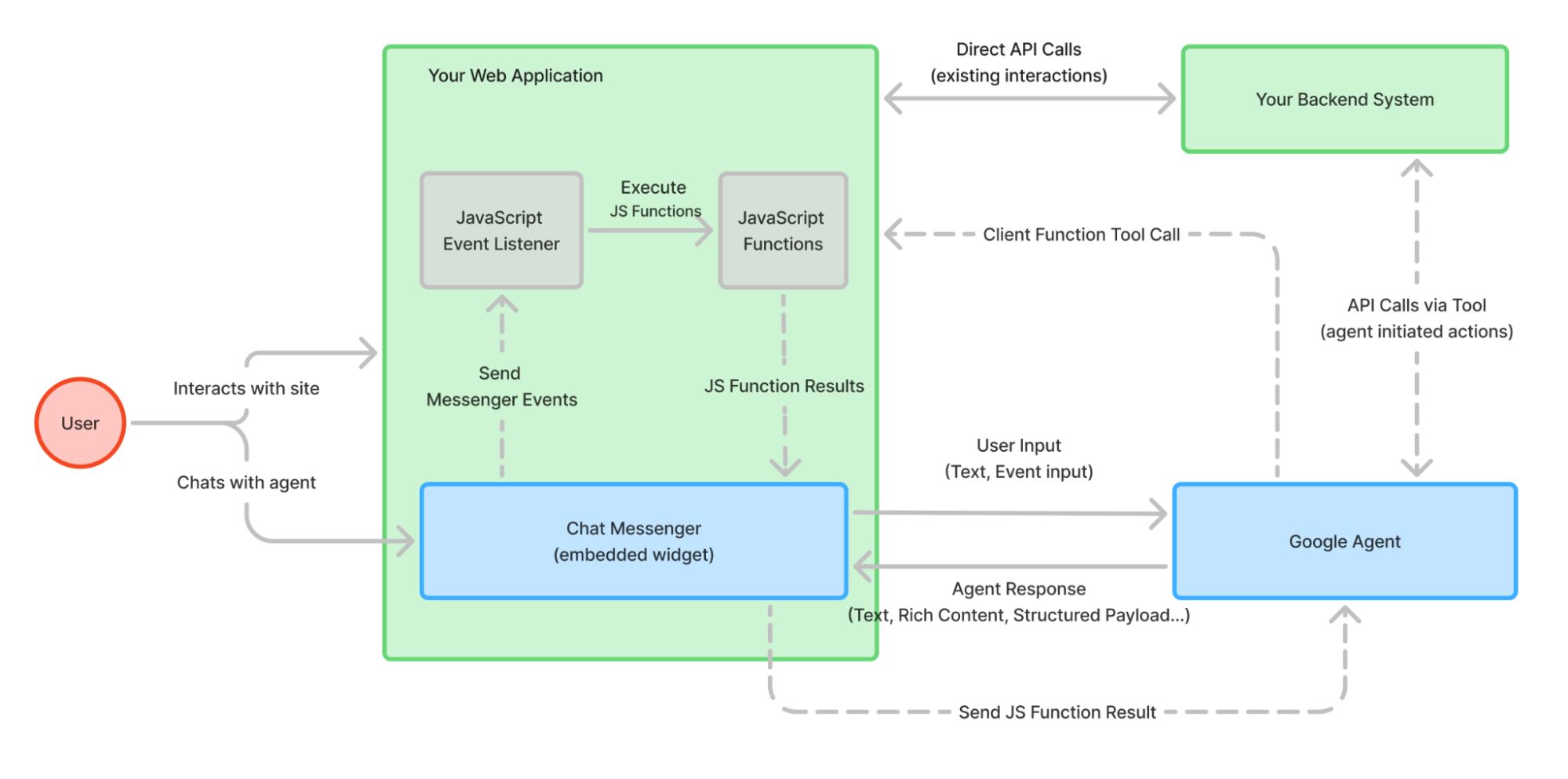
JavaScript events
Messenger triggers a variety of events that you can create
event listeners
for.
The event target for these events is the chat-messenger element.
To add an event listener for the chat-messenger element,
add the following JavaScript code,
where event-type is one of the event names described in this section
const chatMessenger = document.querySelector('chat-messenger');
chatMessenger.addEventListener('event-type', function (event) {
  // Handle event
  ...
});
The following event types are supported:
chat-messenger-loaded: This event is triggered when thechat-messengerelement is fully loaded and initialized.chat-messenger-closechat-messenger-error: This event occurs when the CES agent sends an error status code. The event structure looks like the followingeventId= `chat-messenger-error-v2` event.details { message: string; code: number | undefined; status: number | string; }df-update-cart-count: This event occurs when "Add to cart", "Adjust item quantity", "Delete item" happen in theproduct_carousel,product_detail,product_comparisonrich content elements. The event structure looks like the following{ "detail": { "count": <cart_item_count>, } }
JavaScript functions
The chat-messenger element provides
functions
you can call to affect its behavior.
renderCustomEvent
This function renders a text message, as if it came from the agent application as a text response.
For example:
const chatMessenger = document.querySelector('chat-messenger');
chatMessenger.renderCustomText('Custom text');
renderCustomCard
This function renders a custom card, as if it came from the agent application as a rich response message. The format of the custom payload response is defined in the Rich response messages section.
For example:
const chatMessenger = document.querySelector('chat-messenger');
const payload = [
  {
    "type": "info",
    "title": "Info item title",
    "subtitle": "Info item subtitle",
    "image": {
      "src": {
        "rawUrl": "https://example.com/images/logo.png"
      }
    },
    "actionLink": "https://example.com"
  }];
chatMessenger.renderCustomCard(payload);
Configure authentication
All API requests made by the web widget to Google's backend services must be authenticated. This is accomplished using a short-lived OAuth 2.0 access token.
The identity associated with this token, whether it's an end-user or a service account, must have the necessary IAM permissions to interact with the agent.
The remaining subsections describe the ways you can set up authentication.
Set up a token broker
A token broker is a web service that runs in your Google Cloud project and generates an access token on behalf of a service account you own. The web widget can automatically call the URL for your token broker at the beginning of a conversation to get a fresh token to use when communicating with the CX Agent Studio API.
You can set up a token broker in two ways: Google-hosted or self-hosted.
Google-hosted
Use the token broker provided by Google to allow public access to your chat widget:
- When creating the deployment and widget config, enable public access, and optionally enable origin and reCAPTCHA checks (recommended to prevent spoofing and abuse).
- The chat widget will request a session scope token from the Google-provided token broker and use it for chat sessions.
Self-hosted
Follow these steps to set up a self-hosted token broker:
- Create a service account in your project and grant it the Customer Engagement Suite Client role.
- Deploy a Cloud Run functions function with the token broker sample code we provide.
See detailed step-by-step instructions in the open source repository.
Set up OAuth2
An OAuth2 client allows the web widget to initiate an authentication flow for the end-user. This typically means a dialog window is opened, where the user logs in to their Google Account (or other providers) and the web widget receives a token to operate on the user's behalf.
Choose this to require end-users to sign in before using the agent, where the user credentials are used for access to the agent application.
Here are the main steps you need to follow:
- In the Google Cloud console, go to Google Auth Platform and select Clients.
- Click Create Client.
- Select Web application as the client type.
- Enter a name for your new client.
- Add your website URL to both Authorized Javascript origins and Authorized Redirect URIs.
- Click Create and wait 5 minutes before continuing.
After following the steps, you will get a client ID in the form:
123456789012-abcdefghijklmnopqrstuvwxyz.apps.googleusercontent.com
Provide this
in the oauth-client-id attribute of the chat-messenger web component.
Build your own authentication API
Build your own API to handle the authentication and authorization
of the end-user which returns a google access token or signed jwt
that has the permission to call runSession in your app.
For information on using the CX Agent Studio API, see API access.