

You can customize chart colors in Data Studio to distinguish categories and highlight key data trends. Applying consistent coloring techniques helps viewers interpret complex visual data quickly and navigate multi-page reports with clarity. You can select single colors, color by dimension values, or color by series order in the Color by section of the STYLE tab.
To apply a color option, follow these steps:
- Select a chart and then on the right, open the STYLE tab.
- Select an option in the Color by section.
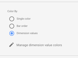
Color by dimension values
Coloring by dimension values applies consistent colors to the data series in your charts by mapping specific colors to specific dimension values.
The default dimension value colors are based on the current report theme, however can choose different colors by editing the dimension value color map.
Example
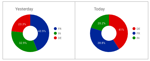
In the following charts, the colors used for each dimension stay constant, even if their position in the chart changes: France is always blue, Germany is always red, and India is always green.
Color by series order
The series order option colors the data according to its order in the chart. This option emphasizes the ranking of the data over the identity of the data. For example, suppose you want the highest valued dimension to always appear in green. Using the color by series order option, you can assign that color to the first color swatch in the current theme.
Example
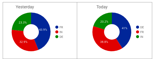
These charts use the color by series order (called slice order in the Pie Chart properties panel) option. Here, dark blue represents the highest valued dimension, rather than a specific country.
Set series colors
To change the colors assigned to data series in a specific chart:
- Select that chart, then on the right, open the STYLE tab.
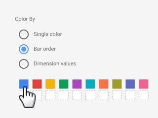
- In the Color by section, select Series order, Bar order, or Slice order, depending on the type of chart.
- Click a color box to set the color for each series. The color boxes appear in rank order: the first color box corresponds to the first series, the second box to the second series, and so on.
Single color
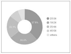
Bar charts and pie charts have a single color option that displays the data in shades of the selected color, as shown in the following example.
Color metrics
Metrics get their default colors from the current report theme. You can customize metric colors in selected charts by editing the STYLE properties for those charts.
Learn how to create custom colors.