
Spanner Graph visualizations show the graph elements returned by a query or the elements of a graph schema. A visualization helps you understand how data points (nodes) are connected (edges). While a table of hundreds of data points can be difficult to interpret, its graph visualization can reveal patterns, dependencies, and anomalies.
Visualize Spanner Graph query results
You can use the Google Cloud console to visualize Spanner Graph query
results in Spanner Studio. To visualize a query with
Spanner Graph, the query must return graph elements in JSON format
using the
SAFE_TO_JSON
or TO_JSON
function. We recommend that you return graph paths instead of returning nodes
and edges individually. Returning paths offers the following benefits:
Paths contain complete data of nodes and edges. Some intermediate nodes and edges in a visualization of a complex query might not be available if you return individual nodes and edges.
If you return paths, your
RETURNstatement can be less complex than if you return nodes and edges individually.
The following sample query returns the paths of account transfers, which you can visualize:
GRAPH FinGraph
MATCH result_paths = (account:Account {is_blocked: True})-[:Transfers]->(dest_account:Account)
RETURN SAFE_TO_JSON(result_paths) AS result_paths
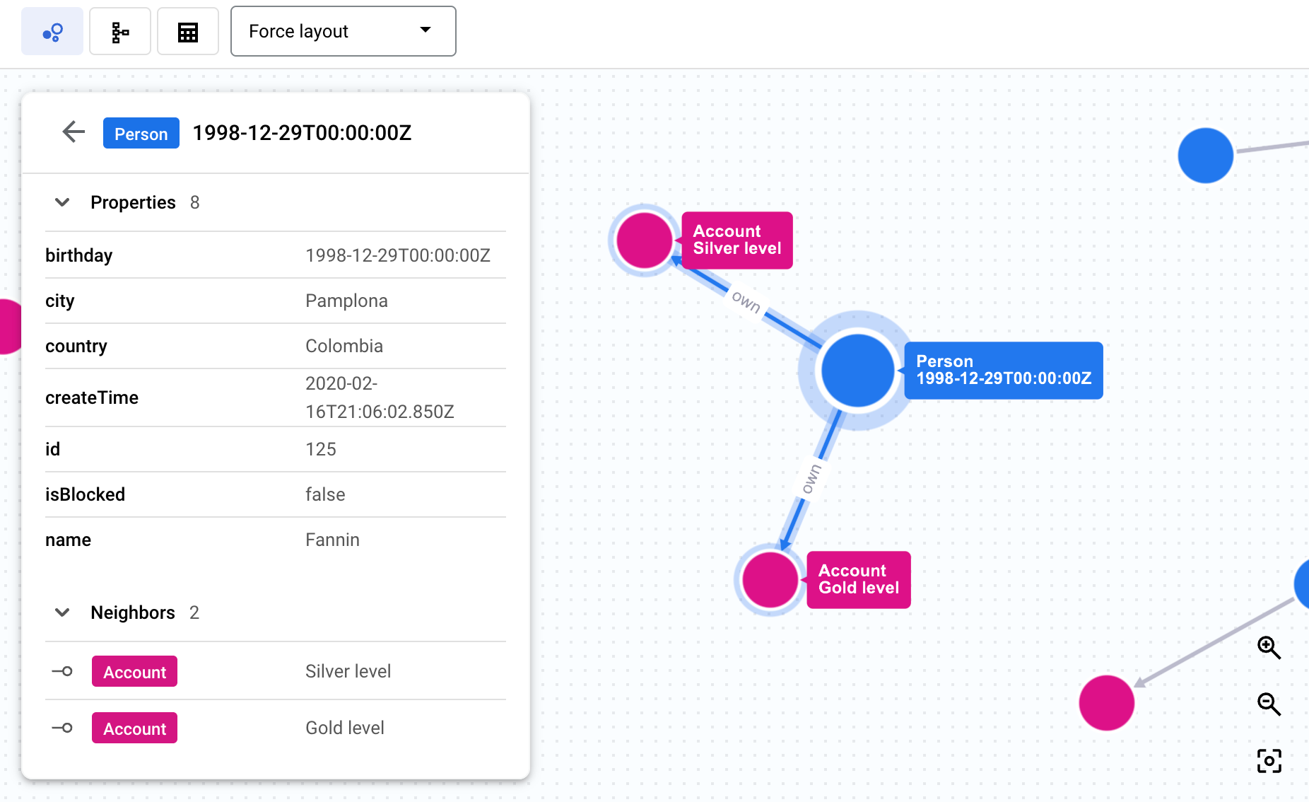
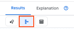
After you run a query, the query results area displays the visualization. The detail panel shows a summary of node and edge labels with counts for each. Click a node or an edge to navigate the graph and view properties, neighbors, and connections, as the following screenshot shows. Alternatively, you can view the query results as a table or toggle to a visualization of the underlying graph schema.
For more information, see Return graph elements as JSON.
Choose query result visualization options
You can update how your nodes appear in a query visualization. For example, you can specify the layout of your query visualization, the color of your nodes, and which property appears on each node.
Query result display updates are for your current query result visualization session. The updates to your visualization options don't persist if you run the same query again.
Choose a layout for a Spanner Graph visualization
The menu on the visualization panel provides the following layout options:
Force layout (default): Presents nodes as points that repel each other, while connected nodes pull together, simulating physical forces to create a visually intuitive layout.
Hierarchical: Positions nodes to create a visual hierarchy based on connectivity.
Sequential: Positions nodes to create a visual sequence based on connectivity.
Show labels: Displays all node and edge labels on the graph at all zoom levels.
Choose the node property to display
By default, a node displays its first property. If you want a node to display a different property, do the following:
When you're viewing a visualization of the results of a Spanner Graph query, click Switch to schema view on the Results tab of the query results panel.
In the schema visualization, click a node of the type you want to update.
In the detail panel that appears for the selected node, click the property you want to display. All nodes in your query results that are of the type of node you selected show the property you selected.
Choose the color of your nodes
When you're viewing a visualization of the results of a Spanner Graph query, click Switch to schema view on the Results tab of the query results panel.
In the schema visualization, click a node of the type you want to update.
In the detail panel that appears for the selected node, click Node display options.
Click a color, or enter a custom hex color code. All nodes in your query results that are of the type of node you selected display with the color you choose.
Choose which nodes display
To choose which nodes display in a visualization, do the following:
In the query visualization, right-click a node.
Click one of the following menu options to modify the visible graph state:
Expand renders adjacent nodes by traversing all incoming edges, outgoing edges, or filtering by a specific edge type.
Collapse prunes the current view by hiding all nodes connected to the target node using incoming edges, outgoing edges, or a specific edge type.
Hide node removes the target node from the current view.
Show only neighbors hides all nodes in the graph except for the target node and those directly connected to it.
Highlight node highlights the target node.
Visualize a Spanner Graph schema
The structure of a graph, such as its nodes, edges, labels, and properties, is defined by its schema, which maps graph elements to data in Spanner tables. The graph definition is either stored in a schema that you create using input tables, or it's evident from the data when you use schemaless data management.
You can visualize graphs that you create with a schema or graphs that use schemaless data management. Visualizing the schema helps you understand your graph's structure, including the types of nodes and edges it contains and how they connect. This can be useful for complex graphs, providing a clear view of relationships that might be hard to infer from DDL statements alone.
You can see a visualization of a Spanner Graph schema in the Google Cloud console by doing one of the following:
When you're viewing a visualization of the results of a Spanner Graph query, click Switch to schema view on the Results tab of the query results panel.
Click View schema on a Spanner Graph in the Object explorer:
In the Google Cloud console, open the Spanner page.
Select an instance from the list.
Select a database.
In the navigation menu, click Spanner Studio. The Object explorer pane displays a list of the objects in your database.
Click View actions on a graph, then click View schema.
Troubleshoot Spanner Graph visualizations
The following can help you troubleshoot and understand Spanner Graph visualization issues and behavior.
A visualization doesn't appear for a Spanner Graph query
Issue: You run a Spanner Graph query and it appears in table format only.
Possible cause: The query doesn't return graph elements in JSON format. For example:
- The following query can't be visualized because it returns nodes and edge identifiers:
GRAPH FinGraph
MATCH (person:Person {name: "Dana"})-[owns:Owns]->(account:Account)
RETURN person.id as person_id, account.id as account_id
- The following query can't be visualized because it returns property values:
GRAPH FinGraph
MATCH (person:Person {name: "Dana"})-[owns:Owns]->(account:Account)
RETURN owns.create_time, account.nick_name
Recommended solution:
Return graph elements in JSON format using
SAFE_TO_JSON
or
TO_JSON. For
more information, see
Visualize Spanner Graph query results.
Spanner Graph query results are partially visualized
Issue: A query result visualization shows only a part of the query results.
Possible cause: The query returns more than 10 MB of data. A query visualization can display up to 10 MB of data.
Recommended solution: Simplify the query so it returns less than 10 MB of data.
Some graph elements aren't displayed in a Spanner Graph visualization
Issue: A visualization includes all of the returned nodes and edges, but some of the graph elements aren't displayed.
Possible cause: The query used to create the Spanner Graph visualization returns individual nodes and edges instead of a graph path.
Recommended solution: Update the query to return a graph path.
What's next
- Learn how to set up and query Spanner Graph.
- Learn about Spanner Graph queries.
- Learn about Spanner Graph schemas.
- Learn about Spanner Graph visualization integrations.