
This document describes how to display trace data on custom dashboards. By adding trace widgets to your dashboards, you can build a unified troubleshooting view that correlates span latencies with system metrics and application logs.
To display trace data on a dashboard, you can add a trace-specific widget, use a save option on the Trace Explorer page, or use the Cloud Monitoring API.
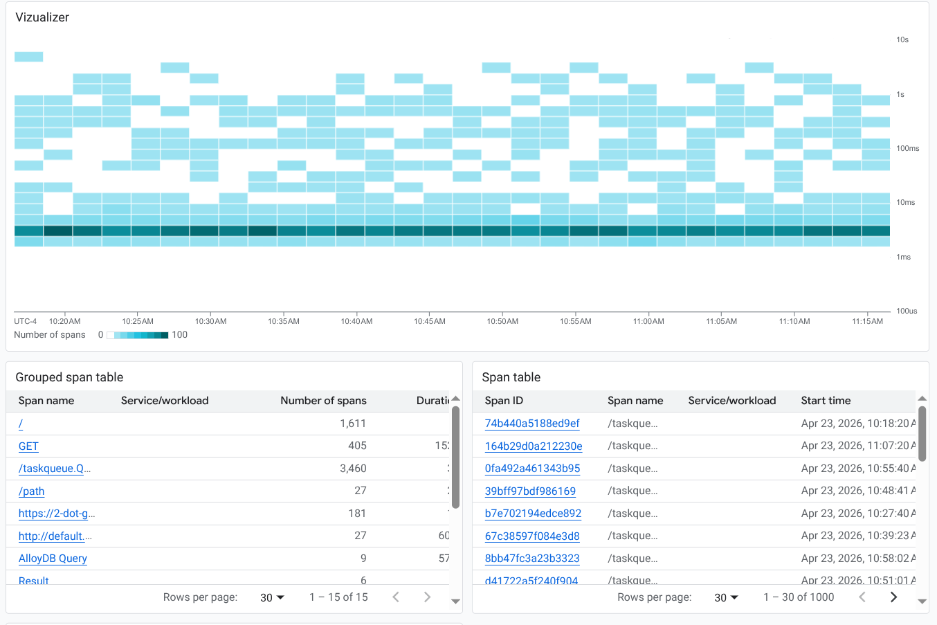
Visualizing trace data
The Trace Explorer page provides a pre-configured suite of visualizations for troubleshooting. By default, it displays a heatmap of span latencies and lists of individual or grouped spans. For more information, see Find and explore traces.
Because custom dashboards are modular, you can build a persistent version of this comprehensive view by combining individual trace widgets. For example, you can add a heatmap widget alongside separate tables for grouped and individual spans. Recreating this layout on a dashboard lets you monitor all aspects of your trace data in a single, shared view with your other telemetry:
By default, trace widgets display data from the resources in your default trace scope. However, you can modify the scope of individual widgets to search different projects or focus on specific resource groups.
When you edit a trace widget, an integrated version of the Trace Explorer opens. This editor lets you add filters and modify configuration options, just as you would when performing investigations, before applying the persistent changes to your dashboard tiles.
Before you begin
To get the permissions that you need to display trace data on a custom dashboard, ask your administrator to grant you the following IAM roles:
- Monitoring Editor (
roles/monitoring.editor) on on your project. - Cloud Trace User (
roles/cloudtrace.user) on on each project whose trace entries you want to view.
For more information about granting roles, see Manage access to projects, folders, and organizations.
You might also be able to get the required permissions through custom roles or other predefined roles.
You can put up to 100 widgets on a dashboard.
Use the save option on the Trace Explorer page
The Trace Explorer offers several visualizations of your trace data. You can add these visualizations to a dashboard to create a similar view.
To save data from the Trace Explorer to a custom dashboard, do the following:
-
In the Google Cloud console, go to the
 Trace explorer page:
You can also find this page by using the search bar.
In the toolbar, select Save to dashboard.
Select the display style. You have the following options:
- Visualizer: Add a heatmap to your dashboard.
- Span table: Add a table of individual spans to your dashboard.
- Grouped span table: Add a table of grouped spans to your dashboard.
Select or create a dashboard.
Click Save to dashboard.
Add a trace widget to a custom dashboard
This section describes how to display trace data on a custom dashboard. These instructions are for the Google Cloud console and assume you are editing a dashboard. For information about using the Cloud Monitoring API, see Dashboard displaying trace data.
To display trace data on a custom dashboard, do the following:
Open a custom dashboard:
-
In the Google Cloud console, go to the Dashboards page:
If you use the search bar to find this page, then select the result whose subheading is Monitoring.
- In the toolbar of the Google Cloud console, select your Google Cloud project. For App Hub configurations, select the App Hub host project or management project.
Select a dashboard or click Create dashboard.
If you create a dashboard, then use the Scope menu to configure which resources are searched for trace data. By default, the system searches the resources in the default trace scope for trace data.
-
In the toolbar, click add Add widget.
In the Add widget dialog, go to the Data section and select Trace.
Configure the Trace widget. You can change the default view, the title, and add filters.
To change the view, in the toolbar, expand the Chart view menu and select a view:
- To add a heatmap (default), select Span duration (heatmap).
- To display the rate of spans, select Span rate (line chart).
- To display latency data, select Span duration (percentile).
- To list spans in tabular format, select Span rate (line chart) or Span duration (percentile), and use the Widget type menu to display a table. Selectors let you display grouped or ungrouped data.
To restrict which traces are shown, add filters.
To update the title, enter the new title in the Widget title field.
To apply your changes to the dashboard, in the toolbar, click Apply. To discard your changes, click Cancel.
To save your modified dashboard, in the toolbar, click Save.
Modify or edit a widget that displays trace data
To modify a widget, hold the pointer over the widget to activate the toolbar, and then click edit Edit widget.
A Trace Explorer editor opens. From this view, you can add or remove filters and modify any configuration options. You can then either apply your changes to your dashboard or discard them.
Limitations
- Dashboard-level filters don't apply to trace widgets.
- You can't apply a variable to the query for a trace widget.