
This document describes how to display metric data on a custom dashboard. Line charts display the values of metric data over time. However, you can also use tables or other visualizations to display the most recent values for your metric data. You can display metric data that has a numeric or distribution value, including user-defined metrics and log-based metrics.
If you want to display other types of data, then see the following documents:
- Display incidents and charts for alerting policies
- Logs and errors
- Descriptive text
- Service-level objectives (SLOs) for a set of services
- Charts that show the results of a Observability Analytics query
For information about the Cloud Monitoring API to configure custom dashboards, see Manage dashboards by API.
This feature is supported only for Google Cloud projects. For App Hub configurations, select the App Hub host project or management project.
Visualizations for metric data
To display data over time, use Charts. There are four styles available:
- Line
- Stacked area
- Stacked bar
- Heatmap
Line charts are the default visualization and are suitable for most metric data. Stacked bar charts are best when you are charting metric data that has infrequent samples, such as quota metrics. For metric data whose value type is a distribution, use the heatmap.
To display only the most recent values, use one of the following styles:
- Tables display labels, let you limit the number of rows, and they let you color-code cells based on the value.
- Gauges and Scorecards display a green, amber, or red indication based on how the value compares to a set of thresholds.
- Histograms display the relative frequency of the most recent values of multiple time series.
- Pie charts display the most recent value of each time series as a fraction of the sum of all values.
- Treemaps display the most recent values of grouped data as a series of nested rectangles, where the color for a rectangle is proportional to its value.
After a widget is configured, you can change its visualization.
Before you begin
Complete the following in the Google Cloud project where you want to create and manage dashboards:
-
To get the permissions that you need to create and modify custom dashboards by using the Google Cloud console, ask your administrator to grant you the Monitoring Editor (
roles/monitoring.editor) IAM role on your project. For more information about granting roles, see Manage access to projects, folders, and organizations.You might also be able to get the required permissions through custom roles or other predefined roles.
For more information about roles, see Control access with Identity and Access Management.
You can put up to 100 widgets on a dashboard.
Display metric data on a dashboard
To display metric data on your dashboard, complete the following steps:
You might want to change the appearance of the chart, display a ratio of metrics, or make other changes. To learn about the available options, see the Advanced configuration options section of this document.
Open a dashboard and add a widget
To display metric data on a custom dashboard, do the following:
-
In the Google Cloud console, go to the Dashboards page:
If you use the search bar to find this page, then select the result whose subheading is Monitoring.
- In the toolbar of the Google Cloud console, select your Google Cloud project. For App Hub configurations, select the App Hub host project or management project.
Do one of the following:
- To create a new dashboard, select Create dashboard.
- To update an existing dashboard, find the dashboard in the list of all dashboards and select its name.
In the toolbar, click add Add widget.
In the Add widget dialog, select a widget.
- To add a line chart, select leaderboard Metric.
- To add a different visualization, select the visualization from the widget library.
You can change the visualization style by using widget options.
Select a metric type to display
In this step, you configure a query. The query defines what data the widget displays.
Menu-driven interface
Select the time series data that you want to view:
-
In the Metric element, expand the Select a metric menu.
The Select a metric menu contains features that help you find the metric types available:
- To find a specific metric type, use the
filter_list Filter bar.
For example, if you by enter
util, then you restrict the menu to show entries that includeutil. Entries are shown when they pass a case-insensitive "contains" test. - To show all metric types, even those without data, click Active. By default, the menus only show metric types with data.
For example, you might make the following choices:
- In the Active resources menu, select VM instance.
- In the Active metric categories menu, select uptime_check.
- In the Active metrics menu, select Request latency.
- Click Apply.
- To find a specific metric type, use the
filter_list Filter bar.
For example, if you by enter
- Optional: To specify a subset of data to display, in the Filter element, select Add filter, and then complete the dialog. For example, you can view data for one zone by applying a filter. You can add multiple filters. For more information, see Filter charted data.
For more information, see Select the data to chart.
-
Combine and align time series:
- To display every time series, in the Aggregation element, set the first menu to Unaggregated and the second menu to None.
- To combine time series, in the Aggregation element,
do the following:
Expand the first menu and select a function.
The chart is refreshed and displays a single time series. For example, if you select Mean, then the displayed time series is the average of all time series.
To combine time series that have the same label values, expand the second menu, and then select one or more labels.
The chart is refreshed and shows one time series for each unique combination of label values. For example, to display on time series per zone, set the second menu to zone.
When the second menu is set to None, the chart displays one time series.
- Optional: To configure the spacing between data points, click add Add query element, select Min Interval, and then enter a value.
For more information about grouping and alignment, see Choose how to display charted data.
- Optional: To display only the time series with the highest or lowest values, use the Sort & Limit element.
PromQL
- In the toolbar of the query-builder pane, select the button whose name is code PromQL.
-
Enter your query into the query editor. For example, to chart the average CPU utilization of the VM instances in your Google Cloud project, use the following query:
avg(compute_googleapis_com:instance_cpu_utilization)
For more information about using PromQL, see PromQL in Cloud Monitoring.
Monitoring filter
-
In the Metric element, click help_outline Help, and then select Direct Filter Mode.
The Metric and Filter elements are deleted, and a Filters element that lets you enter text, is created.
If you selected a resource type, metric, or filters before switching to Direct Filter Mode mode, then those settings are shown in the field of the Filters element.
- Enter a Monitoring filter in the field of the Filters element.
Combine and align time series:
- To display every time series, in the Aggregation element, set the first menu to Unaggregated and the second menu to None.
- To combine time series, in the Aggregation element,
do the following:
Expand the first menu and select a function.
The chart is refreshed and displays a single time series. For example, if you select Mean, then the displayed time series is the average of all time series.
To combine time series that have the same label values, expand the second menu, and then select one or more labels.
The chart is refreshed and shows one time series for each unique combination of label values. For example, to display on time series per zone, set the second menu to zone.
When the second menu is set to None, the chart displays one time series.
- Optional: To configure the spacing between data points, click add Add query element, select Min Interval, and then enter a value.
For more information about grouping and alignment, see Choose how to display charted data.
Save your changes
After you select a metric type to display, you can save your changes, change the default settings, or configure widget-specific fields. The following sections of this document might be helpful when you configure widget-specific fields:
When you are satisfied with your chart, save the changes and then update the dashboard.
- To apply your changes to the dashboard, in the toolbar, click Apply. To discard your changes, click Cancel.
- To save your modified dashboard, in the toolbar, click Save.
After you save your widget, you can edit that widget and modify any of its settings. For example, you can change the visualization style.
Advanced configuration options
This section describes the options available to you to customize your widget:
- Change the visualization
- Set appearance
- Set visibility
- Display multiple metric types
- Display a ratio of metric types
Change the visualization
To display the most recent values of your metric data, instead of displaying that data over time, use one of the following visualizations:
To modify your widget's visualization, in the Display pane, select arrow_drop_down Widget type and make a selection from the menu.
The Widget type lists all widget types that can display the same type of data; however, some widgets might not be enabled. For example, suppose a line chart displays several time series. The Widget type menu shows that most visualization types are listed as Compatible. For example, you can always switch from a line chart to a table. However, the following widget types aren't available:
- The Heatmap widget is disabled because these widgets can only display distribution-valued data.
- The logs panel isn't listed because the logs panel can't display metric data.
Set appearance
Optional: To change how a chart or table displays the selected data, use the options in the Display pane:
- Chart options:
- Analysis mode menu: Select between line charts, x-ray, and statics.
- Compare to Past menu: Overlay current data with past data.
- Threshold Line menu: Add a reference threshold.
- Legend Alias menu: Configure the name of a legend column.
- Y-axis assignment, Y-axis labels, and Y-axis scale menus: Configure configure Y-axis assignment, labels, or scale.
- Table options:
- Value option menu: Select between the latest value and an aggregated value.
- Visible columns menu: Select which columns are shown.
- Column formatting menu: Configure column names, alignment of data in a column, units, and whether cells are color-coded.
- Metric view menu: Select whether the value is show by itself or shown relative to a range of values.
- Legend Alias menu: Configure the name of a legend column.
Set visibility
By default, your dashboard displays your widget. If you define variables, then you can make your widget visible only when the variable has specific values. For more information, see Set the visibility of a widget.
Display multiple metric types
You can configure charts and tables to display multiple metric types. For tables, Cloud Monitoring tries to display the values for both metric types on the same row, when possible. For more information, see How tables merge data from multiple metric types.
Menu-driven interface
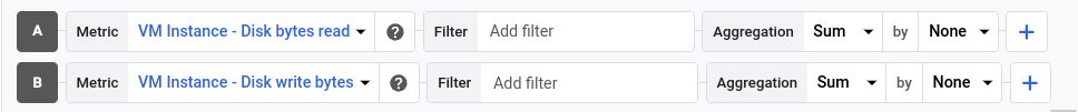
- Select Add query. A new query is added. For example, a query with the label B might be added.
- For the new query, in the Metric element, select a resource type and metric type. You can also add filters, combine time series, and sort and limit the number of displayed time series.
The following screenshot illustrates the Metrics Explorer display when there are two metric types charted:
PromQL
Not supported.
Monitoring filter
Not supported.
Display a ratio of metric types
You might want to chart a ratio of metrics when Google Cloud doesn't provide the metric data in the form you prefer.
Menu-driven interface
- Configure the chart to display two metric types that have the same
metric kind. For example, both are
GAUGEmetrics. - Ensure that the value of the Min Interval field is the same for both metric types. To access this field, click add Add query element and select Min Interval.
-
Update the aggregation fields.
We recommend that the labels for the denominator metric type match the values set for the numerator metric type. For example, you might select the
zonelabel for the numerator and denominator.You aren't required to use the same set of labels for both metric types; however, you can only select labels that are common to both metric types.
-
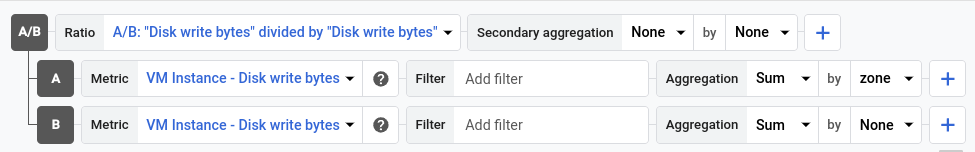
In the toolbar of the query pane, select Create ratio, and then complete the dialog.
After you create the ratio, three queries are shown:
- A/B Ratio identifies the ratio query.
- A identifies the query for the numerator.
- B identifies the query for the denominator.
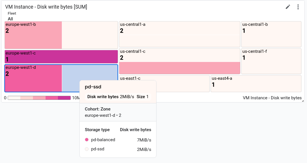
The following example illustrates a ratio that compares the sum of the bytes written to disk per zone, to the total number of bytes written to disk:
-
Optional: To switch the numerator and denominator metrics, in the Ratio element, expand the menu, and then make a selection.
PromQL
- In the toolbar of the query-builder pane, select the button whose name is code PromQL.
-
Enter your query into the query editor. For example, to chart the ratio of average latency of your
my_summary_latency_secondsmetric, use the following query:sum without (instance)(rate(my_summary_latency_seconds_sum[5m])) / sum without (instance)(rate(my_summary_latency_seconds_count[5m]))
For more information about using PromQL, see PromQL in Cloud Monitoring.
Monitoring filter
Not supported.
Configure a table
To view the most recent data in tabular form, add a table. Tables can display numeric data. For example, they can display one or more metric type, or percentiles for distribution-valued metrics.
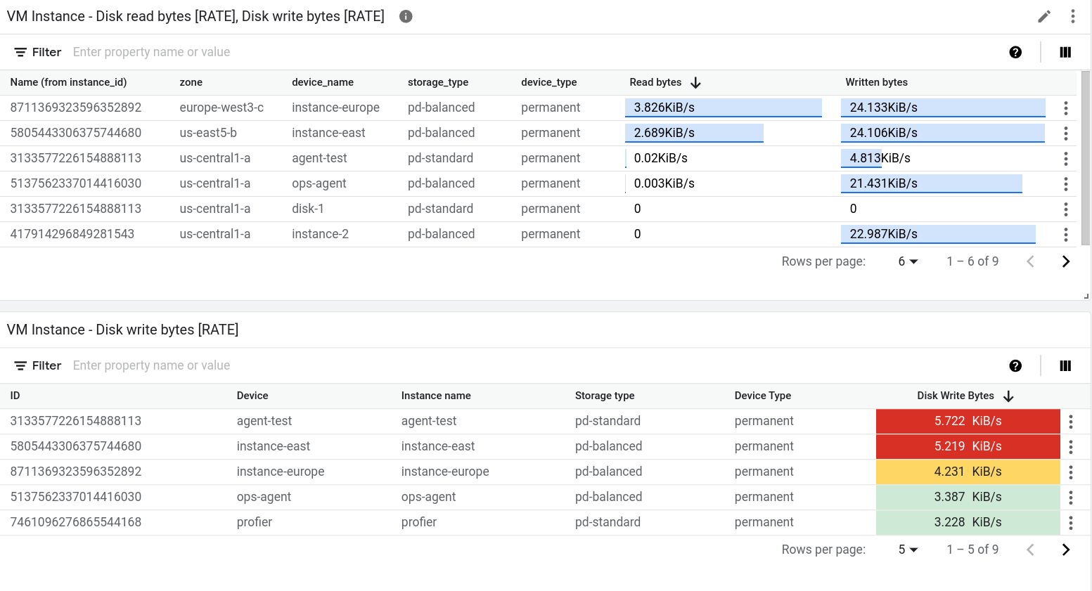
The following screenshot illustrates two tables. The first table displays two metric types, the number of bytes read from instances and the number of bytes written to instances. An aggregated value is shown along with a reference bar. The second table shows the latest value of one metric type, and the value column has been configured to color-code the cell based on how the value compares to a threshold:
There are two widgets that display data in tabular form: Top List widget and Table widget. The primary difference between these two widgets is that the Top List widget sorts the order of the rows and it displays the value along with a visual indicator of the value compared to the range of possible values. Because the Top List widget provides a visual representation of the value, you can't color-code the cell based on how the value compares to a threshold.
To add a table to dashboard, do the following:
- Open a dashboard and add a widget and add a Table or Top List widget.
Select a metric type to display.
Each row in the table corresponds to one time series. One table column displays a numeric value that is either the latest value or an aggregate value. The other columns display the labels in the time series.
Optional: Select another metric type.
When a table displays multiple metric types, the data for both metric types is shown on the same row, when possible. For more information, see Understand tables that display multiple metric types.
Configure the table:
You can also use the Cloud Monitoring API to add a table widget to a
dashboard. For more information, see
Dashboard with a TimeSeriesTable widget.
Display latest value or aggregated value
By default, tables display the most recent value. However, a table can show a value that is computed over the time-range selected for your dashboard.
To select between the latest value and the aggregated value, use the Value option field.
If you display the aggregated value, then for each time series, the data within the time range selected by your dashboard is combined by the alignment function. The alignment function is one of the aggregation options and isn't shown by default. To view the alignment function, expand the Aggregation element and in the first element, select Configure aligner. After you make this selection, the Aggregation element is replaced by a Grouping element and a menu named Alignment function.
Select the columns to display
By default, one column in the table displays a numeric value. All other columns correspond to a label in the time series. For label-based columns, the column name is derived from the label.
To configure the columns shown by the table, expand the Visible Columns menu and make your selections.
Configure column format
To configure an individual column, in the Columns element, expand the Override column menu, select the column to be modified, and then do any of the following:
- To set the name of column, use the Display name field.
- To set the alignment of the data in the column, use the format_align_left Left align, format_align_center Center align, and format_align_right Right align buttons.
- To color-code the cell based on how the numeric value compares to a threshold, set the warning and danger thresholds.
- If you write PromQL queries, then use the Unit menu to set the units shown with the data. The units are automatically configured when you configure your query by using menu selections.
Display referential value
Tables can display only a value, or they can display a value relative to the range of values. When the range option is selected, the value is shown along with a blue-colored bar, the length of the bar is proportional to the value shown.
To configure whether a referential value is shown, use the Metric view element.
Sort and filter
You can change the order of the rows in the table display, and you can filter the table contents so that only specific rows are shown. These settings aren't persistent. When you leave the dashboard page or when you reload the dashboard, the sorting and filtering options you applied are discarded.
You have the following sorting and filtering options:
To sort the table by a column, click the column header.
To change the table columns, click view_column View columns, make your modifications, and then click OK.
To list only specific rows, add one or more filters. You can add multiple filters. When you don't specify the OR operator between two filters, a logical-AND joins those filters.
To add a filter, click
Enter property name or value, select a property from the menu, and then enter a value or select from the value menu. For example, if you filter on the propertyNameand enter the valuedemo, then the table lists only rows where theNamefield includes the valuedemo.
Understand tables that display multiple metric types
If a table queries for multiple metric types, then the Google Cloud console performs a merge operation by examining the labels attached the aggregated data for both metric types. When the labels that are common to both queries let Monitoring determine a unique row identifier, then a single row on the table displays the most recent value for each query. Otherwise, there is one row for each time series.
For example, suppose a table queries two different metric types. Let's call
these queries A and B. The following describes how the query results
are merged:
If the result of both queries has the same set of labels, then the merge is always successful. Each row contains the latest value for each query. If a query doesn't return a value for a particular combination of labels, then the table cell is empty.
For example, suppose both queries contain a
zonelabel. The table contains one row for each zone reported by queryAand queryB. However, if queryAreturns a time series whose zone isus-central1-abut queryBdoesn't return a time series with this value, then the latest value for queryBis shown as an empty cell.If the labels for the results of one query are a subset of the labels for the results of the other query, then the results are merged.
For example, suppose that results for both queries include labels for
locationandcluster_name, but that the results for queryAalso include a label formemory_type. In this situation, each row corresponds to a time series with unique values for the three labels.On any row, the value shown for query
Bis the value of the time series that matches the two common labels,locationandcluster_name, and the third label is ignored.If the results of the two queries don't share any labels or if they share some labels, but not enough to form a unique row identifier, then the results can't be merged. The table lists one row for each time series returned by query
Aor by queryB, and some table cells are empty.For example, suppose the labels for query
Aarelocationandmemory_type, and that the labels for queryBarelocationandcluster_name. Even though the labellocationis common, that label isn't sufficient to create a unique row identifier.As described in the next section, you might be able to resolve a merge failure.
How to resolve a merge failure
When you are charting multiple metrics, a merge failure might occur
because the metrics use different label names for the same field.
One way you can resolve this failure is to convert one query to PromQL
and then use the label_replace() function to
convert the label names used by one metric type to match those of the
other metric type.
For example, consider a table configured with two queries:
A: Queries thePrometheus/kube_pod_container_status_ready/gaugemetric type. The aggregation options are set to sum time series after grouping the data by theclusterlabel.B: Queries thekubernetes.io/container/memory/request_bytesmetric type. The aggregation options are set to sum time series after grouping the data by thecluster_namelabel.
The table can't merge the results because the results for query A and
query B have different labels.
To resolve the failure, convert query A to PromQL and replace cluster
with cluster_name. The following example illustrates the modified query:
sum by (cluster_name)(
    label_replace(
        avg_over_time(kube_pod_container_status_ready[${__interval}]),
        "cluster_name", "$1", "cluster", "(.*)"
    )
)
With the changes, both queries produces the same set of labels.
Therefore, each row in the table lists a cluster name,
the value for query A, and the value for query B.
For information about using PromQL, see PromQL in Cloud Monitoring.
Configure gauges and scorecards
To view the most recent measurement as compared to a color-coded set of thresholds, add a gauge or a scorecard. Gauges display only the most recent measurement while scorecards also show a history of recent measurements. The background color of these widgets is also color-coded. When the most recent value is within expected ranges, the widget color is white. When the value is in a warning range, the widget becomes amber. Similarly, when the value is in a danger range, the widget becomes red.
These widgets can display multiple gauges or scorecards. For example, the following image shows a gauge widget that displays three gauges:
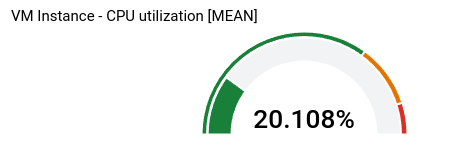
The number of gauges shown by the gauge widget depends on your aggregation settings. In the example, the aggregation settings result in three time series, so three gauges are shown. You define the thresholds at the widget level, so they apply to each time series. In this example, one gauge is red, one is amber, and the third is green.
The remainder of the information in this section is for the
Google Cloud console. For information about using the Cloud Monitoring API,
see Dashboard with a basic Scorecard.
To add a gauge or scorecard to a dashboard, do the following:
Open a dashboard and add a widget and add either a Gauge or a Scorecard widget.
In the Display pane, configure the widget:
For gauge widgets, click arrow_drop_down Gauge range, and then set the minimum and maximum values. When a gauge displays a percentage, set these values to 0 and 1 respectively.
Click arrow_drop_down Gauge threshold, and then set the warning and danger thresholds. Threshold fields that are empty aren't used.
For the gauge displayed previously, two thresholds are set. Values higher than 0.9 are in the danger range. Values higher than 0.7 but not in the danger range, are in the warning range.
For scorecards, click arrow_drop_down Spark chart view, then expand the menu of options, and then select the display style.
To apply your changes to the dashboard, in the toolbar, click Apply. To discard your changes, click Cancel.
To save your modified dashboard, in the toolbar, click Save.
Configure histograms, pie charts, and treemaps
This section provides information about how to configure widgets that show the most recent metric values in a graphical form.
Configure a histogram
A histogram provides information about the relative frequency of the most recent value of multiple time series. That is, the x-axis is indexed by bins, each of which corresponds to a range of values. The y-axis specifies a count, which is the number of samples whose values are in the range of the bin.
The following screenshot shows a histogram widget:
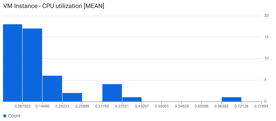
The example shows the most recent value for about 50 time series. The most recent value for most of time series is 0.145 or less.
To add a histogram to a dashboard, do the following:
- Open a dashboard and add a widget and add a Histogram widget.
Select a metric type to display.
A histogram is shown with a default bin configuration.
Optional: Update the bin configuration:
To configure the number or size of the bins, select Histogram bins and make a selection.
To specify the number of bins, select Count, and then enter a value. We recommend that the value you enter is at least 5 but not more than 50. However, this feature supports up to 1000 bins.
To specify the size of each bin, select Size, and then enter a value.
To specify the minimum and maximum x-axis values, select X-axis range and complete the dialog.
To specify linear or logarithmic scaling on the y-axis, select Y-axis scale and complete the dialog.
Select Apply and then Save.
You can also use the Cloud Monitoring API to add a histogram widget to a
dashboard. For more information, see
Dashboard with a Histogram widget.
Configure a pie chart
To view the most recent data as a fraction of the total, add a pie chart. Like tables, a pie chart can display any metric type that has a numeric value, and they can display percentiles for distribution-valued metrics. Each time series contributes one slice to the pie.
The following screenshot illustrates a dashboard that displays the CPU utilization of virtual machine instances by using two different configurations of a Pie chart widget:

For information about how to add pie charts to a dashboard, see the following documents:
Open a dashboard and add a widget and add a Pie Chart widget.
To display the total value, set the Chart type field to Donut.
For information about using the API to configure a pie chart, see
Dashboard with a PieChart widget.
Configure a treemap
To view the most recent data as a nested series of rectangles, where each
rectangle corresponds to a unique collection of label values, add a tree map.
Assume that you've aggregated the data you are charting by the zone label.
If you set the widget type to treemap, then each rectangle on the
treemap corresponds to one zone. The color saturation of a rectangle is
proportional to the value it represents.
The following screenshot shows a treemap widget where the
time series are aggregated by zone and storage_type:
In the screenshot, the tooltip is shown for one rectangle.
To configure a treemap, do the following:
- Open a dashboard and add a widget and add a Treemap widget.
- Select a metric type to display.
- If the Aggregation element displays Unaggregated, then use the menu to select an aggregation function. For example, select Mean or Max.
- In the second field of the Aggregation element, select at least one label.
- To apply your changes to the dashboard, in the toolbar, click Apply. To discard your changes, click Cancel.
- To save your modified dashboard, in the toolbar, click Save.
For information about using the API to configure a treemap, see
Dashboard with a Treemap widget.
What's next
You can also add the following widgets to your custom dashboards:
- Display incidents and charts for alerting policies
- Log entries
- Descriptive text
- Service-level objectives (SLOs) for a set of services
For information about exploring charted data and filtering your dashboards, see the following documents:
- Explore charted data
- Add temporary filters to a custom dashboard
- Create and manage variables and pinned filters