
本頁面說明如何使用 Cloud Monitoring API 建立資訊主頁。每個範例都會顯示 JSON 格式的資訊主頁定義,以及對應的資訊主頁。您可以將 JSON 提供給 Google Cloud CLI 和 Cloud Monitoring API 端點。
Cloud Monitoring 也會在 GitHub 上提供精選的資訊主頁定義。您可以在 Google Cloud 專案中安裝這些定義,做為自訂資訊主頁。如要瞭解這個存放區及如何安裝這些資訊主頁,請參閱「安裝範例資訊主頁」。
使用 API 或 Google Cloud CLI 的時機
您可以透過 Cloud Monitoring API 和 Google Cloud CLI,一次管理多個資訊主頁。您可以使用Google Cloud 控制台管理資訊主頁,但使用指令碼大量管理自訂資訊主頁可能會更輕鬆。
如要在資訊主頁中新增空白預留位置小工具,也必須使用 API。
透過 API 使用 MQL 或 PromQL
您可以使用 dashboards.create 方法建立資訊主頁。您會將 Dashboard 物件傳遞至 API 方法,該物件包含資訊主頁顯示的每個小工具項目。
當小工具顯示時間序列資料 (例如圖表小工具) 時,Dashboard 物件中的項目會包含 TimeSeriesQuery 物件。這個物件會說明要繪製成圖表的時間序列資料,您可以使用 Monitoring 篩選器、MQL 查詢或 PromQL 查詢指定該資料:
如要使用監控篩選器,請填入
timeSeriesField欄位。本頁面的範例使用 Cloud Monitoring 篩選器。如要使用 MQL 查詢,請填入
timeSeriesQueryLanguage欄位。詳情請參閱「建立圖表」。如要使用 PromQL 查詢,請填入
prometheusQuery欄位。如需一般資訊,請參閱「在 Cloud Monitoring 中使用 PromQL」。
資訊主頁版面配置
本節包含可用的不同資訊主頁版面配置相關資訊。
GridLayout資訊主頁
這個資訊主頁會顯示含有三個小工具的 GridLayout。
{
  "displayName": "Grid Layout Example",
  "gridLayout": {
    "columns": "2",
    "widgets": [
      {
        "title": "Widget 1",
        "xyChart": {
          "dataSets": {
            "timeSeriesQuery": {
              "timeSeriesFilter": {
                "filter": "metric.type=\"agent.googleapis.com/nginx/connections/accepted_count\"",
                "aggregation": {
                  "perSeriesAligner": "ALIGN_RATE"
                }
              },
              "unitOverride": "1"
            },
            "plotType": "LINE"
          },
          "timeshiftDuration": "0s",
          "yAxis": {
            "label": "y1Axis",
            "scale": "LINEAR"
          }
        }
      },
      {
        "text": {
          "content": "Widget 2"
        }
      },
      {
        "title": "Widget 3",
        "xyChart": {
          "dataSets": {
            "timeSeriesQuery": {
              "timeSeriesFilter": {
                "filter": "metric.type=\"agent.googleapis.com/nginx/connections/accepted_count\"",
                "aggregation": {
                  "perSeriesAligner": "ALIGN_RATE"
                }
              },
              "unitOverride": "1"
            },
            "plotType": "STACKED_BAR"
          },
          "timeshiftDuration": "0s",
          "yAxis": {
            "label": "y1Axis",
            "scale": "LINEAR"
          }
        }
      }
    ]
  }
}
資訊主頁看起來會類似下列範例:
MosaicLayout資訊主頁
這個資訊主頁會顯示 MosaicLayout 和兩個小工具。
{
  "displayName": "Mosaic Layout Example",
  "mosaicLayout": {
    "columns": 12,
    "tiles": [
      {
        "xPos": 2,
        "yPos": 2,
        "width": 7,
        "height": 2,
        "widget": {
          "title": "CPU utilization in us-central1-a",
          "scorecard": {
            "timeSeriesQuery": {
              "timeSeriesFilter": {
                "filter": "metric.type=\"compute.googleapis.com/instance/cpu/utilization\" resource.type=\"gce_instance\" resource.label.zone=\"us-central1-a\"",
                "aggregation": {
                  "perSeriesAligner": "ALIGN_MEAN",
                  "crossSeriesReducer": "REDUCE_MAX"
                }
              },
              "unitOverride": "1"
            },
            "gaugeView": {
              "upperBound": 1.5
            },
            "thresholds": [
              {
                "value": 0.8,
                "color": "YELLOW",
                "direction": "ABOVE"
              },
              {
                "value": 1,
                "color": "RED",
                "direction": "ABOVE"
              }
            ]
          }
        }
      },
      {
        "xPos": 1,
        "yPos": 5,
        "width": 4,
        "height": 4,
        "widget": {
          "title": "My Chart",
          "xyChart": {
            "dataSets": [
              {
                "timeSeriesQuery": {
                  "timeSeriesFilter": {
                    "filter": "metric.type=\"compute.googleapis.com/instance/cpu/utilization\" resource.type=\"gce_instance\"",
                    "aggregation": {
                      "perSeriesAligner": "ALIGN_MEAN",
                      "crossSeriesReducer": "REDUCE_MAX",
                      "groupByFields": [
                        "resource.label.zone"
                      ]
                    }
                  },
                  "unitOverride": "'1'"
                },
                "plotType": "LINE",
                "minAlignmentPeriod": "60s"
              }
            ],
            "yAxis": {
              "label": "y1Axis",
              "scale": "LINEAR"
            }
          }
        }
      }
    ]
  }
}
資訊主頁看起來會類似下列範例:
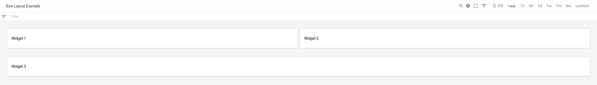
RowLayout資訊主頁
這個資訊主頁會顯示含有三個小工具的 RowLayout。
{
  "displayName": "Row Layout Example",
  "rowLayout": {
    "rows": [
      {
        "weight": "1",
        "widgets": [
          {
            "text": {
              "content": "Widget 1",
              "format": "MARKDOWN"
            }
          },
          {
            "text": {
              "content": "Widget 2",
              "format": "MARKDOWN"
            }
          },
          {
            "text": {
              "content": "Widget 3",
              "format": "MARKDOWN"
            }
          }
        ]
      }
    ]
  }
}
資訊主頁看起來會類似下列範例:
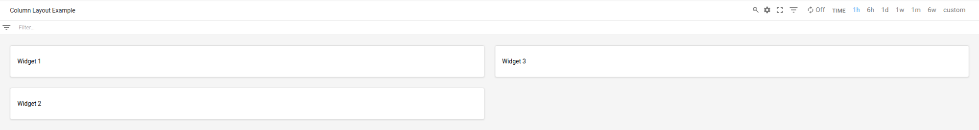
ColumnLayout資訊主頁
這個資訊主頁會顯示 ColumnLayout,內含三個小工具。
{
  "displayName": "Column Layout Example",
  "columnLayout": {
    "columns": [
      {
        "weight": "1",
        "widgets": [
          {
            "text": {
              "content": "Widget 1",
              "format": "MARKDOWN"
            }
          },
          {
            "text": {
              "content": "Widget 2",
              "format": "MARKDOWN"
            }
          },
          {
            "text": {
              "content": "Widget 3",
              "format": "MARKDOWN"
            }
          }
        ]
      }
    ]
  }
}
資訊主頁看起來會類似下列範例:
啟用資訊主頁事件,並新增篩選器和標籤
本節說明如何為資訊主頁新增篩選器和標籤,以及如何設定資訊主頁來顯示事件。
在資訊主頁上啟用事件
您可以在 Dashboard 物件中加入 annotations 欄位,設定要在資訊主頁上顯示事件,例如 Google Kubernetes Engine 更新事件或虛擬機器故障事件。annotations 欄位包含 DashboardAnnotations 物件的執行個體,該物件包含兩個欄位:
「
defaultResourceName」欄位會列出資訊主頁層級的預設值,供您搜尋事件的Google Cloud 專案。如果您未指定這個欄位,系統會搜尋您選取的專案。EventAnnotation物件的陣列。每個物件都包含下列項目:displayName欄位,可讓您定義事件專屬切換按鈕的標籤。如果未指定這個欄位,或這個欄位的值為空白字串,系統會顯示事件的預設名稱。enabled欄位,可控制事件切換鈕的值。當true時,切換鈕會處於on位置,且事件會顯示在資訊主頁上。當false時,切換鈕會處於off位置。eventType欄位,其中包含EventType列舉的值。filter欄位,可讓您指定要附加至事件專屬查詢的查詢。如果這個欄位的值是空字串,系統會使用事件專屬查詢。resourceNames欄位,可讓您定義要搜尋事件的Google Cloud 專案清單。如果這個欄位是空陣列,系統會搜尋所選專案。
以下範例顯示指定 Google Kubernetes Engine 事件的 annotations 欄位:
{
  "displayName": "Annotation example",
  "annotations": {
    "defaultResourceNames": [],
    "eventAnnotations": [
      {
        "displayName": "",
        "enabled": true,
        "eventType": "GKE_CLUSTER_UPDATE",
        "filter": "resource.labels.cluster_name=my-cluster",
        "resourceNames": []
      }
    ]
  },
  "dashboardFilters": [],
  "mosaicLayout": {
  ...
  },
  "labels": {}
}
在前例中,filter 欄位用於將查詢限制在 my-name 叢集。displayName 欄位設為空白字串,因此事件的切換按鈕會顯示事件類型的預設名稱。最後,由於 resourceNames 設為空陣列,系統會查詢目前 Google Cloud 專案中的記錄項目。
新增資訊主頁篩選器和變數
如要控管資訊主頁小工具顯示的資料,可以新增變數和已釘選的篩選器。變數與釘選篩選器不同,變數會套用至特定小工具。
如果您建立已釘選的篩選器或變數,監控功能會更新自訂資訊主頁的工具列,顯示篩選器。如果是已釘選的篩選器,工具列篩選器的名稱就是已釘選的篩選器名稱。如果是變數,工具列篩選條件的名稱是貨幣符號 $,
後方加上變數名稱。每個工具列篩選器都包含一個選單,可讓您變更相關聯的已釘選篩選器或變數值。如果是變數,你可以將工具列篩選器換成資訊主頁小工具。詳情請參閱「資訊主頁與 FilterControl 小工具」。
如要進一步瞭解變數和已釘選的篩選器,以及如何將變數套用至小工具,請參閱「資訊主頁篩選器」。
新增資訊主頁標籤
這個範例顯示 Dashboard 物件,其中指定名為 playbook 的標籤。
{
  "displayName": "Example",
  "mosaicLayout": {
    "columns": 12,
    "tiles": [
      ...
    ]
  },
  "dashboardFilters": [],
  "labels": {
    "playbook": ""
  }
}
如上一個範例所示,labels 欄位會實作為 map,其中 key 和 value 欄位都是字串。為資訊主頁新增標籤時,請將 key 設為標籤名稱,並將 value 欄位設為空字串。
您可以選擇是否要在資訊主頁中新增標籤。
已啟用 Widgets 的資訊主頁
本節包含的資訊主頁範例含有不同類型的 Widget。
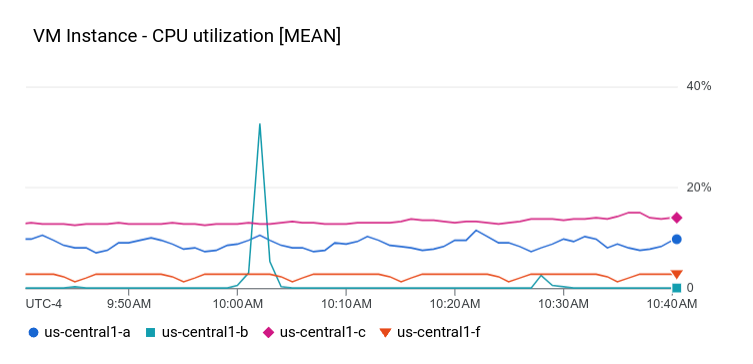
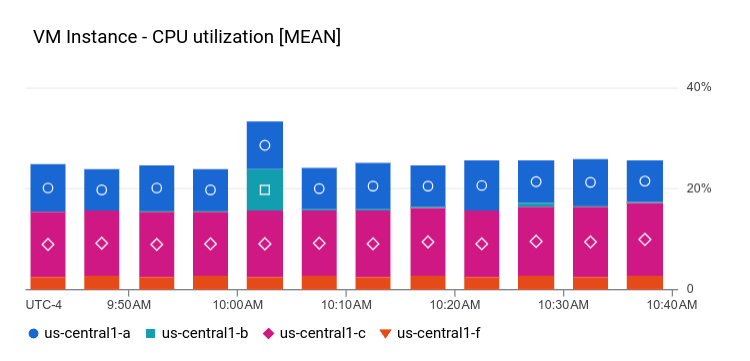
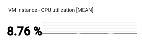
資訊主頁 (含 XyChart)
這個資訊主頁會顯示含有基本 XyChart 的資訊主頁。如果您曾使用 Google Cloud 控制台在資訊主頁上建立圖表,這些圖表就是 XyChart 小工具的執行個體。
這個 API 提供的功能與 Google Cloud 控制台類似,可變更圖表的 PlotType,或設定圖表的檢視模式。
{
  "dashboardFilters": [],
  "displayName": "Example line chart",
  "labels": {},
  "mosaicLayout": {
    "columns": 48,
    "tiles": [
      {
        "height": 16,
        "widget": {
          "title": "VM Instance - CPU utilization [MEAN]",
          "xyChart": {
            "chartOptions": {
              "mode": "COLOR"
            },
            "dataSets": [
              {
                "minAlignmentPeriod": "60s",
                "plotType": "LINE",
                "targetAxis": "Y1",
                "timeSeriesQuery": {
                  "timeSeriesFilter": {
                    "aggregation": {
                      "alignmentPeriod": "60s",
                      "crossSeriesReducer": "REDUCE_MEAN",
                      "groupByFields": [
                        "resource.label.\"zone\""
                      ],
                      "perSeriesAligner": "ALIGN_MEAN"
                    },
                    "filter": "metric.type=\"compute.googleapis.com/instance/cpu/utilization\" resource.type=\"gce_instance\""
                  }
                }
              }
            ],
            "thresholds": [],
            "yAxis": {
              "label": "",
              "scale": "LINEAR"
            }
          }
        },
        "width": 24
      }
    ]
  }
}
資訊主頁上的圖表類似於下列範例:
下一節將說明如何建立可觀測性分析圖表小工具、如何在圖表上顯示門檻,以及如何設定圖表使用的 Y 軸 (左側、右側或兩者皆是)。
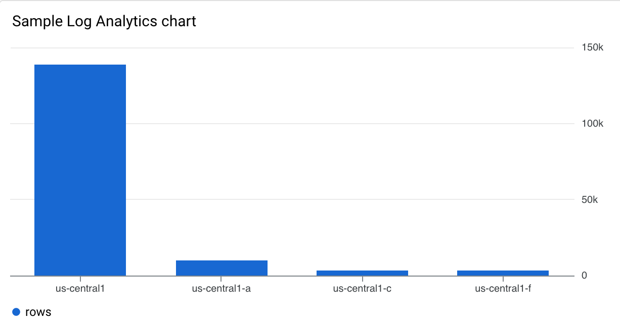
資訊主頁,內含 Observability Analytics 圖表
這個資訊主頁會顯示含有 Observability Analytics 圖表的資訊主頁。範例 JSON 包含 SQL 查詢。
{
  "displayName": "Example",
  "dashboardFilters": [],
  "mosaicLayout": {
    "columns": 48,
    "tiles": [
      {
        "width": 24,
        "height": 16,
        "widget": {
          "title": "Sample analytics chart",
          "xyChart": {
            "chartOptions": {
              "mode": "COLOR"
            },
            "dataSets": [
              {
                "breakdowns": [],
                "dimensions": [
                  {
                    "column": "location",
                    "columnType": "STRING",
                    "maxBinCount": 5,
                    "sortColumn": "location",
                    "sortOrder": "SORT_ORDER_ASCENDING"
                  }
                ],
                "measures": [
                  {
                    "aggregationFunction": {
                      "parameters": [],
                      "type": "count"
                    },
                    "column": ""
                  }
                ],
                "plotType": "STACKED_BAR",
                "targetAxis": "Y1",
                "timeSeriesQuery": {
                  "opsAnalyticsQuery": {
                    "queryHandle": "",
                    "sql": "SELECT\n  CAST(JSON_VALUE(resource.labels.location) AS STRING) AS location,\n  severity,\nFROM\n  `VIEW`"
                  }
                }
              }
            ],
            "thresholds": [],
            "yAxis": {
              "label": "",
              "scale": "LINEAR"
            }
          }
        }
      }
    ]
  },
  "labels": {}
}
資訊主頁上的圖表類似於下列範例:
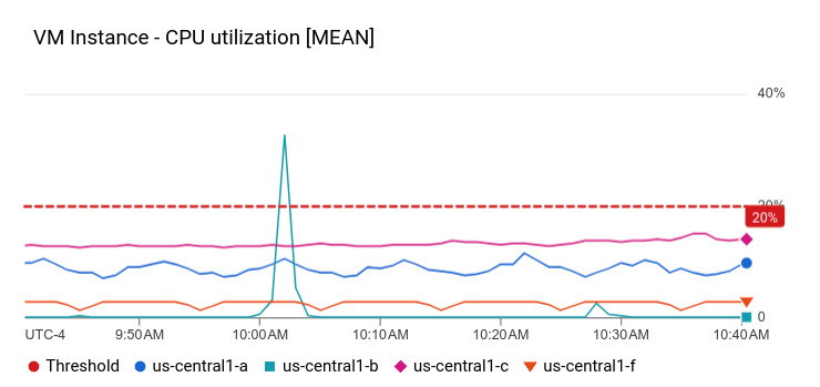
顯示 XyChart 和門檻的資訊主頁
這個資訊主頁顯示含有基本 XyChart、門檻和已設定左側 Y 軸的資訊主頁。
{
  "dashboardFilters": [],
  "displayName": "Example line with threshold",
  "labels": {},
  "mosaicLayout": {
    "columns": 48,
    "tiles": [
      {
        "height": 16,
        "widget": {
          "title": "VM Instance - CPU utilization [MEAN]",
          "xyChart": {
            "chartOptions": {
              "mode": "COLOR"
            },
            "dataSets": [
              {
                "minAlignmentPeriod": "60s",
                "plotType": "LINE",
                "targetAxis": "Y1",
                "timeSeriesQuery": {
                  "timeSeriesFilter": {
                    "aggregation": {
                      "alignmentPeriod": "60s",
                      "crossSeriesReducer": "REDUCE_MEAN",
                      "groupByFields": [
                        "resource.label.\"zone\""
                      ],
                      "perSeriesAligner": "ALIGN_MEAN"
                    },
                    "filter": "metric.type=\"compute.googleapis.com/instance/cpu/utilization\" resource.type=\"gce_instance\""
                  }
                }
              }
            ],
            "thresholds": [
              {
                "label": "",
                "targetAxis": "Y1",
                "value": 0.2
              }
            ],
            "yAxis": {
              "label": "",
              "scale": "LINEAR"
            }
          }
        },
        "width": 24
      }
    ]
  }
}
在上述範例中,JSON 會指定使用左側 Y 軸,因為其中包含 y2Axis 結構。在 targetAxis 欄位中,右側 Y 軸使用「Y1」,左側 Y 軸使用「Y2」。如果省略 targetAxis 欄位,則會使用右側 Y 軸。
這個資訊主頁上的圖表類似於下列範例:
您可以建構圖表,顯示多種指標類型,並使用左右軸。先前的範例說明瞭含有單一指標類型的圖表,也就是 dataSets 陣列中只有一個元素。繪製兩種指標類型時,dataSets 陣列會包含兩個元素,且每個元素都會指定 targetAxis。
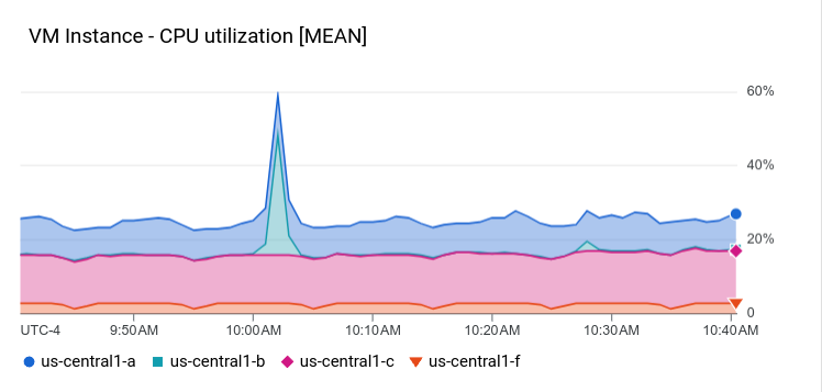
資訊主頁,內含 STACKED_AREA PlotType 的 XyChart
這個資訊主頁會顯示 XyChart,並包含 STACKED_AREA
PlotType。
{
  "dashboardFilters": [],
  "displayName": "Example stacked area",
  "labels": {},
  "mosaicLayout": {
    "columns": 48,
    "tiles": [
      {
        "height": 16,
        "widget": {
          "title": "VM Instance - CPU utilization [MEAN]",
          "xyChart": {
            "chartOptions": {
              "mode": "COLOR"
            },
            "dataSets": [
              {
                "minAlignmentPeriod": "60s",
                "plotType": "STACKED_AREA",
                "targetAxis": "Y1",
                "timeSeriesQuery": {
                  "timeSeriesFilter": {
                    "aggregation": {
                      "alignmentPeriod": "60s",
                      "crossSeriesReducer": "REDUCE_MEAN",
                      "groupByFields": [
                        "resource.label.\"zone\""
                      ],
                      "perSeriesAligner": "ALIGN_MEAN"
                    },
                    "filter": "metric.type=\"compute.googleapis.com/instance/cpu/utilization\" resource.type=\"gce_instance\""
                  }
                }
              }
            ],
            "thresholds": [],
            "yAxis": {
              "label": "",
              "scale": "LINEAR"
            }
          }
        },
        "width": 24
      }
    ]
  }
}
資訊主頁上的圖表類似於下列範例:
資訊主頁,內含 XyChart 和 STACKED_BAR PlotType
這個資訊主頁會顯示 XyChart,並包含 STACKED_BAR
PlotType。
{
  "dashboardFilters": [],
  "displayName": "Example stacked bar",
  "labels": {},
  "mosaicLayout": {
    "columns": 48,
    "tiles": [
      {
        "height": 16,
        "widget": {
          "title": "VM Instance - CPU utilization [MEAN]",
          "xyChart": {
            "chartOptions": {
              "mode": "COLOR"
            },
            "dataSets": [
              {
                "minAlignmentPeriod": "60s",
                "plotType": "STACKED_BAR",
                "targetAxis": "Y1",
                "timeSeriesQuery": {
                  "timeSeriesFilter": {
                    "aggregation": {
                      "alignmentPeriod": "60s",
                      "crossSeriesReducer": "REDUCE_MEAN",
                      "groupByFields": [
                        "resource.label.\"zone\""
                      ],
                      "perSeriesAligner": "ALIGN_MEAN"
                    },
                    "filter": "metric.type=\"compute.googleapis.com/instance/cpu/utilization\" resource.type=\"gce_instance\""
                  }
                }
              }
            ],
            "thresholds": [],
            "yAxis": {
              "label": "",
              "scale": "LINEAR"
            }
          }
        },
        "width": 24
      }
    ]
  }
}
資訊主頁看起來會類似下列範例:
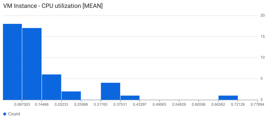
資訊主頁,其中 XyChart 設定為直方圖
如要以直方圖形式查看最新資料,請設定 DataSet.dimensions 陣列,這是 XyChart 中的欄位。直方圖會提供多個時間序列最新值的相對頻率資訊,也就是說,x 軸會依「值區」建立索引,每個值區都對應到一個值範圍。y 軸會指定「計數」,也就是值位於值區範圍內的樣本數。
如要設定直方圖,請在 XyChart 結構中執行下列操作:
- 將
DataSet.plotType欄位設為"STACKED_BAR"。 - 將
DataSet.dimension.column欄位設為"metric_value"。
如要控管 bin 模型,而不是讓 Cloud Monitoring 根據資料決定 bin,請在 DataSet.dimension 結構中加入下列欄位:
xMin和xMax:設為指標類型的最小值和最大值。maxBinCount或numericBinSize:設定特徵分塊數量或特徵分塊大小。如果設定特徵分塊數量,建議值至少為 5,但不超過 50。特徵分塊數量上限為 1000。
下列 JSON 說明使用直方圖視覺化效果顯示資料的資訊主頁:
{
  "displayName": "Histogram example",
  "dashboardFilters": [],
  "description": "",
  "labels": {},
  "mosaicLayout": {
    "columns": 48,
    "tiles": [
      {
        "height": 16,
        "width": 24,
        "widget": {
          "title": "VM Instance - CPU utilization [MEAN]",
          "xyChart": {
            "chartOptions": {
              "displayHorizontal": false,
              "mode": "COLOR"
            },
            "dataSets": [
              {
                "dimensions": [
                  {
                    "column": "metric_value"
                  }
                ],
                "minAlignmentPeriod": "60s",
                "plotType": "STACKED_BAR",
                "targetAxis": "Y1",
                "timeSeriesQuery": {
                  "timeSeriesFilter": {
                    "aggregation": {
                      "alignmentPeriod": "60s",
                      "groupByFields": [],
                      "perSeriesAligner": "ALIGN_MEAN"
                    },
                    "filter": "metric.type=\"compute.googleapis.com/instance/cpu/utilization\" resource.type=\"gce_instance\""
                  }
                }
              }
            ],
            "thresholds": [],
            "yAxis": {
              "scale": "LINEAR"
            }
          }
        }
      }
    ]
  }
}
dataSets.dimensions 欄位會導致 XyChart 顯示為直方圖。範例資訊主頁中的直方圖使用預設設定,因此 dimension 欄位包含一個子欄位 "column": "metric_value"。
下方的螢幕截圖顯示設定為直方圖的 XyChart:
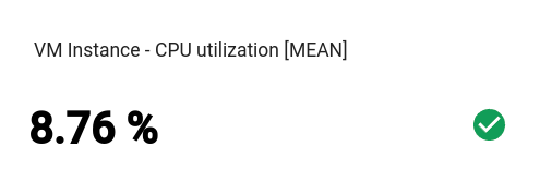
資訊主頁,內含基本 Scorecard
這個資訊主頁會顯示Scorecard,但沒有量表或走勢圖。這個範例顯示 Compute Engine CPU 使用率,而計分卡有兩個門檻。其中一個門檻使用黃色表示 CPU 使用率超過 70%,另一個門檻則使用紅色表示 CPU 使用率超過 90%。
由於目前的 CPU 使用率低於指定門檻,因此顏色為綠色。
{
  "dashboardFilters": [],
  "displayName": "Example-basic scorecard",
  "labels": {},
  "mosaicLayout": {
    "columns": 48,
    "tiles": [
      {
        "height": 8,
        "widget": {
          "scorecard": {
            "thresholds": [
              {
                "color": "YELLOW",
                "direction": "ABOVE",
                "label": "",
                "value": 0.7
              },
              {
                "color": "RED",
                "direction": "ABOVE",
                "label": "",
                "value": 0.9
              }
            ],
            "timeSeriesQuery": {
              "outputFullDuration": true,
              "timeSeriesFilter": {
                "aggregation": {
                  "alignmentPeriod": "60s",
                  "crossSeriesReducer": "REDUCE_MEAN",
                  "groupByFields": [],
                  "perSeriesAligner": "ALIGN_MEAN"
                },
                "filter": "metric.type=\"compute.googleapis.com/instance/cpu/utilization\" resource.type=\"gce_instance\""
              }
            }
          },
          "title": "VM Instance - CPU utilization [MEAN]"
        },
        "width": 16
      }
    ]
  }
}
這些小工具可以顯示多個評量表。舉例來說,如果匯總設定產生三個時間序列,這個小工具就會顯示三張計分卡,每個時間序列各一張。
資訊主頁看起來會類似下列範例:
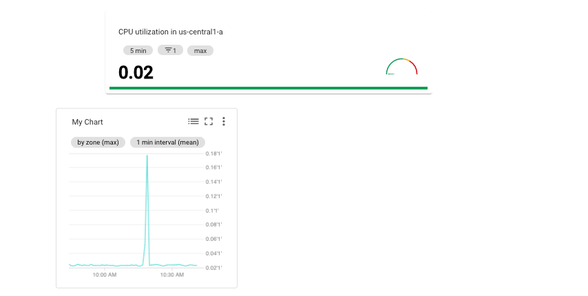
資訊主頁,內含 Scorecard 和 GaugeView
這個資訊主頁會在先前範例的基本評量表中新增量表。
GaugeView 物件可指定上限和下限,以指定要在儀表上顯示的值範圍。由於評分表顯示的值介於 0 到 1 之間,因此這些上下限是合理的。如要新增指標,請在基本評量表的 JSON 中加入下列內容:
  "gaugeView": {
    "lowerBound": 0,
    "upperBound": 1,
  },
以下顯示完整的修改後資訊主頁規格:目前值低於門檻,因此儀表板會以適當顏色顯示。
{
  "dashboardFilters": [],
  "displayName": "Example-Gauge",
  "labels": {},
  "mosaicLayout": {
    "columns": 48,
    "tiles": [
      {
        "height": 8,
        "widget": {
          "scorecard": {
            "gaugeView": {
              "lowerBound": 0,
              "upperBound": 1
            },
            "thresholds": [
              {
                "color": "YELLOW",
                "direction": "ABOVE",
                "label": "",
                "value": 0.7
              },
              {
                "color": "RED",
                "direction": "ABOVE",
                "label": "",
                "value": 0.9
              }
            ],
            "timeSeriesQuery": {
              "outputFullDuration": true,
              "timeSeriesFilter": {
                "aggregation": {
                  "alignmentPeriod": "60s",
                  "crossSeriesReducer": "REDUCE_SUM",
                  "groupByFields": [
                    "resource.labels.\"zone\""
                  ],
                  "perSeriesAligner": "ALIGN_MEAN"
                },
                "filter": "metric.type=\"compute.googleapis.com/instance/cpu/utilization\" resource.type=\"gce_instance\""
              }
            }
          },
          "title": "VM Instance - CPU utilization [MEAN]"
        },
        "width": 16
      }
    ]
  }
}
這些小工具可以顯示多個計量表。舉例來說,以下螢幕截圖顯示已設定 GaugeView 的 Scorecard 小工具,而該小工具顯示了三個計量表:
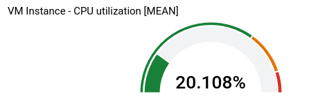
小工具顯示的指標數量取決於匯總設定。在這個範例中,匯總設定會產生三個時間序列,因此會顯示三個指標。您可以在小工具層級定義閾值,因此這些閾值會套用至每個時間序列。在本例中,一個計量表為紅色,一個為琥珀色,第三個則為綠色。
資訊主頁,內含 Scorecard 和 SparkChartView
這個資訊主頁會以走勢圖取代上一個範例中的量表。SparkChartView 物件可以在計分卡上建立折線圖或長條圖。這個範例使用折線圖。只要值未違反門檻,就會顯示為綠色。如要新增走勢圖,請將上一個圖表中的 gaugeView JSON 物件替換為下列內容:
  "sparkChartView": {
    "sparkChartType": "SPARK_LINE"
  },
評分表如下所示:
含有 PieChart 小工具的資訊主頁
資訊主頁可使用圓餅圖顯示資料。每個時間序列都會在圓餅圖中佔據一個切片。圓餅圖不會顯示一段時間內的資料,只會顯示最新值。
所有圓餅圖都是由 PieChart 小工具指定。
如要設定圖表,顯示最近一次測量的總和,請將 chartType 欄位設為 DONUT。否則,請將這個欄位設為 PIE 的值。
"pieChart": {
  "chartType": "DONUT",
},
以下範例會設定含有兩個圓餅圖的資訊主頁,其中一個圓餅圖會設定為圓環圖:
{
  "dashboardFilters": [],
  "displayName": "Example Pie Donut",
  "labels": {},
  "mosaicLayout": {
    "columns": 48,
    "tiles": [
      {
        "height": 16,
        "widget": {
          "pieChart": {
            "chartType": "DONUT",
            "dataSets": [
              {
                "minAlignmentPeriod": "60s",
                "timeSeriesQuery": {
                  "timeSeriesFilter": {
                    "aggregation": {
                      "alignmentPeriod": "60s",
                      "perSeriesAligner": "ALIGN_RATE"
                    },
                    "filter": "metric.type=\"compute.googleapis.com/instance/disk/read_bytes_count\" resource.type=\"gce_instance\"",
                    "secondaryAggregation": {
                      "alignmentPeriod": "60s",
                      "perSeriesAligner": "ALIGN_MEAN"
                    }
                  }
                }
              }
            ]
          },
          "title": "VM Instance - Disk read bytes [MEAN]"
        },
        "width": 24
      },
      {
        "height": 16,
        "widget": {
          "pieChart": {
            "chartType": "PIE",
            "dataSets": [
              {
                "minAlignmentPeriod": "60s",
                "timeSeriesQuery": {
                  "timeSeriesFilter": {
                    "aggregation": {
                      "alignmentPeriod": "60s",
                      "perSeriesAligner": "ALIGN_RATE"
                    },
                    "filter": "metric.type=\"compute.googleapis.com/instance/disk/read_bytes_count\" resource.type=\"gce_instance\"",
                    "secondaryAggregation": {
                      "alignmentPeriod": "60s",
                      "perSeriesAligner": "ALIGN_MEAN"
                    }
                  }
                }
              }
            ]
          },
          "title": "VM Instance - Disk read bytes [MEAN]"
        },
        "width": 24,
        "xPos": 24
      },
    ]
  }
}
如下列螢幕截圖所示,兩個小工具都會以圓餅圖顯示資料,其中一個小工具會顯示最近值的總和:

含有 Treemap 小工具的資訊主頁
如要以一系列巢狀矩形顯示最新資料,其中每個矩形對應一組不重複的標籤值,請新增樹狀圖。假設您已依 zone 標籤匯總要繪製的資料。如果將小工具類型設為樹狀圖,樹狀圖上的每個矩形就會對應一個區域。矩形的色彩飽和度與代表的值成正比。
瀏覽樹狀圖時,請使用指標啟用矩形的工具提示。
下列 JSON 會設定 Treemap 小工具,依區域和儲存空間類型匯總時間序列:
{
  "displayName": "Example Treemap",
  "dashboardFilters": [],
  "labels": {},
  "mosaicLayout": {
    "columns": 48,
    "tiles": [
      {
        "xPos": 24,
        "height": 16,
        "width": 24,
        "widget": {
          "title": "VM Instance - Write read bytes [SUM]",
          "id": "",
          "treemap": {
            "dataSets": [
              {
                "breakdowns": [],
                "measures": [],
                "timeSeriesQuery": {
                  "outputFullDuration": true,
                  "timeSeriesFilter": {
                    "aggregation": {
                      "alignmentPeriod": "60s",
                      "crossSeriesReducer": "REDUCE_SUM",
                      "groupByFields": [
                        "resource.label.\"zone\"",
                        "metric.label.\"storage_type\""
                      ],
                      "perSeriesAligner": "ALIGN_RATE"
                    },
                    "filter": "metric.type=\"compute.googleapis.com/instance/disk/write_bytes_count\" resource.type=\"gce_instance\""
                  },
                  "unitOverride": ""
                }
              }
            ],
            "treemapHierarchy": [
              "resource.label.\"zone\"",
              "metric.label.\"storage_type\""
            ]
          }
        }
      }
    ]
  }
}
下方的螢幕截圖顯示了採用上述設定的樹狀圖小工具:
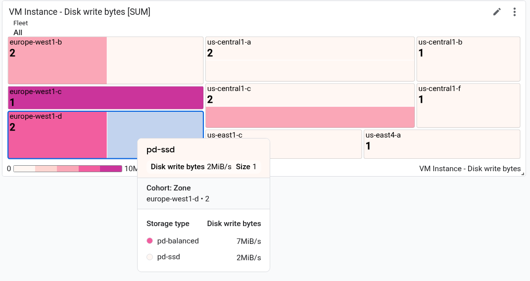
在螢幕截圖中,一個矩形顯示工具提示。
含有 TimeSeriesTable 小工具的資訊主頁
資訊主頁可以表格格式顯示資料,其中每個不重複的標籤值組合各佔一行。表格不會顯示一段時間內的資料,而是顯示最新值或匯總值。
所有資料表都由 TimeSeriesTable 小工具指定:
如要設定顯示的時間序列,請使用
dataSets欄位。dataSets陣列中的每個物件都對應至單一指標類型。如果您查詢多個指標類型, Google Cloud 控制台會嘗試在同一資料列中顯示每個查詢的最新值。詳情請參閱「表格如何合併多個指標類型的資料」。TimeSeriesQuery欄位會指定指標類型。- 如要讓表格顯示匯總值 (資料會根據資訊主頁設定的時間範圍值匯總),請將
timeSeriesQuery.outputFullDuration欄位設為true。
如要設定顯示的資料列數量上限,請設定
pickTimeSeriesFilter欄位。舉例來說,如要只顯示過去 10 分鐘內平均值最大的兩個時間序列,請加入下列項目:"pickTimeSeriesFilter": { "direction": "TOP", "numTimeSeries": 2, "rankingMethod": "METHOD_MEAN" },如果省略
pickTimeSeriesFilter欄位,表格最多會顯示 300 列。如要設定表格顯示資料的方式,請使用
metricVisualization欄位:- 如要只顯示「25%」等值,請省略這個欄位或將值設為
"NUMBER"。使用這項設定時,Google Cloud 控制台會將小工具顯示為「表格」小工具。 - 如要顯示值,以及與可能值範圍相比的值的視覺指標,請將這個欄位的值設為
"BAR"。使用這項設定時,Google Cloud 控制台會將小工具顯示為「Top List」小工具。
- 如要只顯示「25%」等值,請省略這個欄位或將值設為
如要設定顯示的資料欄和資料欄的屬性,請使用
columnSettings陣列。如未指定這個欄位,表格會為每個標籤顯示一欄。"column"欄位的值必須設為標籤鍵或value,這會參照時間序列的最新值。您可以設定資料欄的顯示名稱,也可以設定表格儲存格內資料的對齊方式:- 如要自訂欄標題,請設定
displayName欄位。 - 如要根據最新值與門檻的比較結果,為顯示最新值的儲存格上色,請新增
thresholds物件。 - 如要變更文字對齊方式,請新增
alignment欄位。
以下範例說明兩個資料欄:
"columnSettings": [ { "column": "device_name", "displayName": "Device", "visible": true }, { "alignment": "CENTER", "column": "value", "displayName": "Disk Write Bytes", "thresholds": [ { "color": "YELLOW", "direction": "ABOVE", "value": 4000 }, { "color": "RED", "direction": "ABOVE", "value": 5000 } ], "visible": true } ],- 如要自訂欄標題,請設定
下列 JSON 說明含有兩個表格的資訊主頁。第一個表格會顯示兩種指標類型:從執行個體讀取的位元組數,以及寫入執行個體的位元組數。表格會顯示匯總值和參考長條。第二個表格會顯示一種指標類型的最新值,且表格已設定值資料欄,可根據值與門檻的比較結果,為儲存格加上顏色代碼:
{
  "displayName": "Example",
  "mosaicLayout": {
    "columns": 48,
    "tiles": [
      {
        "width": 44,
        "height": 17,
        "widget": {
          "title": "VM Instance - Disk read bytes [RATE], Disk write bytes [RATE]",
          "timeSeriesTable": {
            "dataSets": [
              {
                "timeSeriesQuery": {
                  "timeSeriesFilter": {
                    "filter": "metric.type=\"compute.googleapis.com/instance/disk/read_bytes_count\" resource.type=\"gce_instance\"",
                    "aggregation": {
                      "alignmentPeriod": "60s",
                      "perSeriesAligner": "ALIGN_RATE",
                      "groupByFields": []
                    },
                    "pickTimeSeriesFilter": {
                      "rankingMethod": "METHOD_MEAN",
                      "numTimeSeries": 30,
                      "direction": "TOP"
                    }
                  },
                  "unitOverride": "",
                  "outputFullDuration": true
                },
                "tableTemplate": "",
                "minAlignmentPeriod": "60s"
              },
              {
                "timeSeriesQuery": {
                  "timeSeriesFilter": {
                    "filter": "metric.type=\"compute.googleapis.com/instance/disk/write_bytes_count\" resource.type=\"gce_instance\"",
                    "aggregation": {
                      "alignmentPeriod": "60s",
                      "perSeriesAligner": "ALIGN_RATE",
                      "groupByFields": []
                    },
                    "pickTimeSeriesFilter": {
                      "rankingMethod": "METHOD_MEAN",
                      "numTimeSeries": 30,
                      "direction": "TOP"
                    }
                  },
                  "unitOverride": "",
                  "outputFullDuration": true
                },
                "tableTemplate": "",
                "minAlignmentPeriod": "60s"
              }
            ],
            "metricVisualization": "BAR",
            "columnSettings": [
              {
                "column": "Name (from instance_id)",
                "visible": true
              },
              {
                "column": "zone",
                "visible": true
              },
              {
                "column": "device_name",
                "visible": true
              },
              {
                "column": "storage_type",
                "visible": true
              },
              {
                "column": "device_type",
                "visible": true
              },
              {
                "column": "value",
                "visible": true,
                "displayName": "Read bytes"
              },
              {
                "column": "value-1",
                "visible": true,
                "displayName": "Written bytes"
              }
            ],
            "opsAnalyticsSettings": {
              "maxRows": "0",
              "showFilterBar": false,
              "pageSize": "0"
            },
            "displayColumnType": false
          },
          "id": ""
        }
      },
      {
        "yPos": 17,
        "width": 44,
        "height": 16,
        "widget": {
          "title": "VM Instance - Disk write bytes [RATE]",
          "timeSeriesTable": {
            "columnSettings": [
              {
                "column": "device_name",
                "displayName": "Device",
                "visible": true
              },
              {
                "alignment": "LEFT",
                "column": "instance_name",
                "displayName": "Instance name",
                "visible": true
              },
              {
                "column": "storage_type",
                "displayName": "Storage type",
                "visible": true
              },
              {
                "column": "device_type",
                "displayName": "Device Type",
                "visible": true
              },
              {
                "alignment": "CENTER",
                "column": "value",
                "displayName": "Disk Write Bytes",
                "thresholds": [
                  {
                    "color": "YELLOW",
                    "direction": "ABOVE",
                    "label": "",
                    "value": 4000
                  },
                  {
                    "color": "RED",
                    "direction": "ABOVE",
                    "label": "",
                    "value": 5000
                  }
                ],
                "visible": true
              },
              {
                "alignment": "LEFT",
                "column": "Name (from instance_id)",
                "displayName": "ID",
                "visible": true
              }
            ],
            "dataSets": [
              {
                "minAlignmentPeriod": "60s",
                "timeSeriesQuery": {
                  "timeSeriesFilter": {
                    "aggregation": {
                      "alignmentPeriod": "60s",
                      "perSeriesAligner": "ALIGN_RATE"
                    },
                    "filter": "metric.type=\"compute.googleapis.com/instance/disk/write_bytes_count\" resource.type=\"gce_instance\""
                  }
                }
              }
            ],
            "displayColumnType": false,
            "metricVisualization": "NUMBER",
            "opsAnalyticsSettings": {
              "maxRows": "0",
              "pageSize": "0",
              "showFilterBar": false
            }
          }
        }
      }
    ]
  },
  "dashboardFilters": [],
  "labels": {}
}
下圖說明先前定義的資料表:

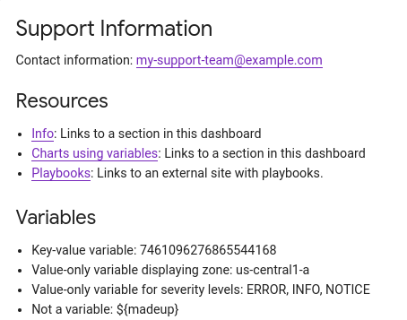
含有 Text 小工具的資訊主頁
這個範例顯示含有 Text 小工具的資訊主頁。
{
  "dashboardFilters": [],
  "displayName": "DB2+TE",
  "labels": {},
  "mosaicLayout": {
    "columns": 48,
    "tiles": [
    ...
      {
        "height": 16,
        "widget": {
          "text": {
            "content": "# Support information\n\n\nContact information: my-support-team@example.com\nOnline help: [Playbooks](https://example.com)\n\n",
            "format": "MARKDOWN",
            "style": {
              "backgroundColor": "",
              "fontSize": "FS_LARGE",
              "horizontalAlignment": "H_LEFT",
              "padding": "P_EXTRA_SMALL",
              "textColor": "",
              "verticalAlignment": "V_TOP"
            }
          }
        },
        "width": 24,
        "yPos": 14
      }
    ]
  }
}
文字小工具看起來類似下列範例:
含有 AlertChart 小工具的資訊主頁
這個資訊主頁會顯示含有 AlertChart 小工具的資訊主頁:
{
  "category": "CUSTOM",
  "displayName": "Alerting policy chart example",
  "mosaicLayout": {
    "columns": 12,
    "tiles": [
      {
        "height": 4,
        "widget": {
          "alertChart": {
            "name": "projects/my-project/alertPolicies/14205854094151528373"
          }
        },
        "width": 6,
      }
    ]
  }
}
與其他資訊主頁小工具不同,您不必為這些小工具指定標題或指標篩選器,而是指定警告政策的資源名稱。name 欄位的最後一個項目是警告政策 ID。
資訊主頁上的圖表類似於下列範例:
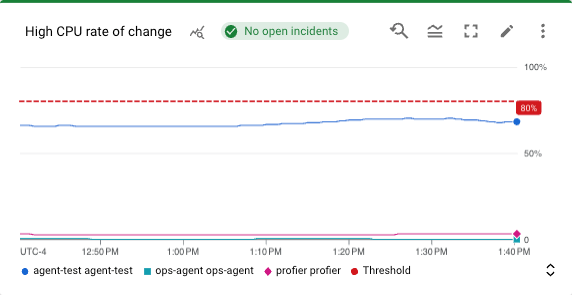
在這個範例中,警告政策會監控兩部不同虛擬機器的 CPU 使用率。虛線顯示條件門檻,設為 50%。標籤為 No incidents 的綠色方塊表示警告政策沒有未解決的事件。如果將指標放在事件方塊上,系統會開啟對話方塊,連結至基礎警告政策。
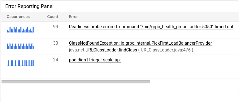
含有 ErrorReportingPanel 小工具的資訊主頁
這個資訊主頁會顯示含有 ErrorReportingPanel 小工具的資訊主頁:
{
  "dashboardFilters": [],
  "displayName": "Error reporting widget",
  "labels": {},
  "mosaicLayout": {
    "columns": 48,
    "tiles": [
      {
        "height": 16,
        "widget": {
          "errorReportingPanel": {
            "projectNames": [
              "projects/my-project"
            ],
            "services": [],
            "versions": []
          },
          "title": "Error Reporting Panel"
        },
        "width": 24,
      }
    ]
  }
}
建議您將錯誤報告面板的高度設為至少 16 個單位,寬度則設為至少 24 個單位。在先前的範例中,小工具的高度為 16 個單位,寬度為 24 個單位。
錯誤報告面板會顯示所選專案的錯誤群組,並可將錯誤群組限制為特定資源類型、服務或服務版本。下例說明錯誤報告面板:
含有 FilterControl 小工具的資訊主頁
建立變數後,Monitoring 會更新自訂資訊主頁的工具列,顯示該變數的篩選器。篩選器名稱為美元符號 $,後方加上變數名稱。例如,$my-variable。每個篩選器都包含一個選單,可讓您變更變數的值。
使用工具列篩選器管理變數值可能不是最佳做法。舉例來說,假設您有一個含有許多圖表的資訊主頁,而您有一個變數只適用於兩個圖表。在這種情況下,您可以採取下列做法:
- 在資訊主頁中新增
CollapsibleGroup小工具,然後將這兩個圖表放入群組。 在資訊主頁中新增
FilterControl小工具。設定這個小工具的變數,並將小工具加入群組。群組小工具包含
FilterControl小工具,可讓您變更變數的值,以及變數套用的目標小工具。此外,資訊主頁工具列不會再顯示變數的篩選條件。
下列資訊主頁包含 FilterControl 小工具:
{
  "displayName": "Dashboard with filter control widget",
  "dashboardFilters": [
    {
      "filterType": "RESOURCE_LABEL",
      "labelKey": "project_id",
      "stringValue": "my-project",
      "templateVariable": "proj",
      "valueType": "STRING"
    }
  ],
  "description": "",
  "labels": {},
  "mosaicLayout": {
    "columns": 48,
    "tiles": [
      {
        "yPos": 70,
        "height": 5,
        "width": 16,
        "widget": {
          "title": "Project control",
          "filterControl": {
            "templateVariable": "proj"
          }
        }
      }
    ]
  }
}
上一個範例定義了一個變數 proj,並新增一個 FilterControl 小工具。完成這項設定後,變數選單會從資訊主頁工具列移至名為「Project control」的小工具。該小工具包含選單,可用於選取專案。
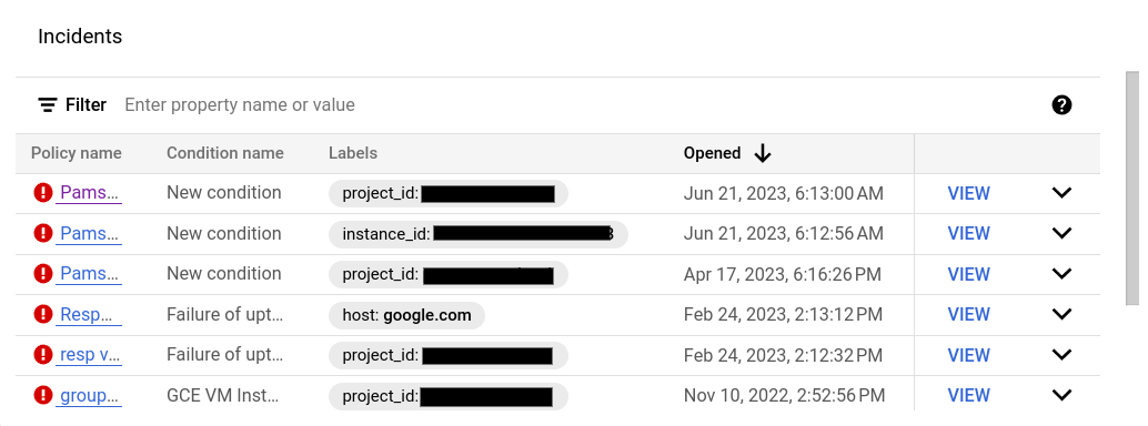
含有 IncidentList 小工具的資訊主頁
這個資訊主頁會顯示含有 IncidentList 小工具的資訊主頁:
{
  "category": "CUSTOM",
  "dashboardFilters": [],
  "displayName": "Incident widget",
  "labels": {},
  "mosaicLayout": {
    "columns": 12,
    "tiles": [
      {
        "height": 5,
        "widget": {
          "incidentList": {
            "monitoredResources": [],
            "policyNames": []
          },
          "title": "Incidents"
        },
        "width": 8,
        "xPos": 0,
        "yPos": 0
      }
    ]
  }
}
上例將 title 欄位設為 Incidents,並將小工具設定為顯示 gce_instance 類型資源的所有事件。設定這個小工具時,您可以選取多項快訊政策或多種資源類型。
資訊主頁上的事件小工具如下所示:
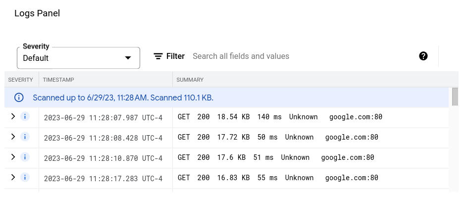
含有 LogsPanel 小工具的資訊主頁
這個資訊主頁會顯示含有 LogsPanel 小工具的資訊主頁:
{
  "category": "CUSTOM",
  "displayName": "Logs Panel",
  "mosaicLayout": {
    "columns": 12,
    "tiles": [
      {
        "height": 4,
        "widget": {
          "logsPanel": {
            "filter": "",
            "resourceNames": [
              "projects/012012012012"
            ]
          },
          "title": "Logs Panel"
        },
        "width": 6,
        "xPos": 0,
        "yPos": 0
      }
    ]
  }
}
建議您將記錄面板的高度設為至少 3 個單位,寬度則設為至少 4 個單位。在先前的範例中,小工具的高度為 4 個單位,寬度為 6 個單位。
記錄面板會顯示 resourceNames 欄位中列出的 Google Cloud 專案記錄。上一個範例只指定一個專案,但您可以在這個清單中加入多個專案。
記錄面板看起來類似以下範例:
如需疑難排解資訊,請參閱「API 呼叫以建立包含記錄面板的資訊主頁失敗」。
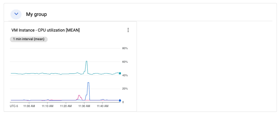
含有 CollapsibleGroup 小工具的資訊主頁
這個資訊主頁會顯示含有 CollapsibleGroup 小工具的資訊主頁:
{
  "category": "CUSTOM",
  "displayName": "Group testing",
  "mosaicLayout": {
    "columns": 12,
    "tiles": [
      {
        "height": 4,
        "widget": {
          "collapsibleGroup": {
            "collapsed": false
          },
          "title": "My group"
        },
        "width": 12,
        "xPos": 0,
        "yPos": 0
      },
      {
        "height": 4,
        "widget": {
          "title": "VM Instance - CPU utilization [MEAN]",
          "xyChart": {
            "chartOptions": {
              "mode": "COLOR"
            },
            "dataSets": [
              {
                "minAlignmentPeriod": "60s",
                "plotType": "LINE",
                "targetAxis": "Y1",
                "timeSeriesQuery": {
                  "apiSource": "DEFAULT_CLOUD",
                  "timeSeriesFilter": {
                    "aggregation": {
                      "alignmentPeriod": "60s",
                      "crossSeriesReducer": "REDUCE_NONE",
                      "perSeriesAligner": "ALIGN_MEAN"
                    },
                    "filter": "metric.type=\"compute.googleapis.com/instance/cpu/utilization\" resource.type=\"gce_instance\"",
                    "secondaryAggregation": {
                      "alignmentPeriod": "60s",
                      "crossSeriesReducer": "REDUCE_NONE",
                      "perSeriesAligner": "ALIGN_NONE"
                    }
                  }
                }
              }
            ],
            "thresholds": [],
            "timeshiftDuration": "0s",
            "yAxis": {
              "label": "y1Axis",
              "scale": "LINEAR"
            }
          }
        },
        "width": 6,
        "xPos": 0,
        "yPos": 0
      }
    ]
  }
}
在先前的範例中,可收合群組小工具包含單一圖表,顯示 VM 執行個體的 CPU 使用率。可收合群組小工具會跨越表格的整列。當群組的 (x,y) 位置和高度規格包含小工具的 (x,y) 位置時,小工具就會納入群組。在先前的範例中,群組位於 (0,0) 位置,高度為 4。xyChart 位於 (0,0) 位置,因此會納入群組。不過,如果該圖表的位置變更為 (0,5),圖表就會從群組中排除。最後,當小工具的 (x,y) 位置導致小工具納入群組時,可收合群組小工具的高度可能會擴展。
如要在資訊主頁上加入群組小工具,資訊主頁必須有 MosaicLayout。
可收合群組小工具看起來會像下列範例:
含有 SingleViewGroup 小工具的資訊主頁
SingleViewGroup 小工具一次會顯示群組中的一個成員。您可以指定群組中的圖表和其他小工具。此外,您也可以使用 SingleViewGroup 小工具上的選單,控制要顯示群組中的哪個小工具。
SingleViewGroup 小工具支援兩種顯示樣式:DROPDOWN 和 TAB。這兩種樣式的差異在於如何選取要顯示的群組成員。DROPDOWN 樣式的小工具會提供選單,TAB 樣式的小工具則會在工具列上提供分頁標籤:
{
  "dashboardFilters": [],
  "displayName": "Example",
  "labels": {},
  "mosaicLayout": {
    "columns": 48,
    "tiles": [
      {
        "height": 16,
        "widget": {
          "singleViewGroup": {
            "displayType": "DROPDOWN"
          },
          "title": "Untitled group"
        },
        "width": 24,
        "yPos": 16
      },
      {
        "height": 16,
        "widget": {
          "title": "VM Instance - Disk read bytes [RATE]",
          "xyChart": {
            "chartOptions": {
              "mode": "COLOR"
            },
            "dataSets": [
              {
                "minAlignmentPeriod": "60s",
                "plotType": "LINE",
                "targetAxis": "Y1",
                "timeSeriesQuery": {
                  "timeSeriesFilter": {
                    "aggregation": {
                      "alignmentPeriod": "60s",
                      "perSeriesAligner": "ALIGN_RATE"
                    },
                    "filter": "metric.type=\"compute.googleapis.com/instance/disk/read_bytes_count\" resource.type=\"gce_instance\""
                  }
                }
              }
            ],
            "thresholds": [],
            "yAxis": {
              "label": "",
              "scale": "LINEAR"
            }
          }
        },
        "width": 24,
        "yPos": 16
      },
      {
        "height": 16,
        "widget": {
          "title": "VM Instance - Disk write bytes [RATE]",
          "xyChart": {
            "chartOptions": {
              "mode": "COLOR"
            },
            "dataSets": [
              {
                "minAlignmentPeriod": "60s",
                "plotType": "LINE",
                "targetAxis": "Y1",
                "timeSeriesQuery": {
                  "timeSeriesFilter": {
                    "aggregation": {
                      "alignmentPeriod": "60s",
                      "perSeriesAligner": "ALIGN_RATE"
                    },
                    "filter": "metric.type=\"compute.googleapis.com/instance/disk/write_bytes_count\" resource.type=\"gce_instance\""
                  }
                }
              }
            ],
            "thresholds": [],
            "yAxis": {
              "label": "",
              "scale": "LINEAR"
            }
          }
        },
        "width": 24,
        "yPos": 16
      }
    ]
  }
}
如上例所示,tiles 陣列包含一個 SingleViewGroup 物件,但該物件未指定所含物件。而是由 width 和 yPos 欄位的值決定 SingleViewGroup 物件的成員資格。width 和 yPos 欄位值與 SingleViewGroup 物件值相符的物件,會包含在 SingleViewGroup 物件中。在上例中,SingleViewGroup 物件包含兩個圖表。
含有 SectionHeader 小工具的資訊主頁
SectionHeader 小工具會在資訊主頁中建立水平分隔線,並在資訊主頁的目錄中建立項目。您可以自訂目錄中的項目,並在小工具中加入其他資訊。您也可以設定小工具,在目錄的章節標題項目後方加入分隔線。
這個資訊主頁顯示含有單一圖表和 SectionHeader 小工具的資訊主頁:
{
  "dashboardFilters": [],
  "displayName": "Example",
  "labels": {},
  "mosaicLayout": {
    "columns": 48,
    "tiles": [
      {
        "height": 16,
        "widget": {
          "title": "VM Instance - Disk write bytes [RATE]",
          "xyChart": {
            "chartOptions": {
              "mode": "COLOR"
            },
            "dataSets": [
              {
                "minAlignmentPeriod": "60s",
                "plotType": "LINE",
                "targetAxis": "Y1",
                "timeSeriesQuery": {
                  "timeSeriesFilter": {
                    "aggregation": {
                      "alignmentPeriod": "60s",
                      "perSeriesAligner": "ALIGN_RATE"
                    },
                    "filter": "metric.type=\"compute.googleapis.com/instance/disk/write_bytes_count\" resource.type=\"gce_instance\""
                  }
                }
              }
            ],
            "thresholds": [],
            "yAxis": {
              "label": "",
              "scale": "LINEAR"
            }
          }
        },
        "width": 24,
        "yPos": 4
      },
      {
        "height": 4,
        "widget": {
          "sectionHeader": {
            "dividerBelow": true,
            "subtitle": "Instance metrics"
          },
          "title": "Metrics"
        },
        "width": 48
      }
    ]
  }
}
在 SectionHeader 物件中,title 欄位的值會顯示在小工具和目錄中。subtitle 欄位的值只會顯示在小工具中。如果 dividerBelow 的值為 true,目錄中就會新增分隔線。
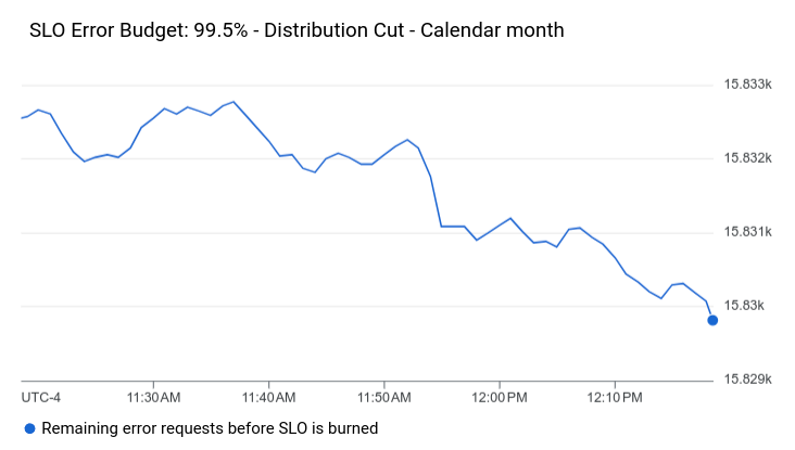
含有服務等級目標小工具的資訊主頁
這個資訊主頁會顯示含有 SLO 小工具的資訊主頁:
{
  "dashboardFilters": [],
  "displayName": "Example",
  "labels": {},
  "mosaicLayout": {
    "columns": 48,
    "tiles": [
      {
        "height": 16,
        "widget": {
          "title": "SLO Error Budget: 99.5% - Distribution Cut - Calendar month",
          "xyChart": {
            "chartOptions": {
              "mode": "COLOR"
            },
            "dataSets": [
              {
                "breakdowns": [],
                "dimensions": [],
                "legendTemplate": "Remaining error requests before SLO is burned",
                "measures": [],
                "plotType": "LINE",
                "targetAxis": "Y1",
                "timeSeriesQuery": {
                  "timeSeriesFilter": {
                    "aggregation": {
                      "perSeriesAligner": "ALIGN_NEXT_OLDER"
                    },
                    "filter": "select_slo_budget(\"projects/Project_Number/services/SERVICE_ID/serviceLevelObjectives/SLO_ID\")",
                  },
                  "unitOverride": "1"
                }
              }
            ],
            "thresholds": []
          }
        },
        "width": 24
      }
    ]
  }
}
如先前的 JSON 所示,SLO 圖表會以 XyChart 物件表示。這些物件會指定所有匯總欄位、門檻,且 filter 欄位的值是時間序列選取器。如要進一步瞭解這些選取器,請參閱「擷取 SLO 資料」。
SLO 小工具看起來會像下列範例:
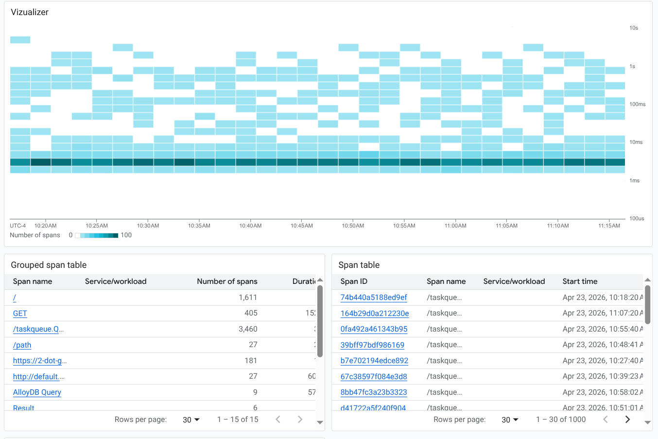
顯示追蹤資料的資訊主頁
如要在資訊主頁上顯示追蹤資料,請使用 XyChart 或 TimeSeriesTable 結構。如要顯示熱視圖或折線圖,請使用 XyChart 結構。如要顯示表格,請使用 TimeSeriesTable 結構。
這個資訊主頁會以熱度圖和兩個表格顯示追蹤資料:
{
  "displayName": "Example trace chart",
  "dashboardFilters": [],
  "description": "",
  "labels": {},
  "mosaicLayout": {
    "columns": 48,
    "tiles": [
      {
        "height": 22,
        "width": 48,
        "widget": {
          "title": "Vizualizer",
          "xyChart": {
            "chartOptions": {
              "displayHorizontal": false,
              "mode": "COLOR"
            },
            "dataSets": [
              {
                "plotType": "HEATMAP",
                "timeSeriesQuery": {
                  "traceQuery": {
                    "resourceContainer": "projects/my-project",
                    "spanDataValue": "SPAN_DURATION",
                    "spanFilters": {
                      "apphubServices": [],
                      "apphubWorkloads": [],
                      "applicationIds": [],
                      "attributes": [],
                      "displayNames": [
                        "/taskqueue.QueryAndOwnTasks"
                      ],
                      "isRootSpan": false,
                      "kinds": [],
                      "services": [],
                      "status": []
                    }
                  }
                }
              }
            ],
            "thresholds": [],
            "yAxis": {
              "scale": "LINEAR"
            }
          }
        }
      },
      {
        "yPos": 22,
        "height": 16,
        "width": 24,
        "widget": {
          "title": "Grouped span table",
          "timeSeriesTable": {
            "columnSettings": [],
            "dataSets": [
              {
                "breakdowns": [
                  {
                    "aggregationFunction": {
                      "type": "none"
                    },
                    "column": "serviceOrWorkload",
                    "limit": 0,
                    "sortOrder": "SORT_ORDER_NONE"
                  }
                ],
                "timeSeriesQuery": {
                  "traceQuery": {
                    "resourceContainer": "projects/my-project",
                    "spanDataValue": "SPAN_DURATION",
                    "spanFilters": {
                      "apphubServices": [],
                      "apphubWorkloads": [],
                      "applicationIds": [],
                      "attributes": [],
                      "displayNames": [],
                      "isRootSpan": false,
                      "kinds": [],
                      "services": [],
                      "status": []
                    }
                  }
                }
              }
            ],
            "metricVisualization": "NUMBER"
          }
        }
      },
      {
        "yPos": 22,
        "xPos": 24,
        "height": 16,
        "width": 24,
        "widget": {
          "title": "Span table",
          "timeSeriesTable": {
            "columnSettings": [],
            "dataSets": [
              {
                "timeSeriesQuery": {
                  "traceQuery": {
                    "resourceContainer": "projects/my-project",
                    "spanDataValue": "SPAN_DURATION",
                    "spanFilters": {
                      "apphubServices": [],
                      "apphubWorkloads": [],
                      "applicationIds": [],
                      "attributes": [],
                      "displayNames": [],
                      "isRootSpan": false,
                      "kinds": [],
                      "services": [],
                      "status": []
                    }
                  }
                }
              }
            ],
            "metricVisualization": "NUMBER"
          }
        }
      }
    ]
  }
}
如先前的 JSON 所示,您可以設定篩選器,並套用至個別物件。
資訊主頁的外觀如下圖所示:
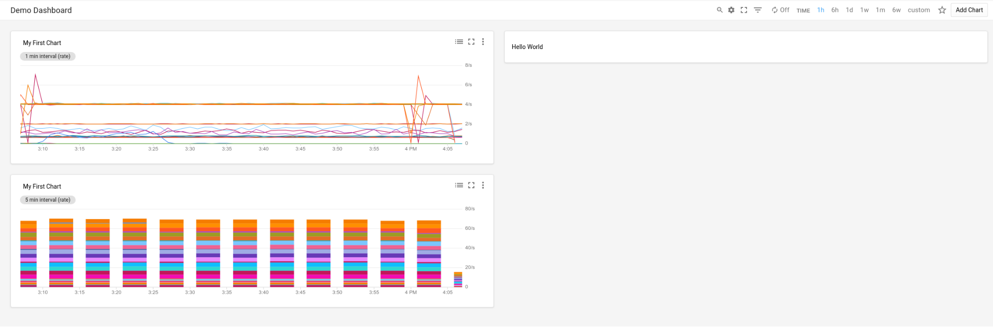
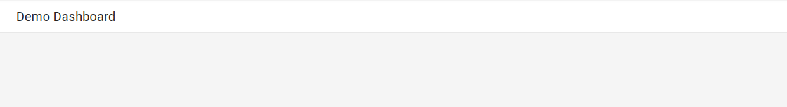
資訊主頁,其中一個小工具空白
這個範例顯示的資訊主頁含有空白的預留位置小工具。
小工具會顯示 displayName 欄位的值。
{
  "displayName": "Demo Dashboard",
  "gridLayout": {
    "widgets": [
      {
        "blank": {}
      }
    ]
  }
}
資訊主頁看起來會類似下列範例:
已設定小工具顯示設定的資訊主頁
這個資訊主頁包含文字小工具和變數。變數值會決定是否顯示或隱藏文字小工具:
名為
show的變數預設值為a。變數的值定義為a、b和c。由於valueType欄位為STRING_ARRAY,因此變數也可以設為a or b等值。在文字小工具中,標示為
visibilityCondition的項目會定義小工具的顯示狀態。如果變數show的值包含b,系統就會顯示文字小工具。否則,系統不會顯示文字小工具。
{
  "displayName": "Conditional Widget Example",
  "mosaicLayout": {
    "columns": 48,
    "tiles": [
      {
        "yPos": 16,
        "width": 24,
        "height": 16,
        "widget": {
          "title": "A text widget",
          "text": {
            "content": "Example showing how to use a custom variable to control visibility.",
            "format": "MARKDOWN",
            "style": {
              "backgroundColor": "#FFFFFF",
              "fontSize": "FS_LARGE",
              "horizontalAlignment": "H_LEFT",
              "padding": "P_EXTRA_SMALL",
              "pointerLocation": "POINTER_LOCATION_UNSPECIFIED",
              "textColor": "#212121",
              "verticalAlignment": "V_TOP"
            }
          },
          "visibilityCondition": {
            "templateVariableCondition": {
              "templateVariable": "show",
              "templateVariableValue": "b",
              "comparator": "REGEX_FULL_MATCH"
            }
          }
        }
      }
    ]
  },
  "dashboardFilters": [
    {
      "labelKey": "",
      "templateVariable": "show",
      "stringArrayValue": {
        "values": [
          "a"
        ]
      },
      "filterType": "VALUE_ONLY",
      "valueType": "STRING_ARRAY",
      "stringArray": {
        "values": [
          "a",
          "b",
          "c"
        ]
      }
    }
  ],
  "labels": {}
}
如要瞭解設定小工具瀏覽權限的相關限制,請參閱「設定小工具的瀏覽權限」。