

This document describes how to set the display options of a chart. You can do the following:
- Set a chart's time range
- Add a reference line
- Set X-ray, color, or statistics mode
- Show outliers
- Compare current data to past data
- Set the Y-axis to the log scale
This feature is supported only for Google Cloud projects. For App Hub configurations, select the App Hub host project or management project.
When investigating an issue, use the Metrics Explorer breakdown feature to determine whether specific resource types or locations are the cause. Metrics Explorer can break a chart into a series of tiles, each displaying time-series data for a specific label key. This view helps you identify spikes, dips, or trends that aggregation might otherwise hide. For more information, see Break down a chart by labels.
Set a chart's time range
A chart can display data for periods ranging from one minute to six weeks. If you don't explicitly set the chart's display period, then it uses the display period of its parent, which is either Metrics Explorer or a custom dashboard.
Configure a chart's time-range override when you want that chart to show data over a longer or shorter time range than is appropriate for other dashboard widgets. For example, consider these use cases:
A dashboard displays a quota metric, which has 1 sample per day, and metric data that is sampled every 60 seconds. The quota-metric chart needs a time range of at least one day, possibly as long as one week. However, this time range is too long to view spikes or dips in the metrics that are sampled every 60 seconds.
For a metric, you want to view both trends and the current measurements. Therefore, you add two charts to the dashboard. For one chart, you set its time-range override to eight days, a bit longer than a week. The other chart displays one hour of data, which is the dashboard's time-range setting.
Changing the time range on a chart can result in realignment of the time series. For conceptual information, see Alignment: within-series regularization.
Set the default time range
Charts on dashboards
The default time range applies to all widgets on a dashboard, except for those with a time-range override and those whose query includes a specific time range.
To set the default time range for a dashboard, do the following:
-
In the Google Cloud console, go to the Dashboards page:
If you use the search bar to find this page, then select the result whose subheading is Monitoring.
- In the toolbar of the Google Cloud console, select your Google Cloud project. For App Hub configurations, select the App Hub host project or management project.
- Select a custom dashboard.
- Go to the toolbar and use the time-range selector.
Metrics Explorer
-
In the Google Cloud console, go to the leaderboard Metrics explorer page:
If you use the search bar to find this page, then select the result whose subheading is Monitoring.
- In the toolbar of the Google Cloud console, select your Google Cloud project. For App Hub configurations, select the App Hub host project or management project.
- Go to the toolbar and use the time-range selector.
Set a time-range override for a chart or group
Charts on dashboards
When set, a chart's time-range override determines the display period for the chart. Suppose that you have a dashboard that displays quota metrics, which have 1 sample per day, and CPU utilization, which records a sample every 60 seconds. To view trends in your quota usage, you need to set the time range to at least one week. However, that time range hides spikes in CPU utilization. To resolve the conflict, set a time-range override for one of the charts.
If you don't set the chart's time-range override, then the dashboard's time-range setting determines the display period.
To specify a time range that applies only to a chart, do the following:
-
In the Google Cloud console, go to the Dashboards page:
If you use the search bar to find this page, then select the result whose subheading is Monitoring.
- In the toolbar of the Google Cloud console, select your Google Cloud project. For App Hub configurations, select the App Hub host project or management project.
- Select a custom dashboard.
Find the chart for which you want to configure a time-range override. In the chart's toolbar, select edit Edit.
You can select charts that are contained in a grouping widget.
In the Display pane, expand Time range override, and then complete the dialog. You can specify a relative or absolute time range.
If the Time range override option isn't listed, then the widget doesn't support configuring this field. For example, you can't set this field for widgets that display the chart associated with an alerting policy.
Click Apply or Save.
Metrics Explorer
If you aren't planning to save the chart to a dashboard, then we recommend using the toolbar to set the chart's time range.
To override the default time range, do the following:
-
In the Google Cloud console, go to the leaderboard Metrics explorer page:
If you use the search bar to find this page, then select the result whose subheading is Monitoring.
- In the toolbar of the Google Cloud console, select your Google Cloud project. For App Hub configurations, select the App Hub host project or management project.
- Select and configure your chart.
- In the Display pane, expand Time range override, and then complete the dialog. You can specify a relative or absolute time range.
Add a reference line
The Threshold option creates a horizontal line from a point on the Y-axis. The line provides a visual reference for the chosen threshold value. You can add a threshold that refers to a value on the left Y-axis or the right Y-axis.
The following screenshot shows a chart with a threshold line:
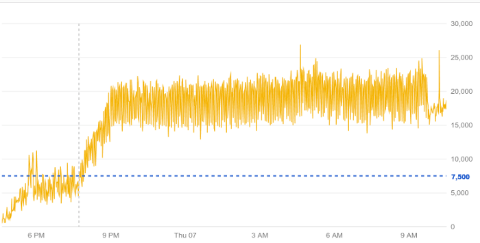
In the previous screenshot, the threshold is set to 7500 and refers to the right Y-axis.
Charts on dashboards
To add a reference line to a chart, do the following:
-
In the Google Cloud console, go to the Dashboards page:
If you use the search bar to find this page, then select the result whose subheading is Monitoring.
- In the toolbar of the Google Cloud console, select your Google Cloud project. For App Hub configurations, select the App Hub host project or management project.
- Select a dashboard.
- In the chart's toolbar, select edit Edit.
- In the Display pane, select Threshold.
- Optional: To change the Y-axis, click arrow_drop_down Y-axis and select from the menu.
- Set a value for the threshold in the Threshold line field.
Metrics Explorer
To add a reference line to a chart, do the following:
-
In the Google Cloud console, go to the leaderboard Metrics explorer page:
If you use the search bar to find this page, then select the result whose subheading is Monitoring.
- In the toolbar of the Google Cloud console, select your Google Cloud project. For App Hub configurations, select the App Hub host project or management project.
- Select a resource type and metric type to chart.
- In the chart's Display pane, expand expand_more Threshold Line, select Add threshold, and then complete the dialog.
Set X-ray, color, or statistics mode
Charts on dashboards
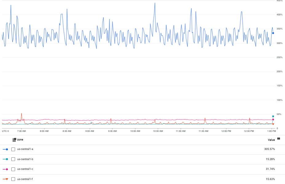
A chart's widget type and its chart mode setting determine how the chart displays data. For example, when you create a line chart, each time series is shown by a line with a unique color. However, you can configure a line chart to display statistical measures such as the mean and moving average.
There are three chart modes:
- Color mode: Displays each time series with a unique color.
- Stats mode: Displays common statistical measures for the data in a chart.
- X-ray mode: Displays each time series with a translucent gray color. Each line is faint, and where lines overlap or cross, the points appear brighter. Therefore, this mode is most useful on charts with many lines. Overlapping lines create bands of brightness, which indicate the normal behavior within a metrics group.
You can permanently change the mode of line charts. You can temporarily change the mode of line, stacked area, stacked bar, and heatmap charts.
To temporarily change the mode of a chart, do the following:
-
In the Google Cloud console, go to the Dashboards page:
If you use the search bar to find this page, then select the result whose subheading is Monitoring.
- In the toolbar of the Google Cloud console, select your Google Cloud project. For App Hub configurations, select the App Hub host project or management project.
- Select a dashboard.
In the chart's toolbar, click more_vert More options, and then make a selection from the menu.
Your changes are discarded when the dashboard is reloaded.
To permanently change the mode of a line chart, do the following:
-
In the Google Cloud console, go to the Dashboards page:
If you use the search bar to find this page, then select the result whose subheading is Monitoring.
- In the toolbar of the Google Cloud console, select your Google Cloud project. For App Hub configurations, select the App Hub host project or management project.
- Select a dashboard.
- In the chart's toolbar, select edit Edit.
- In the Display pane, click arrow_drop_down Chart mode, and then make a selection from the menu.
Metrics Explorer
A chart's widget type and its analysis mode setting determine how the chart displays data. For example, when you create a line chart, each time series is shown by a line with a unique color. However, you can configure a line chart to display statistical measures such as the mean and moving average.
There are three analysis modes:
- Standard mode: Displays each time series with a unique color.
- Stats mode: Displays common statistical measures for the data in a chart.
- X-ray mode: Displays each time series with a translucent gray color. Each line is faint, and where lines overlap or cross, the points appear brighter. Therefore, this mode is most useful on charts with many lines. Overlapping lines create bands of brightness, which indicate the normal behavior within a metrics group.
To change the analysis mode of a line chart, do the following:
-
In the Google Cloud console, go to the leaderboard Metrics explorer page:
If you use the search bar to find this page, then select the result whose subheading is Monitoring.
- In the toolbar of the Google Cloud console, select your Google Cloud project. For App Hub configurations, select the App Hub host project or management project.
- Select a resource type and metric type to chart.
- In the chart's Display pane, expand expand_more Analysis mode, and then make a selection from the menu.
Examples
The following screenshot shows a chart in color mode:
The following screenshot shows the previous chart but in statistics mode:
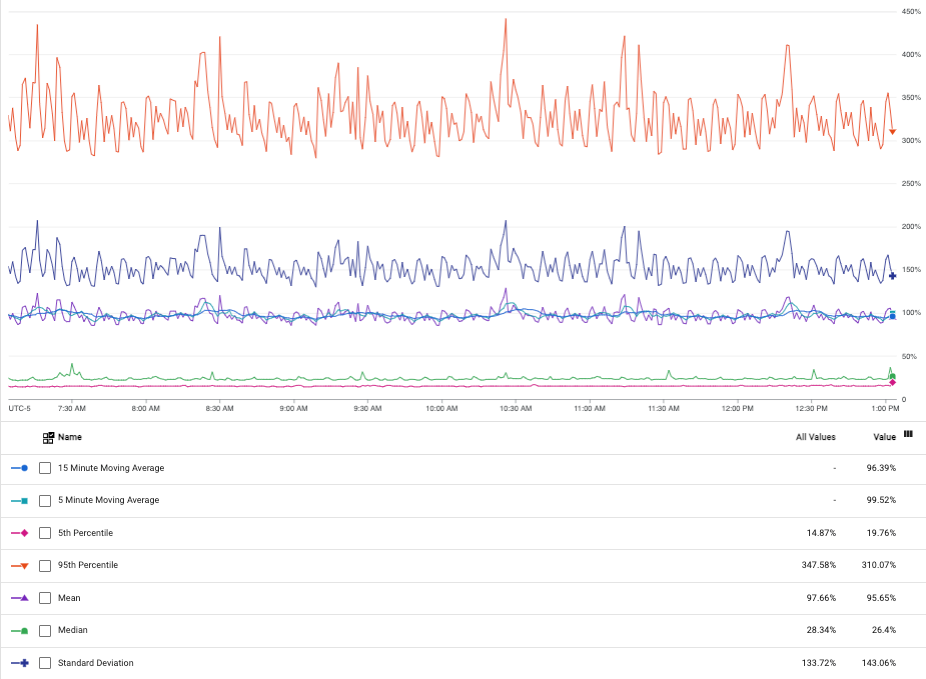
When you select statistics mode, the chart legend displays various statistics, like mean, standard deviation, and others.
The following screenshot shows a chart in X-ray mode:
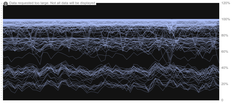
X-ray mode highlights central tendencies and outliers in dense graphs. For example, consider a cluster of machines that are serving the same data. If you view the CPU utilization across the cluster, then you would expect to see a band around the cluster's average CPU utilization. That band shows how the average ranges and can indicate whether the cluster is over- or under-provisioned. You can also use X-ray mode to identify servers that are not operating optimally.
Set the Y-axis to the log scale
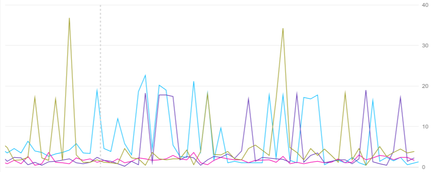
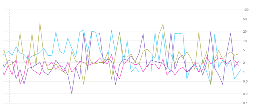
The Log scale on Y-axis option rescales the chart's Y-values logarithmically. You can scale the left Y-axis, the right Y-axis, or both axes. This rescaling is useful when values cluster tightly within a small range. Select the checkbox to enable this option, and clear the checkbox to disable it.
The following screenshots show the same chart with the default Y-axis and with a log-scaled Y-axis.
Default Y-axis:
Log-scaled Y-axis:
Charts on dashboards
To set the Y-axis to the log scale, do the following:
-
In the Google Cloud console, go to the Dashboards page:
If you use the search bar to find this page, then select the result whose subheading is Monitoring.
- In the toolbar of the Google Cloud console, select your Google Cloud project. For App Hub configurations, select the App Hub host project or management project.
- Select a dashboard.
- In the chart's toolbar, select edit Edit.
- In the Display pane, select Log scale on Y-axis.
Metrics Explorer
To set the Y-axis to the log scale, do the following:
-
In the Google Cloud console, go to the leaderboard Metrics explorer page:
If you use the search bar to find this page, then select the result whose subheading is Monitoring.
- In the toolbar of the Google Cloud console, select your Google Cloud project. For App Hub configurations, select the App Hub host project or management project.
- Select a resource type and metric type to chart.
- In the chart's Display pane, expand expand_more Scale, and then select Log scale on Y-axis. There are different options available for the left and right axes.
Configure API mode
Charts on dashboards
To be able to view a widget's configuration as described by the Cloud Monitoring API, click Show API Mode in Configuration.
When selected, a tab labeled API is available on the configuration pane for every widget on the dashboard. API mode can be useful when you manage your dashboards through the Google Cloud console and the Cloud Monitoring API.
Metrics Explorer
Not available.