
When investigating an issue, use the Metrics Explorer breakdown feature to determine if specific resource types or locations are the cause. Metrics Explorer can break a chart into a series of tiles, each displaying time-series data for a specific label key. This view helps you identify spikes, dips, or trends that aggregation might otherwise hide.
Why you should break down your chart
Breaking down a chart by labels helps you identify root causes by isolating data for specific resource types or locations.
Metrics Explorer creates this breakdown as a grid of tiles. Each tile represents a specific label key, surfacing spikes, dips, and trends that are typically hidden by aggregation. This breakdown helps you identify which factors are contributing to an issue and refine your analysis by applying filters directly from the tiles.
The following chart illustrates this:
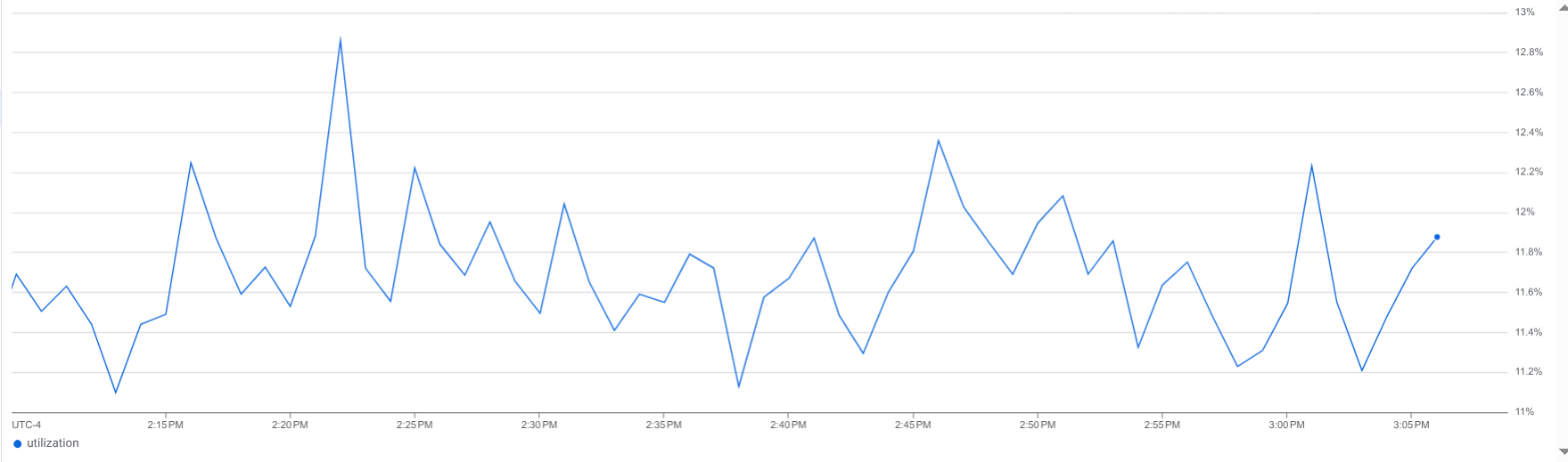
This chart shows a single time series where the values are not changing significantly. However, this chart hides underlying data. How many time series are combined? Are there any time series with significant spikes, dips, or trends?
In contrast, the following shows same chart, but the data is broken down by key:
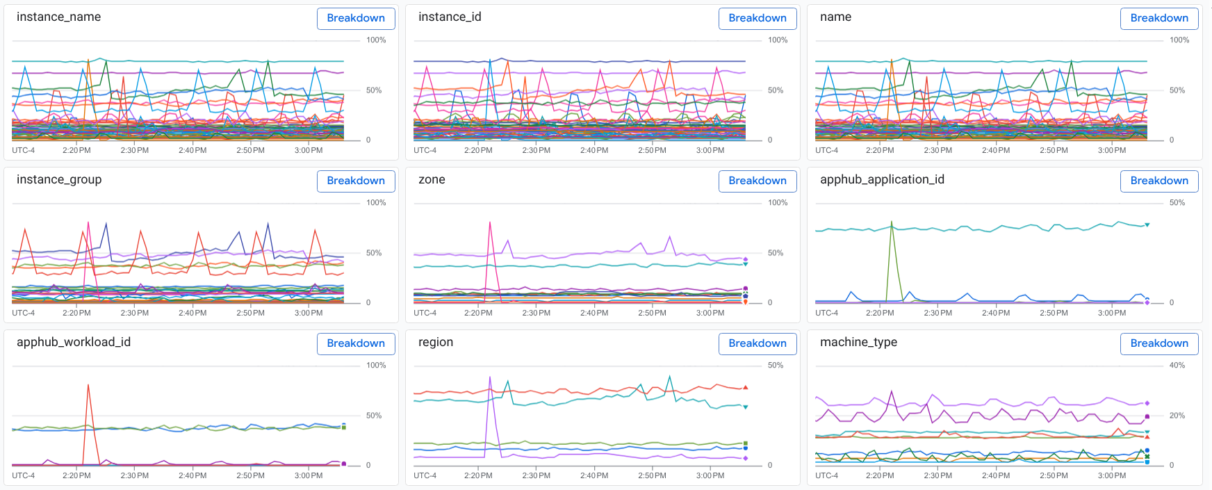
The breakdown shows multiple time series with data collected from various regions and different machine types. It also shows a data spike that might be related to resources in a specific region or to an application.
Before you begin
-
To get the permissions that you need to break down a chart by labels, ask your administrator to grant you the Monitoring Viewer (
roles/monitoring.viewer) IAM role on your project. For more information about granting roles, see Manage access to projects, folders, and organizations.You might also be able to get the required permissions through custom roles or other predefined roles.
This page assumes that you are viewing a chart by using Metrics Explorer and that you want to investigate the data you are viewing.
Break down a chart
To break down your chart by labels:
In the toolbar of Metrics Explorer, select Show breakdown.
The display updates to show a split screen with the following panes:
- Your chart.
- A menu with the text Breakdown by label.
- A collection of tiles. Each tile displays a chart, a label key, and a Breakdown button. Each tile corresponds to a key associated with your metric and resource labels.
The two earlier images in this document illustrate a chart and the tiles that show the data grouped by key.
When you display a breakdown by label key, you have two options:
Select Close breakdown to return to Metrics Explorer.
On a tile, select Breakdown. This applies a breakdown for a specific label key and updates the tiles pane. The updated pane displays each tile with the label value and an Add Filter button.
For example, if you select Breakdown on the
zonetile, you see a tile for each zone with metric data: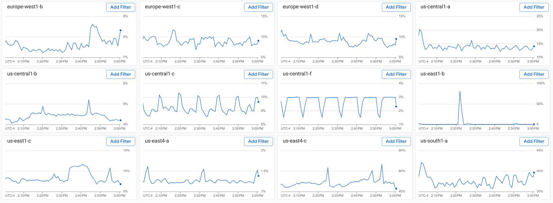
When you display a breakdown by a specific label, you have two options:
Select arrow_back Back on the toolbar that displays that button and text similar to Select a value for some-key.
You return to the split screen that shows a breakdown by label key.
On a tile, select Add Filter.
For example, if you select Add Filter on the
us-east1-btile, your query includes the filterzone=us-east1-b. Your chart and the tiles show only time series that match the filter. The tiles pane also doesn't display a tile for thezonekey.
Optional: Break down your chart by additional label keys.
To return to Metrics Explorer, select Close breakdown.
You can perform these actions at any time:
- Remove filters. To remove a filter, select close Close on the filter.
- Use the menu and search fields to find a specific label.
- Save your chart to a custom dashboard.
Limitations
You can only break down line charts. This feature isn't available for other types of charts, such as heatmaps.
You can't save the split screen, which shows your chart and a breakdown by key.
What's next
Explore charted data: Describes how to use chart controls to highlight timeseries, change the chart resolution, show outliers, and compare current to past data.
Set chart display options: Describes how to change the the visual display of your chart.