
Looker 的獨特功能之一是直接連線至資料庫。也就是說,您隨時都能存取最新資料,並向下鑽研至最精細的層級。因此,雖然您可以查看年度或月度摘要,但 Looker 也提供即時深入瞭解每日、每小時或每秒的選項。
本頁面提供範例,說明如何自訂及運用資料鑽取功能,為使用者打造更強大的分析體驗,包括:
- 自訂基本向下鑽取資料表中的值顯示方式
- 自訂細查圖表,打造視覺化細查體驗
自訂基本向下鑽取資料表中的值顯示方式
Looker 的網頁原生現代化架構不僅能讓您從一個層級向下鑽取至最細微的層級,還能執行更多操作。您只需幾個參數,即可建構任何自訂向下切入路徑。
下列範例說明如何自訂下鑽表格中資料的呈現方式,包括:
- 在鑽取表格中新增自訂資料列限制 (最多 5,000 列)
- 在鑽研表格中新增排序
- 在鑽研表格中新增樞紐
在鑽研表格中新增資料列限制 (最多 5,000 列)
在細查資料表中新增資料列限制,即可控管使用者細查指標值時的資料呈現方式。舉例來說,如果使用者深入查看「退貨數量」指標值,您只想在鑽研表格中顯示前 20 個結果,該怎麼做?您可以使用 link 參數,並將 url 子參數設為 "{{ link }}&limit=20",如下列 LookML 程式碼所示:
measure: returned_count {
  type: count_distinct
  sql: ${id} ;;
  filters: [is_returned: "yes"]
  drill_fields: [detail*]
  link: {
    label: "Explore Top 20 Results"
    url: "{{ link }}&limit=20"
  }
}

set: detail {
  fields: [id, order_id, status, created_date, sale_price, products.brand, products.item_name, users.email]
}
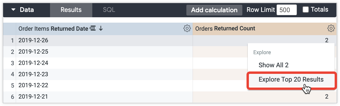
使用者可以從「傳回計數」指標的下鑽選單中選取「探索前 20 項結果」,深入瞭解前 20 項結果:
在鑽研表格中新增排序
除了限制資料外,您也可以控管鑽研表格中的資料排序方式。舉例來說,如果使用者深入瞭解「退貨次數」指標值,您想依「特價」顯示 20 個結果,該怎麼做?您可以使用 link 參數,並將 url 子參數設為 "{{ link }}&sorts=order_items.sale_price"。下列 LookML 程式碼會將自訂排序與自訂資料列限制合併:
measure: returned_count {
  type: count_distinct
  sql: ${id} ;;
  filters: [is_returned: "yes"]
  drill_fields: [detail*]
  link: {
    label: "Explore Top 20 Results by Sale Price"
    url: "{{ link }}&sorts=order_items.sale_price+desc&limit=20"
  }
}

set: detail {
  fields: [id, order_id, status, created_date, sale_price, products.brand, products.item_name, users.email]
}
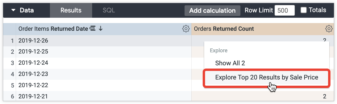
使用者可以從「銷售價格」指標的下鑽選單中選取「依銷售價格探索前 20 項結果」,依銷售價格查看前 20 項結果:
在鑽研表格中新增樞紐
除了限制和排序資料,您也可以在鑽研表格中透視維度。舉例來說,如果使用者深入瞭解「訂單數」指標值,您想在「年齡層」欄位中新增樞紐,顯示各年齡層的年份和毛利率百分比層級,該怎麼做?您可以使用 link 參數,並將 url 子參數設為 "&pivots=users.age_tier":
measure: order_count {
  type: count_distinct
  drill_fields: [created_year, item_gross_margin_percentage_tier, users.age_tier, total_sale_price]
  link: {
    label: "Total Sale Price by Month for Each Age Tier"
    url: "{{link}}&pivots=users.age_tier"
  }
  sql: ${order_id} ;;
}
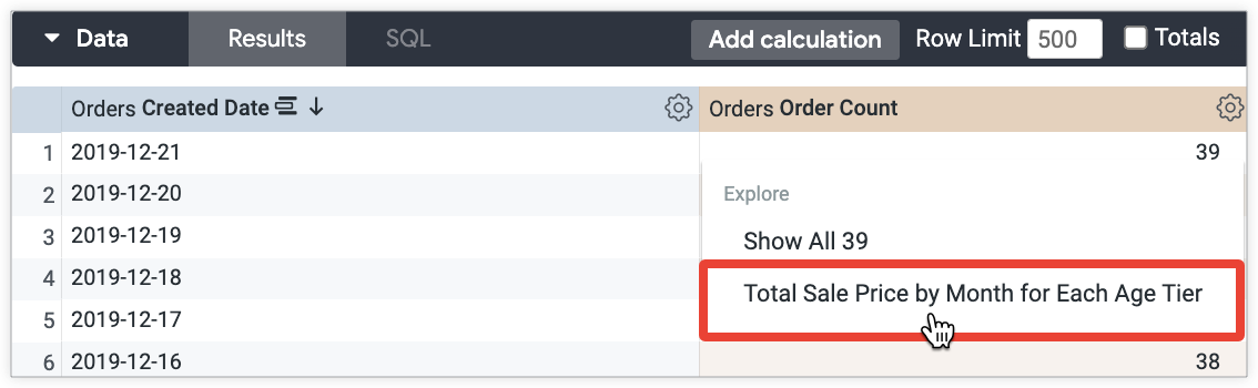
使用者從「訂單數」指標的下鑽選單中選取「各年齡層每月總銷售價格」後,即可查看各年齡層的年度和毛利率百分比:
建立視覺化鑽研體驗
資料表能有效傳達資料,但如果想以視覺化方式呈現使用者細查資料時看到的內容,該怎麼做?除了資料表,您也可以透過其他方式在視覺化圖表中顯示鑽取資料。本節包含下列範例:
- 使用「圖表細查」功能細查資料
- 鑽研散布圖,瞭解限制和移動平均值
- 向下鑽取至含有樞紐的堆疊折線圖
- 細查自訂視覺化內容
- 向下鑽研含有條件式格式設定的資料表計算
使用「圖表細查」功能進行細查
使用者可透過「視覺化下鑽」功能,下鑽至「探索」或「Look」。您無需進行任何自訂,即可使用有限的向下切入設定,以 Looker 根據資料預先選取的不同視覺化類型,顯示向下切入資料。
資訊主頁不支援視覺化鑽取功能。對於資訊主頁,您可以使用link參數建立視覺化鑽研體驗,不必啟用這項功能。後續章節將提供範例,說明如何使用link參數建立視覺化鑽研體驗。
舉例來說,如要顯示每天售出的商品數量,可以建立深入分析「建立日期」和「銷售總價」欄位的指標:
measure: count {
  type: count_distinct
  sql: ${id} ;;
  drill_fields: [created_date, total_sale_price]
}
視覺化鑽研是最簡單的選項,但如果想控制使用者鑽研時顯示的視覺化類型,該怎麼做?下列各節提供範例,說明如何進一步自訂向下切入的視覺化效果。
向下鑽研散布圖,瞭解限制和移動平均值
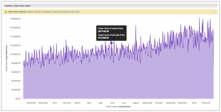
您可以讓使用者向下鑽研,查看包含移動平均趨勢線的散布圖。舉例來說,假設您想以散布圖顯示每日銷售的商品數量,並加入 30 天的移動平均值:
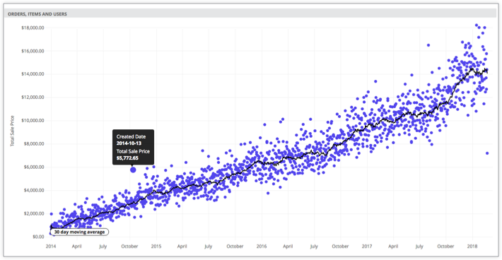
如要這麼做,您可以使用 Liquid 變數,在網址中指定視覺化設定。這些設定可控管下鑽時顯示的視覺化內容:
measure: count {
  type: count_distinct
  sql: ${id} ;;
  drill_fields: [created_date, total_sale_price]
  link: {
    label: "Show as scatter plot"
    url: "
    {% assign vis_config = '{
     \"stacking\" : \"\",
     \"show_value_labels\" : false,
     \"label_density\" : 25,
     \"legend_position\" : \"center\",
     \"x_axis_gridlines\" : true,
     \"y_axis_gridlines\" : true,
     \"show_view_names\" : false,
     \"limit_displayed_rows\" : false,
     \"y_axis_combined\" : true,
     \"show_y_axis_labels\" : true,
     \"show_y_axis_ticks\" : true,
     \"y_axis_tick_density\" : \"default\",
     \"y_axis_tick_density_custom\": 5,
     \"show_x_axis_label\" : false,
     \"show_x_axis_ticks\" : true,
     \"x_axis_scale\" : \"auto\",
     \"y_axis_scale_mode\" : \"linear\",
     \"show_null_points\" : true,
     \"point_style\" : \"circle\",
     \"ordering\" : \"none\",
     \"show_null_labels\" : false,
     \"show_totals_labels\" : false,
     \"show_silhouette\" : false,
     \"totals_color\" : \"#808080\",
     \"type\" : \"looker_scatter\",
     \"interpolation\" : \"linear\",
     \"series_types\" : {},
     \"colors\": [
     \"palette: Santa Cruz\"
     ],
     \"series_colors\" : {},
     \"x_axis_datetime_tick_count\": null,
     \"trend_lines\": [
      {
      \"color\" : \"#000000\",
      \"label_position\" : \"left\",
      \"period\" : 30,
      \"regression_type\" : \"average\",
      \"series_index\" : 1,
      \"show_label\" : true,
      \"label_type\" : \"string\",
      \"label\" : \"30 day moving average\"
      }
     ]
    }' %}
     {{ link }}&vis_config={{ vis_config | encode_uri }}&toggle=dat,pik,vis&limit=5000"
  }
}
向下鑽研含有樞紐的堆疊折線圖
您也可以讓使用者向下鑽研至堆疊折線圖,例如顯示每個月數的總銷售價格,並依建立年份樞紐分析的堆疊折線圖:
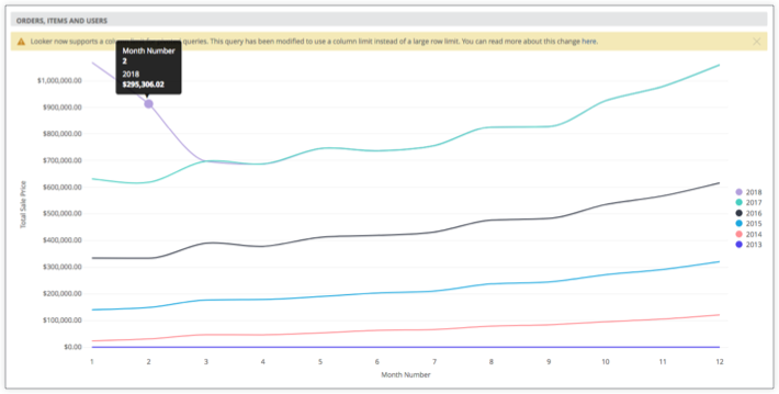
下列 LookML 會指定上述視覺化效果的設定:
measure: total_sale_price {
  type: sum
  value_format_name: usd
  sql: ${sale_price} ;;
  drill_fields: [total_sale_price, created_month_name, created_year]
  link: {
    label: "Show as stacked line"
    url: "
    {% assign vis_config = '{
     \"stacking\" : \"normal\",
     \"legend_position\" : \"right\",
     \"x_axis_gridlines\" : false,
     \"y_axis_gridlines\" : true,
     \"show_view_names\" : false,
     \"y_axis_combined\" : true,
     \"show_y_axis_labels\" : true,
     \"show_y_axis_ticks\" : true,
     \"y_axis_tick_density\" : \"default\",
     \"show_x_axis_label\" : true,
     \"show_x_axis_ticks\" : true,
     \"show_null_points\" : false,
     \"interpolation\" : \"monotone\",
     \"type\" : \"looker_line\",
     \"colors\": [
     \"#5245ed\",
     \"#ff8f95\",
     \"#1ea8df\",
     \"#353b49\",
     \"#49cec1\",
     \"#b3a0dd\"
     ],
     \"x_axis_label\" : \"Month Number\"
    }' %}
     {{ link }}&vis_config={{ vis_config | encode_uri }}&sorts=order_items.created_year+asc,order_items.created_month_name+asc&pivots=order_items.created_year&toggle=dat,pik,vis&limit=500&column_limit=15"
  } # NOTE the &pivots=
}
細查自訂圖表
您也可以允許使用者細查自訂視覺化:
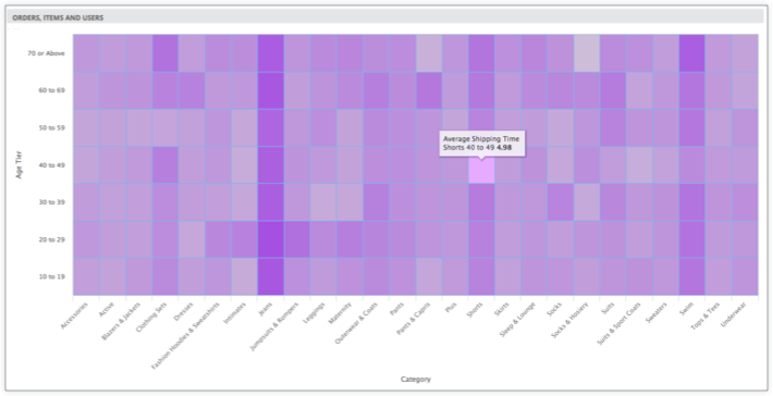
如要執行這項操作,請在為 link 參數指定的視覺化設定中加入自訂視覺化效果:
measure: average_shipping_time {
  type: average
  value_format_name: decimal_2
  sql: ${shipping_time} ;;
  drill_fields: [products.category, users.age_tier, average_shipping_time]
  link: {
    label: "See as custom viz (heatmap)"
    url: "
    {% assign vis_config = '{
     \"minColor\" : \"#d6d6d6\",
     \"maxColor\" : \"#9a33e3\",
     \"dataLabels\" : false,
     \"custom_color_enabled\" : false,
     \"custom_color\" : \"forestgreen\",
     \"show_single_value_title\": true,
     \"show_comparison\" : false,
     \"comparison_type\" : \"value\",
     \"comparison_reverse_colors\": false,
     \"show_comparison_label\" : true,
     \"show_view_names\" : true,
     \"show_row_numbers\" : true,
     \"truncate_column_names\" : false,
     \"hide_totals\" : false,
     \"hide_row_totals\" : false,
     \"table_theme\" : \"editable\",
     \"limit_displayed_rows\" : false,
     \"enable_conditional_formatting\": false,
     \"conditional_formatting_include_totals\": false,
     \"conditional_formatting_include_nulls\": false,
     \"type\" : \"highcharts_heatmap\",
     \"stacking\" : \"\",
     \"show_value_labels\" : false,
     \"label_density\" : 25,
     \"legend_position\" : \"center\",
     \"x_axis_gridlines\" : false,
     \"y_axis_gridlines\" : true,
     \"y_axis_combined\" : true,
     \"show_y_axis_labels\" : true,
     \"show_y_axis_ticks\" : true,
     \"y_axis_tick_density\" : \"default\",
     \"y_axis_tick_density_custom\": 5,
     \"show_x_axis_label\" : true,
     \"show_x_axis_ticks\" : true,
     \"x_axis_scale\" : \"auto\",
     \"y_axis_scale_mode\" : \"linear\",
     \"ordering\" : \"none\",
     \"show_null_labels\" : false,
     \"show_totals_labels\" : false,
     \"show_silhouette\" : false,
     \"totals_color\" : \"#808080\",
     \"series_types\" : {},
     \"hidden_fields\" : [
     \"order_items.count\",
     \"order_items.total_sale_price\"
     ]
    }' %}
     {{ link }}&vis_config={{ vis_config | encode_uri }}&sorts=products.category+asc,users.age_tier+asc&toggle=dat,pik,vis&limit=5000"
  }
}
向下鑽研含有條件式格式設定的資料表計算
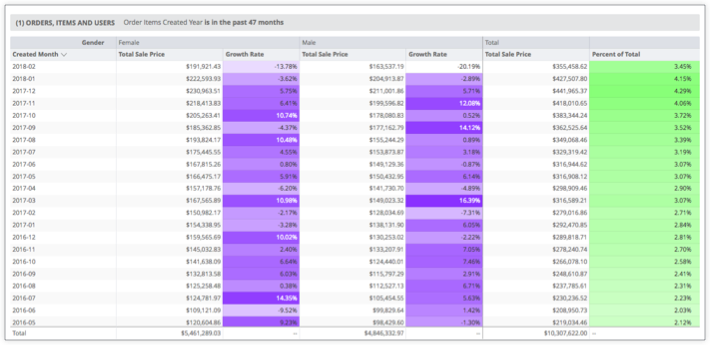
這可以在 LookML 中定義如下:
measure: total_sale_price {
  type: sum
  value_format_name: usd
  sql: ${sale_price} ;;
  drill_fields: [created_month, users.gender, total_sale_price]
  link: {
    label: "Table Calc & Total"
    url: "
    {% assign table_calc = '[
     { \"table_calculation\": \"percent_of_total\",
     \"label\": \"Percent of Total\",
     \"expression\": \"${order_items.total_sale_price:row_total} / sum(${order_items.total_sale_price:row_total})\",
     \"value_format\": null,
     \"value_format_name\": \"percent_2\",
     \"_kind_hint\": \"supermeasure\",
     \"_type_hint\": \"number\"
     },
     { \"table_calculation\": \"growth_rate\",
     \"label\": \"Growth Rate\",
     \"expression\": \"${order_items.total_sale_price} / offset(${order_items.total_sale_price},1) - 1\",
     \"value_format\": null,
     \"value_format_name\": \"percent_2\",
     \"_kind_hint\": \"measure\",
     \"_type_hint\": \"number\"
    }]' %}
    {% assign vis_config = '{
     \"type\": \"table\",
     \"show_view_names\": false,
     \"show_row_numbers\": false,
     \"truncate_column_names\": false,
     \"table_theme\": \"gray\",
     \"enable_conditional_formatting\": true,
     \"conditional_formatting\": [
     {
     \"type\": \"low to high\",
     \"value\": null,
     \"background_color\": null,
     \"font_color\": null,
     \"palette\": {
     \"name\": \"Custom\",
     \"colors\": [
     \"#FFFFFF\",
     \"#6e00ff\"
     ]},
     \"bold\": false,
     \"italic\": false,
     \"strikethrough\": false,
     \"fields\": [
     \"growth_rate\"
     ]},{
     \"type\": \"low to high\",
     \"value\": null,
     \"background_color\": null,
     \"font_color\": null,
     \"palette\": {
     \"name\": \"Custom\",
     \"colors\": [
     \"#FFFFFF\",
     \"#88ff78\"
     ]},
     \"bold\": false,
     \"italic\": false,
     \"strikethrough\": false,
     \"fields\": [
     \"percent_of_total\"
    ]}]}' %}
     {{link}}&total=on&row_total=right&dynamic_fields={{ table_calc |replace(') ', '' | encode_uri }}&pivots=users.gender&vis_config={{ vis_config |replace(') ', '' | encode_uri }}"
  }
}