Adding static design elements can add visual appeal and context to your data stories. As a best practice, use these elements sparingly to avoid distraction from the data.
Click the corresponding icon on the toolbar to add the following components to your reports:
Add text
Use text to add headings and descriptions to your reports. You can also use text to create hyperlinks to pages within your report, to other Looker Studio reports, or to any web-accessible resource.
To add text to your report, follow these steps:
In the toolbar, click the Text icon to add a text box to the report canvas.
Alternatively, you can scroll and select the Line option from the Insert menu.
Click, hold, and drag the corners or sides of the text box to reposition or reshape the text box on the report canvas.
Click inside the text box to add your text in the box.
Style the text
To style the text, follow these steps:
- Click the text box.
- Use the Text Properties options to change the font, size, color, padding, and other aspects of the text.
Make the text scrollable
To make the text box scrollable, from the Overflow settings section, select the Hidden option in the Scroll text menu.
Add images
Use images to add logos and graphics to your report.
To add an image to your report, follow these steps:
In the toolbar, click the Image icon.
Alternatively, you can scroll and select the Image option from the Insert menu.
Select an image file from your hard drive, or enter the URL for an image that's hosted on the web. You can add most common image file formats, such as PNG, JPG, or SVG.
Click, hold, and drag the inside, corners, or sides of the image to reposition or resize it on the report canvas.
Next, you can style the image.
Style the image
To style the image on your chart, click the image to open the Properties panel. You can customize the image by using the Setup tab and Style tab options.
The Setup tab of the Properties panel includes the following options:
- Image file: Displays the filename or web URL of the image. Click the filename or URL to upload a different image.
- Preserve aspect ratio: When this option is enabled, the aspect ratio of the image is preserved when a report viewer resizes the report.
- Image link URL: Enter a URL to make the image a clickable link. The link must begin with the HTTPS protocol.
- Accessibility - Alt text: Add alt text to the image to make it accessible to screen readers. See the Web Content Accessibility Guidelines (WCAG) guidelines on alt text for more information about writing alt text.
The Style tab of the Properties panel include the following options:
- Background: Sets the image background color.
- Opacity: Sets the image opacity. 100% opacity completely hides objects behind the image. 0% opacity makes the image invisible.
- Border color: Sets the image border color.
- Border radius: Adds rounded borders to the image background. When the radius is 0, the background shape has 90° corners. A border radius of 100° produces a circular shape.
- Border weight: Sets the image border line thickness.
- Border style: Sets the image border line style.
- Add border shadow: Adds a shadow to the image's lower and right borders.
Add shapes
Use shapes, arrows, and callouts to create visual separation of data elements, banners, and other graphical effects.
To add a shape, an arrow, or a callout to your report, follow these steps:
In the toolbar, click the Shape icon and select a shape, an arrow, or a callout to add to the report canvas.
Alternatively, you can scroll and select the Shapes option from the Insert menu.
Click, hold, and drag the corners or sides of the shape box to reposition or resize the shape on the report canvas.
Click the shape to open the Shape properties panel and customize the shape's appearance.
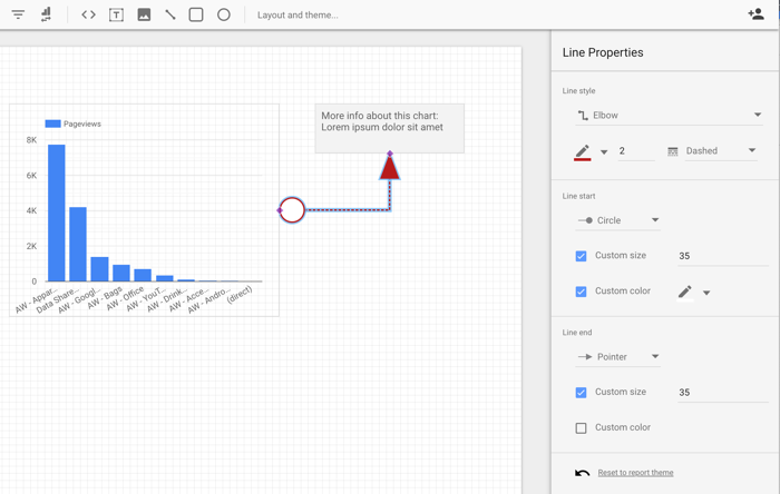
Add lines
Use lines, arrows, and connectors to indicate areas of note or to connect elements in a report.
To add lines, arrows, or connectors to your report, follow these steps:
In the toolbar, click the Line icon.
Alternatively, you can scroll and select the Line option from the Insert menu.
Click, hold, and drag your pointer to draw a Line, Arrow, Elbow Connector, or Curved Connector on the canvas.
Click the line to open the Line Properties panel options to change the appearance of the line, arrow, or connector.