
Use visualization cells
This guide describes how to use visualization cells to visualize data from within a Colab Enterprise notebook.
Visualization cells can generate interactive and editable visualizations based on data from a DataFrame in your notebook. You can configure a visualization cell to help you explore data and discover insights. Visualization cell configuration options include the following:
- Specify which fields are used in the visualization.
- Select a chart type, such as scatter plot or bar chart.
- Specify how the data is aggregated.
- Change the colors, labels, and the title of your visualization.
Limitations
Consider the following limitations when you plan your project:
- The Visualize option under Next steps doesn't always appear when working with pandas DataFrames.
- Gemini in Colab Enterprise can't interact with visualization cells. This means that Gemini can't read or suggest changes to visualization cells, and might not be able to explain or help fix errors generated by visualization cells.
Before you begin
- Sign in to your Google Cloud account. If you're new to Google Cloud, create an account to evaluate how our products perform in real-world scenarios. New customers also get $300 in free credits to run, test, and deploy workloads.
-
In the Google Cloud console, on the project selector page, select or create a Google Cloud project.
Roles required to select or create a project
- Select a project: Selecting a project doesn't require a specific IAM role—you can select any project that you've been granted a role on.
-
Create a project: To create a project, you need the Project Creator role
(
roles/resourcemanager.projectCreator), which contains theresourcemanager.projects.createpermission. Learn how to grant roles.
-
Verify that billing is enabled for your Google Cloud project.
Enable the BigQuery, Compute Engine, Dataform, and Agent Platform APIs.
Roles required to enable APIs
To enable APIs, you need the Service Usage Admin IAM role (
roles/serviceusage.serviceUsageAdmin), which contains theserviceusage.services.enablepermission. Learn how to grant roles.-
In the Google Cloud console, on the project selector page, select or create a Google Cloud project.
Roles required to select or create a project
- Select a project: Selecting a project doesn't require a specific IAM role—you can select any project that you've been granted a role on.
-
Create a project: To create a project, you need the Project Creator role
(
roles/resourcemanager.projectCreator), which contains theresourcemanager.projects.createpermission. Learn how to grant roles.
-
Verify that billing is enabled for your Google Cloud project.
Enable the BigQuery, Compute Engine, Dataform, and Agent Platform APIs.
Roles required to enable APIs
To enable APIs, you need the Service Usage Admin IAM role (
roles/serviceusage.serviceUsageAdmin), which contains theserviceusage.services.enablepermission. Learn how to grant roles.
Required roles
To get the permissions that you need to create a Colab Enterprise notebook, run the notebook's code on a runtime, and use BigQuery data in the notebook, ask your administrator to grant you the following IAM roles on the project:
- BigQuery User (
roles/bigquery.user) - Colab Enterprise User (
roles/aiplatform.colabEnterpriseUser)
For more information about granting roles, see Manage access to projects, folders, and organizations.
You might also be able to get the required permissions through custom roles or other predefined roles.
Create a DataFrame
To use a visualization cell, you'll need data stored in a DataFrame within your notebook. To create a DataFrame, you can run a SQL query in a SQL cell. For more information about SQL cells, see Use SQL cells.
To run a SQL query and create a DataFrame, do the following:
-
In the Google Cloud console, go to the Colab Enterprise My notebooks page.
-
In the Region menu, select the region that contains your notebook.
-
Click the notebook that you want to open. If you haven't created a notebook yet, create a notebook.
-
In the toolbar, to add a SQL cell, click the Insert code cell options menu and select Add SQL cell.
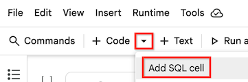
Your SQL cell is added to your notebook.
-
In your SQL cell, enter a SQL query. For example, to query data from BigQuery's public dataset on penguins, you can enter the following:
SELECT * FROM `bigquery-public-data.ml_datasets.penguins`;
-
Hold the pointer over the SQL cell, and then click the Run cell button.
The output of the query is automatically saved in a DataFrame called df.
Create a visualization
To create a visualization from a DataFrame in your notebook, you can add a visualization cell and then configure it to use a specific DataFrame. Or if a Next steps section appears under a generated DataFrame, you can click the Visualize with DATAFRAME_NAME button.
Add visualization cell
-
Use one of the following methods to add a visualization cell to your notebook:
-
In the toolbar, to add a visualization cell, click the Insert code cell options menu and select Add visualization cell.

-
Hold the pointer between two cells in your notebook to indicate where you want to add the visualization cell, and click the Visualization button.
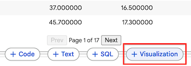
A visualization cell is added to your notebook.
-
-
In the visualization cell, to select the DataFrame to visualize, click the Choose a dataframe menu, and then select df.
Colab Enterprise generates a default visualization. To change the visualization, see the next section.
Visualize with DataFrame
-
If there is a Next steps section under a generated DataFrame, click the Visualize with DATAFRAME_NAME button.
A visualization cell is added to your notebook. The previous cell's DataFrame is automatically set as this visualization cell's data source.
-
Hold the pointer over the visualization cell, and then click the Run cell button.
Colab Enterprise generates a default visualization. To change the visualization, see the next section.
Configure the visualization
A visualization cell generates a default visualization that you can configure by using the cell's side panel. Configuration options vary based on the data that you're using and the chart type of the visualization.
To change the configuration settings of a visualization cell, do the following:
-
In the visualization cell, you can click the Data button to view the underlying data used in the visualization, or click Split mode to view the visualization and underlying data at the same time.
-
Click the Chart button to change back to Chart mode and view the visualization.
-
To show or hide the configuration settings, click the Toggle settings button.
-
In the configuration settings panel, to select a different chart type, click the chart type menu, and select the chart type that you want. Some chart types use only a subset of fields from the available DataFrame.
-
On the Setup tab, change the fields that are used in the visualization by selecting different dimensions and metrics. Generally, dimensions are categorical fields in your data, and metrics are numerical values.
-
To change the aggregation for a metric, click the aggregation setting to the left of the metric's name, and then select a different aggregation.
-
To change the metric used for sorting, click the Sort metric, and select a different metric. You can also change the aggregation and whether to sort values in descending or ascending order.
-
On the Style tab, you can make changes to the text and appearance of the visualization, including the following:
- Whether to show or hide the title and labels
- Title text
- Axis label text
- Font, size, and color of text
- Colors of the visualized metrics
-
At the bottom of the Style tab, click the Show all settings button to make further changes to the visualization, including detailed changes to the axes, grid lines, and legend.
Filter the data in your visualization
You can filter the data in your visualization based on a field's value. To filter the data, do the following:
-
At the top of your visualization cell, click Add filter.
-
Select a field to filter the data on.
-
To complete the filter dialog, do one of the following based on the type of data you're filtering:
- For dimensions, or categorical data, select the categories that you want to include in the visualization.
- For metrics, or numerical data, adjust the sliders to the lowest and highest values that you want to include in your visualization.
-
Click Apply.
What's next
Learn more about BigQuery DataFrames.
Use SQL cells in a Colab Enterprise notebook.
Use Gemini to explain and fix errors.